Best art for a boutique cafe with character
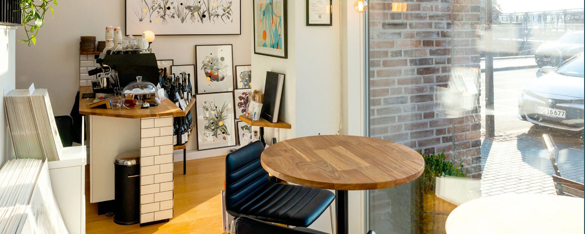
A boutique cafe is remembered in the quiet moments: when the guest waits for their espresso, finds a table by the window, or lets their gaze rest between conversations. The best art for a boutique cafe is therefore not an afterthought on the wall. It is part of the rhythm of the place, a visual signature that gives the coffee, the light, and the space a clearer identity.
Art in a cafe must be special. It must create character without competing with the people in the room. It must be strong enough to be seen from a distance, yet rich enough to reward a closer look. And it must feel chosen, not just hung up.
Art should give the cafe its own unique perspective
The most successful cafe space has a clear idea of what it wants the guest to experience. Perhaps the atmosphere is calm and Nordic with tactile surfaces, muted pigments, and wood. Perhaps it is urban, graphic, and energetic. Perhaps it balances elegance and rawness, with patinated metals, natural stone, and a menu where simplicity is a discipline.
The artworks should reinforce this narrative, not explain it too literally. A photograph of a coffee cup in a coffee shop rarely says anything new. An abstract composition, a shifted collage, or an archival motif in an unexpected color palette, on the other hand, can open up the space. It gives the guest room for their own interpretation and creates a sense that the place has a culture that extends beyond the service.
This is precisely the difference between decoration and curation. Decoration fills a surface. Curation creates relationships between walls, furniture, light, sound, and human movement.
The best art for a boutique cafe depends on the space
There is no single piece of art that suits all cafes. The choice depends on the proportions, light, and operation of the space. A narrow cafe with a low ceiling requires something different from a high-ceilinged corner space with large windows. Before choosing a motif, one should therefore read the room as a composition.
In a small room, one striking artwork can create more tranquility than a dense wall of small pictures. Choose a format with a clear presence and give it space around it. A large fine art print with a subdued, poetic color scheme can add depth without making the room feel smaller. In very compact environments, visual pauses feel like a luxury.
In a larger space, a series can provide direction. Three or four related works give the guest something to follow through the room and make the transition between the order counter, seating areas, and more private corners natural. The series does not have to be identical in color or motif, but it should share a rhythm: the same paper, related tones, a repeated form, or a common artistic approach.
Light also matters more than many expect. A work with deep black hues and fine textures can be exquisite in a warmly lit corner but lose its precision in a window with harsh daylight. Works with transparent color fields, paper texture, or hand-finished details change throughout the day. This is a quality when the placement is well thought out.
Choose materials that can withstand a lively everyday life
A cafe is not a private home. There is steam, traffic, chairs being moved, bags against walls, and a constant shift of light. The materials must therefore be beautiful, but also chosen with respect for the pace of the place.
Giclée prints on exclusive art paper have a special depth in the pigment and a tactile surface that elevates collages, illustrations, and photographic motifs. They are particularly suitable for spaces where a gallery-like lightness is desired. With professional framing and UV-protective glass, the artwork gets a clear, precise appearance and a finish that matches a quality-conscious interior.
Canvas can be the right choice when more texture and a less reflective surface are desired. It works convincingly in cafes with organic materials, soft textiles, or a more relaxed, studio-like atmosphere. However, canvas should not be chosen as a cheap shortcut to size. A good canvas work has an artistic reason for being tactile and spatial.
Hand-finished elements such as gold leaf or layered textures can add a subtle shift in experience. They not only catch the light but make the artwork present over time. Here, uncompromising quality applies: a single well-placed detail is stronger than a surface that tries to impress at first glance.
Colors should create an appetite for staying
Cafe art can be bold, but it should not make the room feel restless. Guests come to meet, read, work, take a break, and return. The colors should support the stay.
Earth tones, dusty blue hues, deep green tones, and warm reddish pigments often have a fine ability to create depth and warmth around wood, stone, and brass. They can give the room a sensual quality without being too sweet. Cool monochrome works, conversely, can sharpen a modern, architectural interior, especially if the cafe has a lot of daylight and clean lines.
Strong colors work best when they are given a task. An intense orange field behind the bar can mark the center. A cobalt blue composition in a quiet side room can draw guests further in. It's not about matching the artworks with cushions or cups, but about letting the color define an atmosphere and a pace.
The complexity of the motif should also be adapted to the zone. At the counter, where the pace is high, graphic works often work well because they are read quickly and clearly. At tables where guests sit longer, more layered works can unfold. Collages, archival images, and abstract details reward the slow gaze and invite conversation without demanding it.
Create a hanging with calm and precision
Even excellent art loses power if it hangs randomly. A boutique cafe doesn't have to look like a museum, but it should have the same respect for distances, sightlines, and proportions.
Start with the places guests naturally look: the wall above a bench, the surface behind the counter, the passage to the restroom, or the quiet corner farthest from the entrance. Let a masterpiece take on the role of an anchor, and build the rest of the hanging around it. When several pictures hang together, the spaces between them must be deliberate. Even distances create discipline, while varied distances only work if they support a clear, lively rhythm.
Height also matters. Art should generally meet a standing gaze, but in a cafe, most guests are sitting down. Above benches and low lounge furniture, works can therefore hang slightly lower than in a traditional gallery. The goal is not a rule, but an experience of contact between the work and the guest.
The frames are part of the curation. A narrow black frame can give graphic prints sharpness. Light oak or ash can highlight the warmth of the paper and add a calm Nordic materiality to the room. A more ornate frame can serve as a deliberate contrast, but only when the cafe's other decor has room for that gesture.
Let art become a reason to return
The strongest cafe art is not necessarily the most photographed. It is the art that continues to give something when the guest returns in three weeks, on a gray Tuesday, or in bright spring light. That's why limited editions, signed prints, and original works have special value. They add an authenticity that cannot be replicated by mass-produced wall decor.
A rotating exhibition can be relevant if the cafe has a large local audience or wants to function as an active cultural space. But don't change just for the sake of changing. A work should be given time to settle. When art becomes a permanent part of the place's memory, the cafe becomes more than a nice stop along the way – it becomes a sensory haven with its own unique perspective.
Therefore, don't choose art to fill the walls. Choose works that can withstand repetition, change with the light, and let guests feel that someone has looked at the space with the same care as they have looked at the coffee.