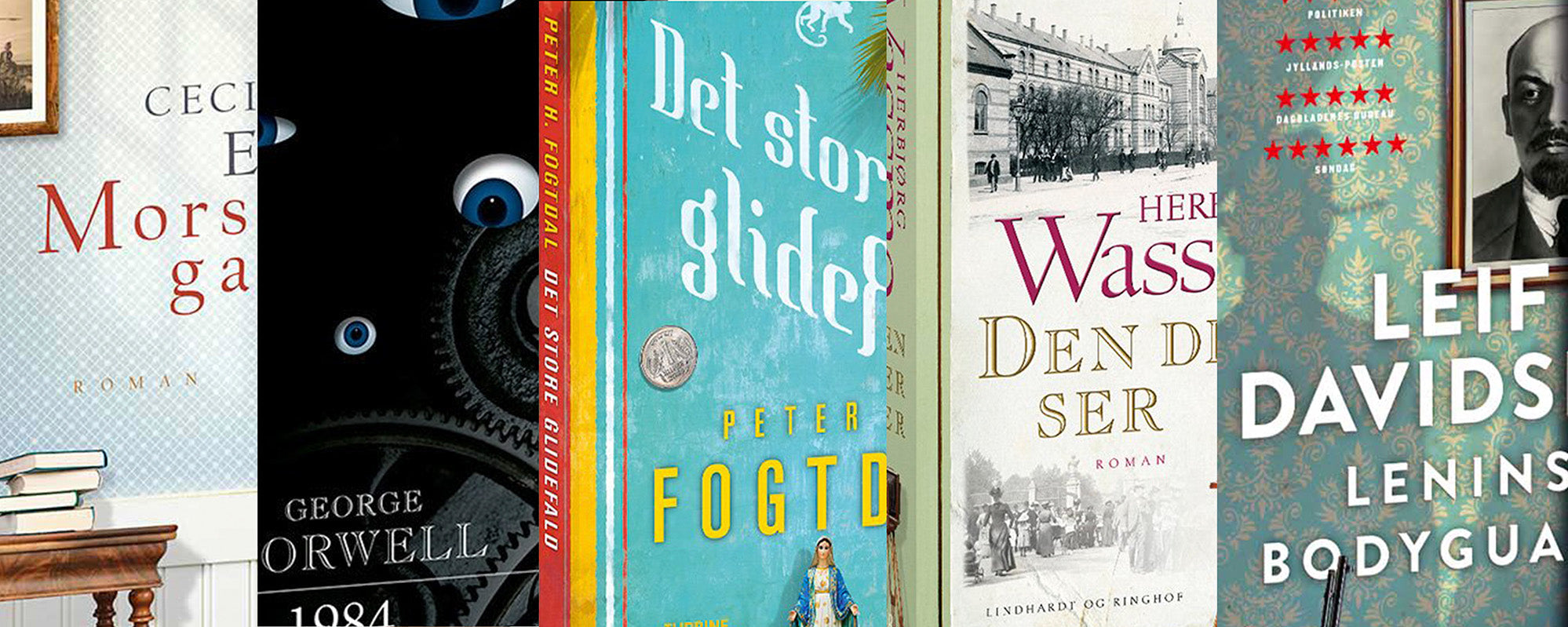
Book cover design examples with strong identity
A book cover has only a few seconds to establish a connection. In a bookstore, as a small digital thumbnail, or in a reader’s hand, it must evoke a precise sense of what awaits inside. The best book cover design examples are therefore not just beautiful surfaces. They are visual interpretations of the text’s rhythm, conflict, tempo, and resonance.
A cover can be enigmatic, but it must never be random. Every color, crop, and typographic decision should give the reader an atmosphere to step into. The goal is not to explain the entire book, but to create the first, irresistible invitation.
What strong book cover design examples show
A successful cover balances three considerations: genre expectations, the book’s unique voice, and the visual clarity that makes it stand out. These three do not always work together peacefully. A crime novel often needs to signal suspense, while a literary novel might demand quietness and complexity. Non-fiction should promise clarity and credibility, but risks becoming too explanatory.
The most compelling solutions find an image or graphic idea that can carry the tension between these layers. A motif doesn't need to show the main character or the central event. On the contrary, a shifted detail, a shadow, an unusual texture, or a simple symbol can give the cover greater longevity. It gives the reader space to imagine the rest.
The literary novel: Silence with an undertow
For fiction, the most interesting solution is rarely the most literal. Imagine a novel about a family returning to a summer house after many years of absence. A photograph of the house would be obvious, but also predictable. A stronger cover might instead work with a faded section of a curtain, an overexposed sea, or a collage where an archival photograph meets a painted surface.
Here, color becomes crucial. Dusty blues, chalky greens, or a muted red can create remembrance, distance, and unease without illustrating the plot. The typography should have the same sensitivity. An elegant serif can add literary weight, while a more raw, scattered setting can emphasize a fragmented narrative. It depends on the manuscript's language: tight prose often calls for a clear visual approach, while lush and sensual text can carry more materiality.
Crime and suspense: Control over the darkness
The crime genre is full of visual codes: night, fog, forests, blood-red accents, and houses with lit windows. They can work, but they are not an idea in themselves. When all covers use the same dark landscape, visibility paradoxically decreases.
A refined crime cover can retain the darkness but change the perspective. A disturbed grainy surface, an anonymous interior, or a cropped face can be more unsettling than yet another silhouette in the forest. The contrast between a precise typographic system and a disturbed visual layer creates a special tension: something is under control, but something else is slipping away.
Color also doesn't have to be black. Sour green, deep petrol, grayish-violet, or washed-out ochre can feel both sophisticated and ominous. A single sharp color point can function as a visual pulse if used with discipline. Too much drama often weakens the psychological intensity that crime readers seek.
Non-fiction: An idea visible from a distance
An academic cover needs to convey a promise quickly. The reader should understand the field and feel the book's authority, without the design being reduced to an infographic. Therefore, the visual idea is more important than a collection of symbols.
A book about working life, for example, can avoid suits, meeting tables, and computer icons. Instead, it can use a tight grid, a shifted line, or a typographic composition that physically shows the tension between structure and human friction. A science book can work with magnified organic forms, but only if the form has a real connection to the content.
Here, readability is not a limitation, but a quality. Title and author name must work in small sizes, and the hierarchy must be clear. This does not mean the cover has to be neutral. It means that the visual richness lies in precision.
From manuscript to cover: The artistic process
A strong cover rarely arises from choosing an image after the first reading. The process begins with questions that go deeper than the plot: What feeling lingers after the last page is turned? Is the text cool, sensual, claustrophobic, or expansive? What must the cover not be mistaken for?
Then, the design direction can be gathered into a visual language. Some books require photography because traces of reality are part of their power. Others open up through illustration, collage, or abstraction, where the unsaid gets more space. Collage is particularly strong when a book contains multiple times, identities, or geographies. It can allow found image fragments, hand-drawn elements, and processed textures to meet in a poetic composition.
Typography should not come last as a label. It is part of the cover's character. A name set with plenty of air around it can feel calm and confident. Tight, compressed typography can create pressure. Letters that overlap the image can add energy, but also steal the atmosphere carried by the motif. The right solution depends on whether the text should guide the eye or act as an image itself.
In cover design work at StoltzeStudio, motif, typography, and materiality are treated as one integrated work. It's not just about creating a front cover that works on screen, but about the special experience that arises when the book is physically in hand.
The material continues the story
The digital front cover is necessary, but the physical book gives the design an extra dimension. The uncoated roughness of the paper, a matte cover, embossed typography, or selective varnish can change the reader's first encounter with the book. The material is not decoration. It is part of the story.
A dark suspense novel can gain more presence through a tactile, almost velvety matte surface rather than high gloss. An exclusive novel edition can feature gold leaf or embossing if the detail reinforces the text's idea of value, ritual, or memory. But an expensive finish doesn't solve a weak concept. If the material becomes the only attraction, the cover risks feeling like packaging rather than artistic interpretation.
The format should also be considered early. A thin paperback, a large hardcover, and a book in a series have different needs. Series covers require a system that can be recognized across titles, without each title losing its own tone. This could be a consistent typographic structure, a recurring color logic, or a fixed compositional framework. The variations should feel related, not monotonous.
Three mistakes that make a cover less precise
The first mistake is trying to tell everything. When characters, landscapes, symbols, and subtitles compete on the same surface, both the mystery and the hierarchy disappear. Choose the detail that contains the most layers.
The second is following genre codes so closely that the book looks like all the others. Genre knowledge is necessary, but the cover must find its own angle within the framework. This can be in the cropping, the color, or the way the title is set.
The third mistake is forgetting scale. A cover is judged both from a distance and up close. It must be legible as a miniature, strong on a book spine, and rich enough to reward a close look. Therefore, test the design in multiple sizes before finalizing the direction.
A good book cover doesn't provide all the answers. It places the book in the reader's consciousness with a clear, sensory tone and lets curiosity do the rest.