How to arrange abstract art with calm
An abstract artwork can transform a room before you even register the furniture. An intense colour field can bring a living room together, a poetic collage can add depth to an entrance hall, and a piece with gold leaf can catch the light as a quiet, living detail. Therefore, the question of how to place abstract art is not just about finding an empty wall. It's about giving the piece the space, light, and visual calm that allows it to stand out with the gravitas it deserves.
Abstract art does not need to explain itself. Its strength often lies in the tension between colour, form, texture, and the experience the viewer brings with them. Its placement should support that openness – not compete with it.
Start with the visual weight of the artwork
The format is important, but size is not the same as visual weight. A small piece with deep black, saturated ultramarine, or striking graphic contrasts can feel more present than a large motif in light, transparent hues. Before measuring the wall, you should therefore consider the artwork's energy.
Ask whether it should create a calm focal point or act as a precise disruption in the room. A large canvas with a tactile surface and powerful brushstrokes can carry an entire wall on its own. A smaller fine art print with delicate layers, archival fragments, or hand-finished gold leaf often gains greater strength when placed with generous space around it.
Also choose the wall based on the artwork's character. A warm, limewashed wall makes earth tones, red hues, and golden details appear even more sensuous. On a cool white or grey surface, graphic compositions and clear contrasts become sharper. The right background doesn't necessarily have to match the colours in the artwork. It should create a deliberate tension where both elements are allowed to exist.
How to place abstract art at the right height
The classic gallery rule is simple: The centre of the artwork should hang approximately 145-150 cm (about 57-59 inches) from the floor. This is a good starting point because it meets the eye at a standing position. But the home is not a neutral gallery, and therefore the rule should be applied with an eye for the room.
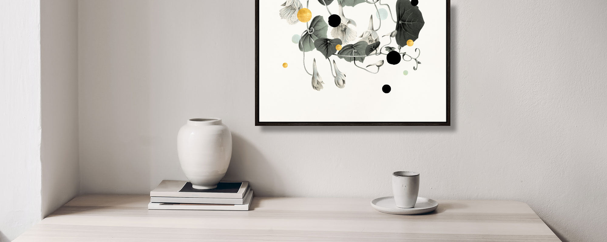
In an entrance hall, where one passes the artwork while standing, the classic height usually works beautifully. Above a sofa, sideboard, or bed, the artwork should hang lower, so it becomes part of the furniture's overall composition rather than a detached object on the wall. As a rule of thumb, maintain 15-25 cm (approximately 6-10 inches) between the top edge of the furniture and the bottom edge of the frame.
An artwork above a sofa should typically be about two-thirds to three-quarters of the sofa's width. This doesn't mean everything has to be symmetrical. On the contrary, a slightly smaller piece, placed off-centre above the sofa and balanced by a floor lamp or a sculptural side table, can create a more personal and curated whole. But if the artwork is too small in relation to the furniture, it loses authority.
Give the artwork breathing room before building a gallery wall
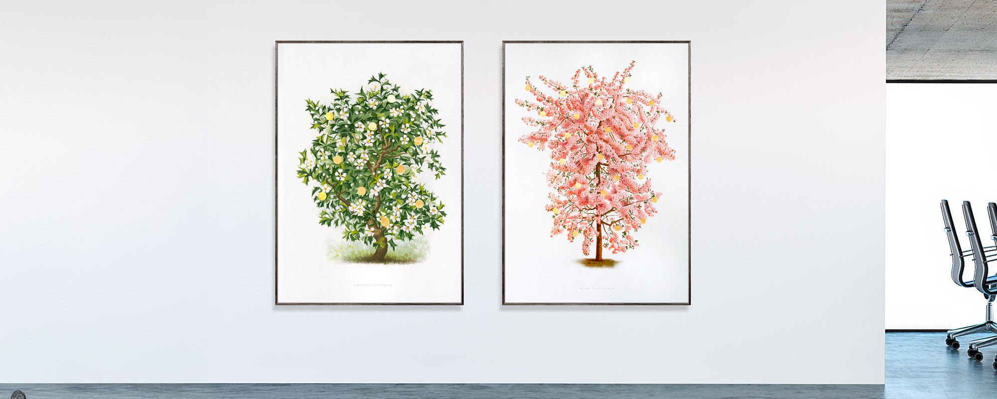
A single composition with a strong visual language rarely needs company. This is especially true for artworks with complex layers, metallic details, or a striking colour scheme. Here, the empty wall becomes an active part of the experience. It acts as a pause around the motif and gives the eye time to register the surface, paper quality, and the subtle shifts in the composition.
It can be tempting to fill all walls, especially when you have found several pieces you love. But a home with art should not look like a storage facility for pictures. Allow selected pieces the space to be protagonists. In a room with high ceilings, a large format can create the necessary anchoring. In a smaller room, one refined print in a generous frame can be more compelling than five smaller motifs.
The gallery wall has its place when it is curated with the same care as an exhibition. Maintain a consistent distance between the artworks, often 5-8 cm, and build the composition from the centre rather than hanging pictures randomly from an edge. A common colour tone, the same frame type, or a related artistic energy can create cohesion. It doesn't have to be uniform to feel unified.
Use light as part of the composition
Light dramatically alters abstract art. A piece that appears subdued in the morning can gain depth and glow in the afternoon's slanted light. This is particularly noticeable in works with texture, canvas, or handcrafted details, where shadows and reflections become part of the expression.
If possible, avoid direct, harsh sunlight for extended periods. Even quality prints and professional pigments deserve consideration if they are to retain their nuances for many years. Instead, choose a wall with indirect daylight, or use soft, adjustable lighting in the evening.
A directional wall lamp or a discreet spot can give the artwork a gallery-worthy presence, but the light must be warm enough to feel inviting and precise enough not to glare. Pay special attention to glass. If you experience reflections from windows or lamps, a different placement, anti-reflective glass, or a more matte surface may be the right solution.
Let the colours converse with the room
Placing abstract art is not about repeating the colour of the sofa cushions. That solution can quickly become too neat. Instead, look for a dialogue between the artwork and the interior. A painting with dusty rose, ochre, and brownish tones can create warmth in a room with dark wood and natural stone. A piece in green or blue hues can bring clarity to a room characterized by linen, cream, and light wood types.
You can choose to let the artwork gather existing colours or introduce a new temperature. In a very neutral room, a deep red, cobalt blue, or acidic yellow surface can provide the friction that makes the decor lively. In a colourful home, a more monochrome piece can act as a sensuous breathing space.
Materials play the same role. A simple black wooden frame gives graphic works contour and precision. Oak or dark walnut adds warmth and a tactile quality. A light, almost invisible frame can make the paper and motif stand out more freely. For works on canvas, the absence of glass is often part of the experience, as the surface is allowed to be present.
Choose placement based on the room's pace
In the living room, art should invite prolonged viewing. Here, larger works, multi-layered collages, and compositions with slow depth work particularly well. Place them where the eye naturally falls when sitting down - above the sofa, opposite the seating area, or at the end of a sightline through the room.
In the entrance hall, art has a different task. It sets the tone in seconds. A vertical piece can add height to a narrow wall, while a smaller piece above a console can create a precise first impression. In the bedroom, many opt for a calmer palette, but calm doesn't have to mean anonymity. Abstract forms with organic lines, muted contrasts, or a quiet metallic detail can give the room intimacy without being merely decorative.
The dining area often tolerates more intensity. Here, the artwork can create conversation and energy, especially if seen in both daylight and by candlelight in the evening. In the home office, abstract art can serve as a mental counterpoint to the straight lines of the screen. Choose something that opens up the space without constantly demanding attention.
Test the placement before hanging
The most reliable method is also the simplest: Tape a piece of paper in the exact format of the artwork, or lean the framed piece against the wall for a couple of days. View it from the doorway, from the sofa, and in different lighting conditions. What feels right in a quick glance might turn out to be too high, too close to furniture, or too isolated once the room is in use.
Also, don't be afraid to move things around. Art is not a permanent solution, but a living part of the home. When the season, light, or furniture changes, a new placement can make a familiar artwork appear completely different.
A special piece should not just fit in. It should create a slight shift in the room – a place where the eye pauses, and where the home feels more like your own.