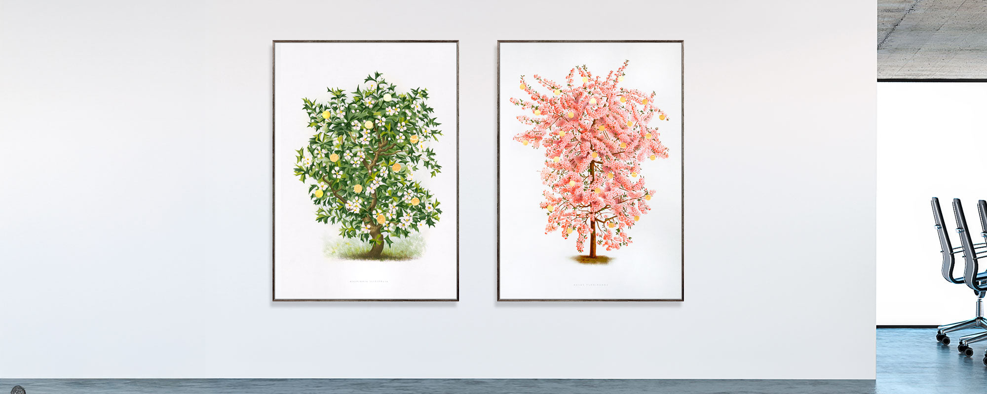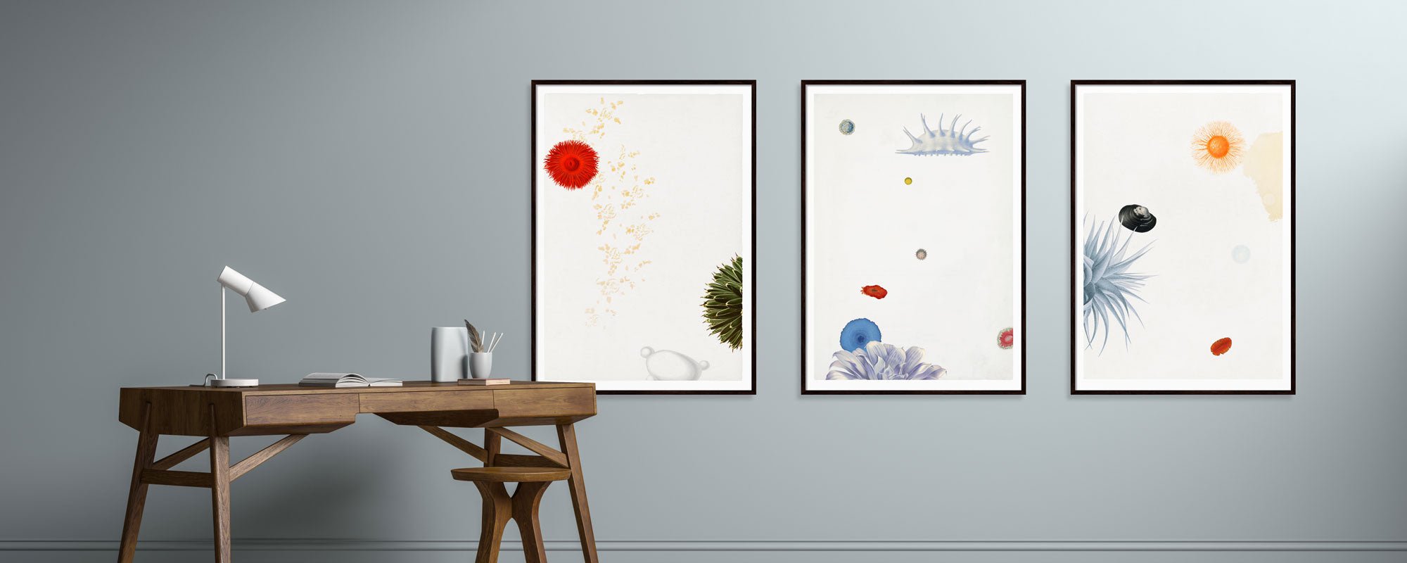
Case with art for modern apartment
A clean room can be beautiful, but without the right counterbalance, a modern home can easily feel too stark. That's why the case for art in a modern apartment is more than just a matter of decoration. It's about providing a counterpoint to the architecture, adding texture, and allowing the home to develop a personal, rather than pre-decorated, tone.
In modern apartments, lines are often sharp, materials cool, and palettes deliberately understated. Concrete, steel, oak, glass, and whitewashed walls create calm, but also risk anonymity. Art changes that dynamic. Not by overpowering the room, but by adding depth, rhythm, and a human touch. That's the difference between a pretty interior and a home with presence.
Why art in a modern apartment requires curation
Many believe that art should primarily match the sofa or unify the colours in a room. In practice, this is rarely the strongest solution. When art is reduced to colour coordination, it loses its tension. A modern apartment, instead, calls for curation – for pieces that either extend the room's mood or introduce a deliberate friction.
A bright, minimalist living space can support a piece with darker gravitas, if the composition still has airiness. A more tactile interior with wood, textiles, and warm stone surfaces can be elevated by graphic motifs with sharper contrast. The crucial factor is not whether everything fits perfectly, but whether the piece feels necessary in the room.
Curation is also about pace. Some apartments need a single masterpiece that creates silence around it. Others call for multiple pieces in dialogue. Both approaches can work, but they create vastly different experiences. One is monumental. The other is more literary – like a collection of voices that together form an atmosphere.
Choose art based on the room's architecture
The best art solution rarely begins with the motif alone. It begins with the room. Look at ceiling height, light incidence, wall surfaces, and distances. A modern apartment often features open floor plans, large windows, and fewer traditional dividing walls. This means that the artworks must be able to hold their own space without disappearing into the whole.
In the living room, larger formats often work best, especially above a sofa, sideboard, or on a clear wall with space around it. Small pieces can be refined, but they require proximity to be appreciated. If placed on a large surface without an anchor, they often appear tentative. Here, it is better to group several smaller pieces in a precise arrangement than to let a single one hang alone and too sparsely.
In the entryway, art can be more direct. Here, it creates a first impression and sets the home's tone. In the bedroom, it is often the more subdued, poetic compositions that work most effectively. Not because the room should be anonymous, but because the eye needs calm. Kitchen-diners can handle more edge, especially if the rest of the decor is stark and functional.
Colours that don't just decorate
Colour choices in art for modern apartments require discipline. Neutral rooms do not necessarily invite neutral works. On the contrary, a monochrome interior can benefit from a piece with deep blue, oxidized green, earthy reds, or black sections that give the room backbone.
This doesn't mean everything has to be dramatic. Subtle tones can be just as effective, especially when they work with layers, transparency, and texture. Sand, chalk, smoky grey, dusty pink, and warm white shades can create an almost architectural calm if the piece also has a strong composition.
It also depends on the light. North-facing rooms absorb warmth and make cool colours even cooler. South-facing rooms tolerate more muted tones without losing their glow. Art should therefore not be chosen based on a screen image alone. It should be considered in relation to daylight, evening lamps, and the materials it will coexist with.
Materiality is not a detail
In premium interior design, materiality is never secondary. A motif can be beautiful, but if the print, paper, and finish lack character, the artwork loses its presence. Especially in a modern apartment, where furniture and surfaces are often carefully selected, the difference becomes clear.
Giclée prints on exclusive paper have a depth and precision that mass-produced posters rarely approach. The surface captures light more subtly, blacks become more vibrant, and fine tonal gradations are preserved. On canvas, a different weight emerges – more painterly, more tactile, often better suited for larger formats.
Hand-finished details can add something special if used sparingly. A touch of gold leaf, a textured surface, or a distinct signature gives the artwork a physical integrity that modern spaces benefit from. Not as ornament, but as a trace of craftsmanship. It is precisely these kinds of details that make art more than a visual element.
The frame should support the artwork, not overpower it
Frame selection is a quiet discipline. The wrong frame can make a strong piece decorative in the wrong way. The right frame creates precision and allows the motif to stand out with naturalness.
In modern apartments, narrow wooden frames, black lacquered profiles, or light, discreet framings often work best. Oak provides warmth. Black provides definition. White can be beautiful, but requires care, especially against white walls, where the artwork might otherwise lose its edge.
Passe-partout can add elegance and air, especially to smaller or more graphic works. But it depends on the motif. Some compositions are strongest right to the edge. Others require distance to breathe. Here, it is worth thinking of the frame as part of the artwork's architecture, not as an accessory.
One statement or a curated gallery wall?
This is a classic choice, and there is no single right answer. A single large piece can give a modern apartment weight and calm. It works particularly well in rooms where the furniture is already complex, or where the architecture deserves space. Here, the art becomes an anchor point.
A gallery wall, on the other hand, can add energy, narrative, and a more personal rhythm. But it requires more discipline than many believe. The best gallery wall does not look like a spontaneous collection. It is curated around a tone, a spacing, a colour family, or a shared materiality.
If the goal is a calm and sophisticated expression, it is often stronger to group works with a conscious kinship than to mix too much. Variation is interesting, but in a modern apartment, it is most elegant when it feels controlled.
How to avoid art looking random
The most common mistake is choosing too small. The second most common is hanging too high. Art should relate to furniture and to the human body. Above a sofa or sideboard, the artwork should be experienced as part of the zone, not as something floating detached above.
Another pitfall is buying art too quickly. A piece should challenge a little. If it's only chosen because it's easy to place, it rarely continues to feel relevant. The strongest choices often have a bit of resistance in them – a detail, a tone, a texture, or a composition that continues to unfold.
It's also worth thinking about balance rather than symmetry. Modern spaces easily become stiff if everything is placed and hung too correctly. Art can shift things. An asymmetrical placement, a vertical format in a horizontal room, or a piece with significant texture can create precisely the tension that makes the whole lively.
When art should feel like a part of life
The best case for art in a modern apartment arises when the works don't just fit in, but make the home feel more settled. Art shouldn't just be seen. It should be lived with over time, in morning light, at dusk, in quiet hours, and in social settings. Therefore, it should be chosen with both eye and instinct.
A curated piece with strong materiality, well-considered format, and artistic integrity can change the experience of an entire room. Not by shouting loudly, but by creating resonance. In an atelier-based universe like StoltzeStudio, this uncompromising approach is palpable in the encounter between art, craftsmanship, and space.
Therefore, don't choose art as the final layer. Choose it as an active part of the home's architecture – the detail that makes the room quieter, more precise, and far more personal.