Guide to Giclée Fine Art Prints
At first glance, a giclée art print might look like a regular print. The difference only becomes apparent when light hits the paper, the colours maintain their depth, and the surface feels like a deliberate part of the work. This guide to giclée art prints is for those of you who aren't looking for wall decorations, but for a work with presence, materiality, and lasting quality.
There's a reason why giclée has become the standard in fine art circles when photography, illustration, and original works are translated into print. The method isn't just about high resolution. It's about precision, pigment, paper, and preserving the work's temperament without flattening it out.
What is a giclée art print?
Giclée is a printing technique where the motif is printed with pigment-based inks on high-quality fine art paper or canvas. In practice, this means greater colour depth, more nuanced transitions, and better archival stability than with many standard prints.
The crucial factor is not just the word itself, but the entire production chain. A true giclée art print requires a file with correct colour management, a printer developed for art production, and a material that can carry the motif's character. If one part falters, the work loses its tranquility. A strong motif on the wrong paper can appear harsh. A beautiful paper type with a weak print profile can cause the colours to die.
Giclée is often used for limited editions, signed prints, and reproductions of original works, precisely because the technique can retain fine details and a more sophisticated tonality. This makes it particularly suitable for art where texture, shadows, and subtle colour shifts are part of the experience.
Why choose giclée over a standard print?
The short answer is quality. The more precise answer is control.
A standard print can be excellent for graphic posters, campaign materials, or temporary decoration. But when you want a work that will live in the room over time, the differences become clear. Giclée typically provides a more saturated black, finer details in mid-tones, and a surface that feels less industrial.
There's also an aesthetic difference. Many mass-produced prints have a certain harshness in their colours or a smoothness that makes the motif flat. A giclée art print often has more air. The paper absorbs and reflects light in a way that creates depth instead of blank noise.
This doesn't mean giclée is always the right choice. If you want an affordable poster for an informal space, a standard print might suffice. But if the work needs to have weight, last a long time, and function as an actual part of your decor or collection, giclée is in a different category.
Guide to giclée art prints: what to look for
When evaluating a giclée art print, you should look beyond the motif for a moment and consider the materials. This is where much of the work's value lies.
The paper shapes the experience
The type of paper is not a technical footnote. It is an active part of the image. A matte cotton rag paper often provides a soft, tactile, and almost velvety surface, which suits poetic compositions, photography, and works with deep shadows. A slightly textured fine art paper can emphasize the tactility in illustrations, collages, and painterly motifs.
A smoother paper can appear sharper and more graphic, but also colder. Therefore, the right choice depends on the nature of the motif. You should ask whether the paper supports the work – not just if it's "premium."
Pigment ink provides depth and durability
Pigment-based ink is central to giclée because it can create both rich colours and high lightfastness. This is especially important if the work is to hang for many years. Colours should be vibrant, but they must also be stable.
If a print is described as giclée without clear information about pigment ink, it's worth paying attention. The term is sometimes used loosely. Serious manufacturers usually openly state both ink type and material.
Edition, signature, and numbering
An open edition and a limited edition print are not the same, even if the quality is high in both cases. Limited editions have a different collectible value, especially if they are numbered and signed. This doesn't automatically confer artistic quality, but it creates a clear edition logic and a more conscious relationship between the work and its owner.
If you're buying with both aesthetics and long-term value in mind, it's relevant to consider the size of the edition. A smaller edition often feels more curated. Conversely, an open edition might be the right solution if you primarily want the work for its visual power.
Finish and hand embellishment
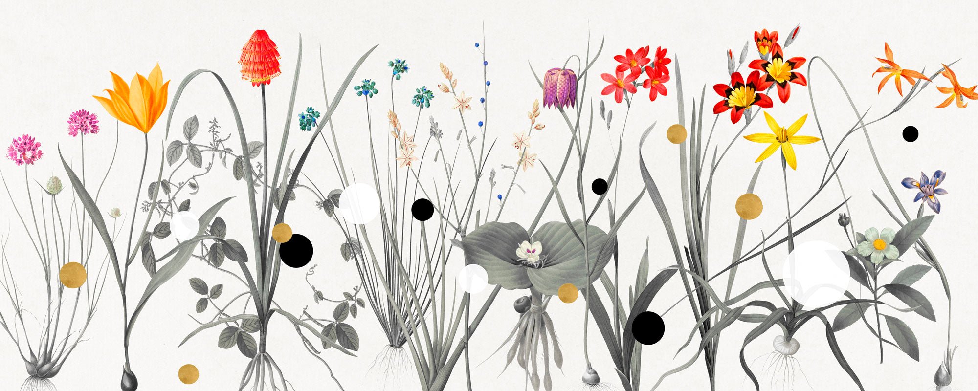
Some giclée prints feature hand-embellished details – for example, gold leaf, painting, or individual surface treatments. Here, the print moves away from reproduction and closer to a unique object. This can give the work a special intimacy, but it also requires that the finish is executed with precision.
Hand-embellishment is most interesting when it genuinely adds something to the image. Not as an effect, but as an extension of the work's idea, light, or tactility.
How to choose the right giclée print for your space
The most successful art purchase rarely starts with the format alone. It starts with the mood of the room.
In a bedroom or a quiet living space, works with soft tonality, tactile surfaces, and a certain stillness often work best. In a dining room, hallway, or hospitality environment, a more striking motif can handle both a larger scale and higher contrast. Giclée is suitable for both, as the technique can carry both the delicate and the dramatic.
The format, of course, matters greatly. Works that are too small can disappear, especially on large walls with high ceilings. Conversely, works that are too large can dominate a room that actually calls for more air. A good rule of thumb is to think in terms of balance rather than filling space. Art needs room around it.
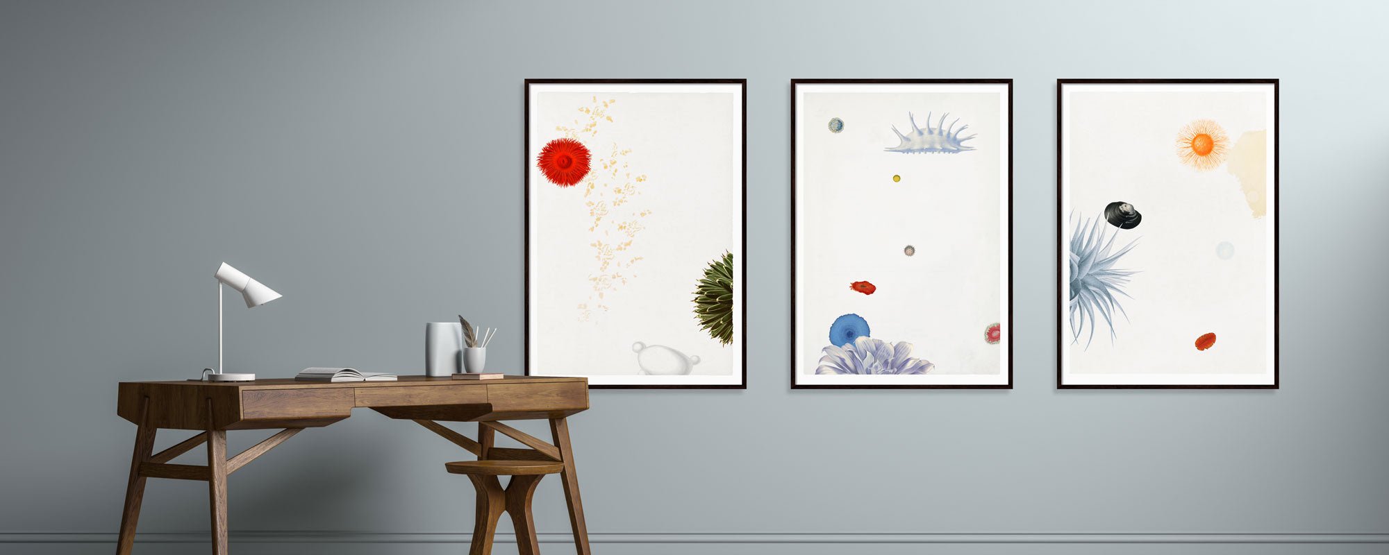
Frame choice also plays a role. An exclusive giclée print deserves framing that doesn't distract. A simple wooden frame, a refined dark tone, or a discreet floating frame can elevate the work, while an overly glossy or decorative frame can draw attention away from the motif.
What characterizes high fine art quality?
Fine art quality is an interplay of several decisions. The paper must be acid-free and developed for archival stability. The print must have precise color reproduction. The finished work must feel meticulously crafted - not just produced.
You can often see it in the details. Transitions in sky, skin, shadows, or muted backgrounds quickly reveal whether the print has finesse. If nuances clump together or lose depth, the quality is rarely at the level implied by the term "fine art."
Furthermore, there should be coherence between motif and material. A strong art print doesn't feel generic. It feels as if the motif has found its repose in that particular paper type, that particular scale, and that particular finish.
Price, value, and the "it depends" answer
Giclée prints cost more than standard prints, and that makes sense. You pay for better materials, more precise production, and often a more curated process. But price and value are not always identical.
An expensive print is not necessarily better if the resolution is mediocre, the paper is poorly chosen, or the edition is inflated. Conversely, a smaller work in a carefully selected edition can have far greater presence than a large print that merely fills the wall.
If you're buying for your home, value should be measured in daily joy, visual tranquility, and the durability of the material. If you're also thinking about collecting, artistic integrity, edition size, and signature become more central. One doesn't exclude the other, but your priority should be clear from the beginning.
For design-conscious buyers, this is often where the difference is most felt. A well-made giclée print doesn't just change the wall. It changes the atmosphere of the room. In an atelier-rooted universe like StoltzeStudio, this very connection between craftsmanship, materiality, and experience is a significant part of the work's strength.
How to care for your giclée art print
Even an archival print benefits from careful consideration. Avoid direct, harsh sunlight for long periods, especially in rooms with large south-facing windows. Consider using UV-protective glass if the artwork hangs in a bright spot. Humidity and large temperature fluctuations are also not ideal, especially for paper-based works.
When handling, clean hands or cotton gloves are a good idea if the print is not yet framed. The surface of fine art paper can be sensitive, and small marks are more visible than you might think.
A good art print is made to last, but it is still a sensory object. It deserves the same attention as other materials you wish to keep beautiful.
When you choose giclée, you're not just choosing a printing method. You're choosing a particular attitude towards art in everyday life – that quality should be seen, felt, and live quietly in the room, long after the first glance has faded.