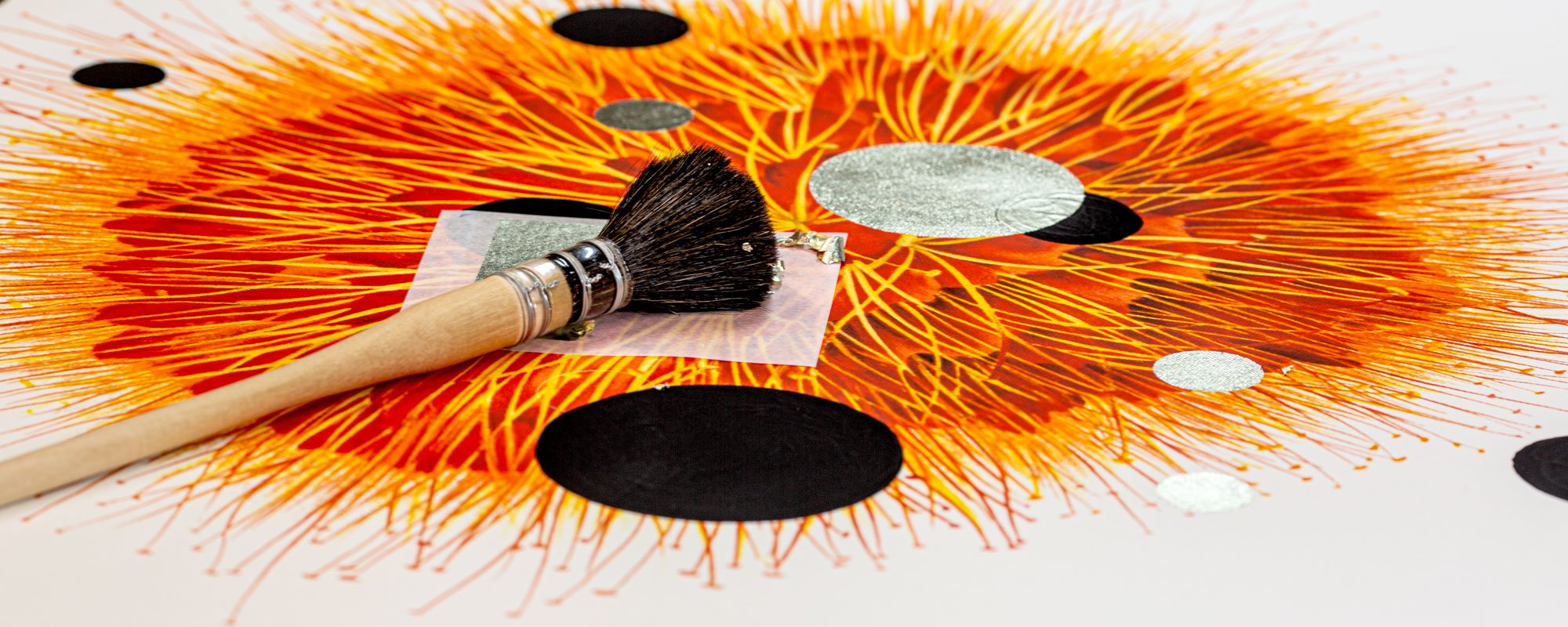
Example of art for a reception with character
A reception is read before a word is spoken. The lighting, materials, and the first wall in view tell the guest whether the company works with precision, imagination, or pure function. Therefore, an example of art for a reception is not merely a matter of filling an empty space. It's about creating an arrival with direction – a visual encounter that feels meticulously crafted without being insistent.
In a professional environment, art must be able to withstand multiple gazes. It needs to offer the returning employee something new to discover over time while simultaneously greeting the new guest with clarity in just a few seconds. This requires curation, scale, and materials with a clear physical presence.
Example of Art for a Reception: A Calm Composition with Depth
Imagine a reception with warm, matte walls, natural stone in the counter, and subdued lighting. Behind the receptionist hangs a large fine art print in a limited color palette: deep ultramarine blue tones, chalky beige, a break of black, and a hand-finished detail in 24-carat gold leaf. The motif is abstract, but not anonymous. It could be a collage where architectural fragments, a horizon line, and organic forms are assembled into a poetic composition.
The artwork does not become an illustration of the company's values. It becomes an independent artistic space that creates a contrast to the reception's function. The gold catches the daylight differently throughout the day, while the matte pigments bring calm to the surface. From a distance, the composition is clear. Up close, the paper structure, layers, and traces of the hand emerge.
It is often precisely this balance that works best in a reception: one piece with enough weight to define the space, but with enough openness for the guest to imbue it with their own meaning. A signed and numbered limited edition print can be a strong choice here, as it combines artistic distinctiveness with a format flexibility that an original work does not always offer.
Choose Art According to the Reception's Pace
A reception is rarely a quiet gallery. Phones ring, doors open, people pass, and conversations are interrupted. Art should therefore not compete with everything else that is happening. It should unify the space.
In a clinic, a law firm, or a headquarters with a formal expression, works with precise composition and few, saturated colors often work particularly well. They convey authority without making the atmosphere harsh. In a creative agency, a boutique hotel, or a company with a more cultural profile, a more layered collage or a motif with visual friction can create the right energy.
It also depends on how long the guest stays. In a reception where one waits five to ten minutes, the artwork may well have details that reward a slow gaze. In an entrance area with high traffic, a strong silhouette, a clear color gradient, or a striking materiality is more important. The first impression must be legible in motion.
One Large Work or a Curated Series?
A single work above the reception brings immediate calm. It is a natural choice when the architecture is already prominent, or when the receptionist is to be the clear center of the room. In such cases, choose a format that does not appear timid. A small frame above a wide counter easily disappears and makes even a good work look like an afterthought.
A series of two or three works, on the other hand, can create rhythm along a wall or guide the guest from the entrance to the waiting area. The series must share a common visual language — related colors, the same paper type, or a repeated form — but should not be too uniform. Art that resembles decorative copies of itself quickly loses its appeal.
In larger reception areas, a combination can be the most compelling solution: a main piece behind the counter and a smaller series in the seating area. This provides a coherent experience without all attention being gathered in one place.
Materials That Withstand Proximity
Reception art is viewed up close. Guests walk past it, employees pass it every day, and often the light falls obliquely across the surface. Therefore, the choice of material should be as deliberate as the motif.
A Giclée print on exclusive art paper has a special depth in the pigments and a tactile, almost velvety calm. It suits spaces where warmth, nuance, and a clear graphic expression are desired. Canvas can provide a more painterly presence and works well when the piece needs volume without too much reflection.
Hand-finished details further change the character of the work. Gold leaf, embossing, or small manual interventions make each copy subtly different. In a reception with many smooth surfaces — glass, steel, lacquered wood — precisely this irregularity can add human warmth. It is a discreet luxury, not an effect for effect's sake.
The frame should support the artwork rather than exhibiting its own significance. Light wood can soften a strict architecture, while black or dark-stained wood provides graphic weight. Anti-reflective glass is worth prioritizing in rooms with large windows or direct spotlights. A beautiful composition loses its power if the guest only sees ceiling lamps and passers-by in the glass.
Colors Must Work With the Space, Not Against It
The most obvious choice is not always the most refined. A reception in neutral tones does not necessarily need a neutral artwork. On the contrary, a deep blue, dusty red, or sharp green can create the concentration the room lacks. The question is whether the color serves a function.
An artwork can pick up an undertone from the floor, a metal detail from the lamp, or the warmth of the wood in the counter. But it should not color-coordinate so perfectly that it looks like inventory. Art must have a life of its own. When it is too obedient, it loses the tension that makes a reception memorable.
Also consider how the color changes in artificial light. White walls can become cool in the evening, and golden bulbs can make delicate pink hues heavy. Preferably view the artwork in relation to the actual lighting conditions of the room, not just on a screen or in a studio. This is especially crucial for works with metallic details and complex, dark pigments.
Avoid Art That Looks Like an Afterthought
The most common mistake is to buy art at the end of the interior design process. When furniture, acoustics, signage, and plants are already in place, art is reduced to an empty wall that needs to be quickly addressed. The result is often formats that are too small, generic motifs, or a color that screams louder than it should.
Another mistake is to turn the reception into a brand board. An artwork may well converse with the company's identity, but it doesn't need to repeat logo colors or visualize the company's industry. An architectural firm doesn't need to hang architecture. A financial advisor doesn't need to choose something that looks "safe." More interesting choices arise when art adds a quality not already present in the room: sensitivity, complexity, humor, or a touch of unpredictability.
Placement requires the same care. Hang the artwork so it can be seen from the entrance, but avoid letting it conflict with screens, information signs, or too many pendant lights. In most cases, the center of the artwork works best close to eye level for a standing guest. Behind a high reception desk, however, it may be necessary to raise it slightly so the motif has room to breathe.
Art as Part of Hospitality
Good reception art is not just representation. It offers a small respite in a space otherwise defined by appointments, waiting times, and practical messages. A well-chosen artwork can give visitors something to gaze upon and make their arrival more personal.
For StoltzeStudio, this quality begins in the creation of the artwork itself: pigment, paper, format, the numbered edition, and the subtle hand-finished difference that cannot be mass-produced. When such decisions are allowed to meet a reception space with the same uncompromising spirit, the art doesn't become wall decoration. It becomes a quiet, confident gesture that attention has been paid to every detail.
Therefore, don't choose the artwork that just "fits in." Choose the one that gives the reception its own pulse – and which continues to be worth looking at long after the first encounter is over.