Art Trends 2026 with Presence and Materiality
A room doesn't become more personal with more objects, but with the right pauses between them. Art trends for 2026 show a clear movement away from the quickly recognizable and towards works with materiality, visual calm, and a story that unfolds over time. Art should no longer merely match the sofa. It should give the room character, invite contemplation, and withstand a long gaze.
For the design-conscious buyer, the trend is less about following a specific style and more about choosing with precision. It's a shift that favors the curated wall over the cluttered wall, the limited edition over the anonymous print run, and craftsmanship over the slick surface.
Art Trends 2026: From Decoration to Anchoring
Recent years in interior design have been characterized by easily accessible color palettes, graphic statements, and art that could be quickly swapped out. In 2026, artworks will carry more weight. Not necessarily in format, but in presence. A picture can be quiet, complex, or a bit enigmatic. It doesn't need to explain itself in a few seconds.
This anchoring is seen in motifs with artistic tension: archival photography, manipulated landscapes, abstract surfaces, fragmented figures, and collages where different eras meet in the same composition. Imperfection becomes a quality. A visible cut edge, a shift in the print, or a layer that almost disappears into the paper gives the work a human touch.
This doesn't mean maximalism is the answer. Quite the opposite. Many homes and hospitality environments still seek clarity and airiness. The difference lies in minimalism becoming warmer and more sensory. A single work can carry an entire room when the motif, material, and placement are chosen with care.
The Material Becomes Part of the Motif
The texture of paper, the depth of canvas, and the interaction of light with a hand-finished surface are not secondary details in 2026. They are part of the work's language. Art buyers are increasingly interested in what they see up close: the fibers of exclusive art paper, the saturation of pigments, and the tactile contrast between matte and vibrant areas.
Giclée prints therefore continue to be relevant when production is uncompromising. The high level of detail makes it possible to preserve fine transitions, grain, and nuances that often get lost in simpler reproductions. But technique alone does not make the work exclusive. The crucial factor is the interplay between the chosen paper, color management, the artist's original, and the way the print is finished.
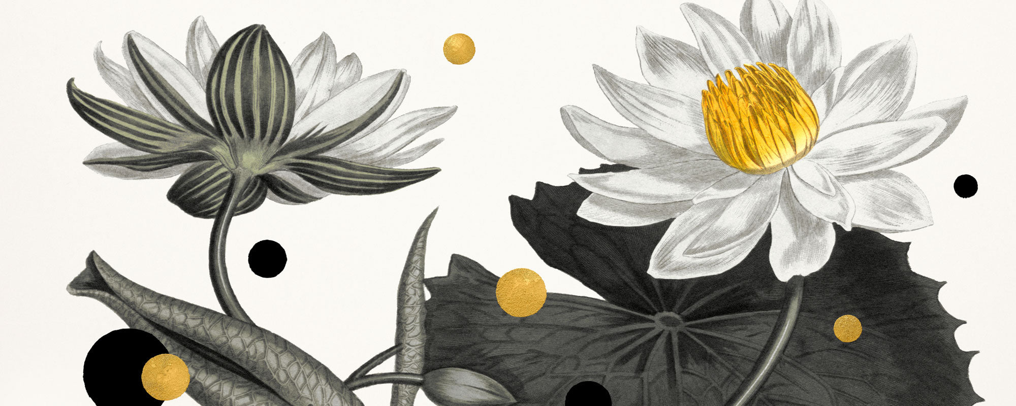
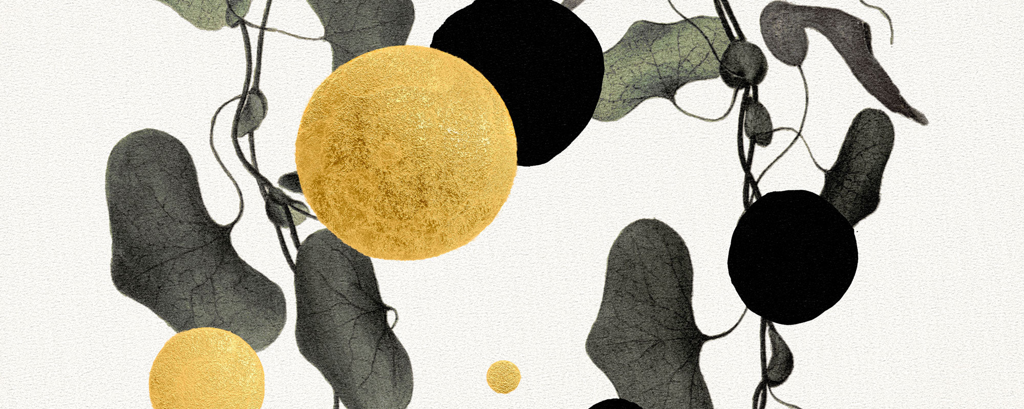
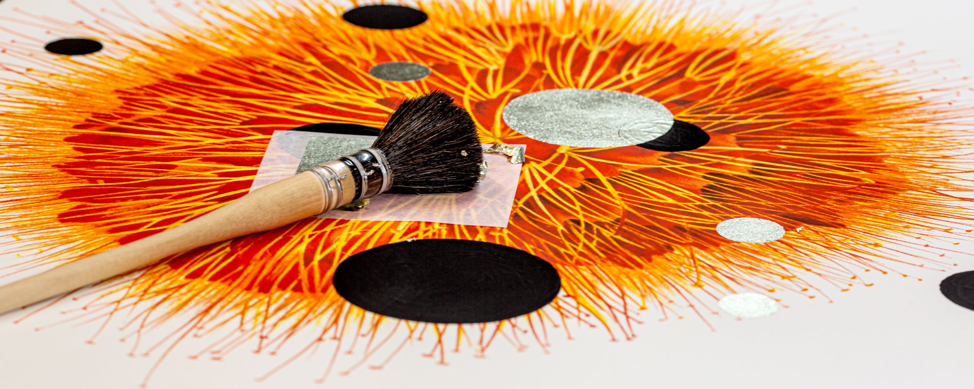
Especially hand-finished details gain a strong position. Gold leaf, discreet brushstrokes, or individual variations mean that a print is not just a copy, but an independent object. 24 karat gold leaf, for example, can add a poetic reflection that changes from morning to evening light. It works best as a precise accent, not as mere embellishment. When gold has a compositional function, it creates both depth and a quiet sense of luxury.
There is, however, a real trade-off. A lot of texture and many finish details require space around the artwork. In a room with heavy textiles, prominent tiles, and multiple patterns, a calm, matte composition might be more convincing. Materiality should be felt, not shouted.
Small Editions and Clear Origins
In a market with an almost infinite stream of images, edition logic becomes a kind of quality marker. Numbered and signed limited editions provide the collector with a clear connection to the work's origin, production, and finite life. It's not just about rarity, but about consciousness: that a work is created in a defined edition, with intent behind each version.
In 2026, more people will choose fewer works with more identity. This applies to both the experienced art buyer and those buying their first fine art print. A small edition can give a collection direction because it invites a deeper understanding of the work. Who is behind it? How was the image created? What process and what material keep it alive?
Original works will always have their own weight, especially when the traces of the artist's hand are visible. But fine art prints have a significant strength: they make it possible to collect works of high artistic and technical quality in various formats and price points. A well-produced print is not a compromise if it is intended as a work in its own right.
Colors with Depth, Not Quick Effects
Colors in 2026 are less concerned with being loud and more concerned with creating atmosphere. Dusty earth tones, chalky blues, deep wine reds, smoky grays, and warm creams form a refined foundation. At the same time, precise color accents will continue to play a role: an intense cobalt, a sharp green field, or a vivid red detail can give an otherwise subdued composition an electric vibrancy.
Perhaps the most interesting color trend is not a specific shade, but an approach. Color is used to build layers, shift moods, and create distance between the elements of the motif. A work can be calm without being neutral. It can be dramatic without dominating the entire room.
When choosing art for a wall, the wall color should not be the only reference. Consider the room's light throughout the day, wood types, metal surfaces, and textiles. In a north-facing room, warm pigments can add depth without making the overall impression heavy. In a bright room with large windows, a darker work can serve as a visual anchor. Color swatches are useful, but nothing replaces seeing a work in the light it will actually live in.
The Curated Wall Gets More Breathing Room
The gallery wall isn't disappearing, but its expression is changing. Instead of grouping many pictures in the same format and frame, more conscious juxtapositions are seen: a large main piece, a smaller graphic counterpoint, and perhaps an object or a shelf with books. This gives the eye rhythm and makes each individual work more legible.
Scale is crucial. A common mistake is choosing art that is too small for the wall, as it feels like the safe solution. A large work, on the other hand, can create calm by reducing the need for further decoration. It requires courage, but a generous format gives the motif space to breathe.
In smaller rooms, the opposite can be true. Here, two or three smaller works can create intimacy, especially if they share a color, a material, or a poetic tension without being identical. Good hanging doesn't feel like a catalog. It feels like a conversation.
The frames should support this conversation. Dark wood adds weight, oak creates warmth, while a narrow black or natural-colored frame can give graphic works a precise finish. Passe-partout provides air and museum-like calm, but doesn't suit all motifs. A collage with raw edges or a canvas work can stand stronger without the extra distance.
Art as a Sensory Sanctuary
Art trends for 2026 also point towards the home as a place for restoration. After years of constant visual input, the role of art is not necessarily to provide more stimulation, but to offer concentration. A work with depth can become a sensory sanctuary: something you return to between work, meals, and daily logistics.
It is precisely here that personal curation gains value. At StoltzeStudio, fine art prints, original works, and hand-finished editions meet in an approach where art is not treated as wall decoration, but as part of a lived space. The work must be able to stand in a home, a creative office, or a hospitable environment and still retain its own integrity.
Therefore, don't just choose based on what's current right now. Choose the image that continues to open itself up: a motif with an unexpected detail, a surface with life, or a color you can't quite let go of. The best art doesn't follow the season. It follows you, as your space and your gaze change.