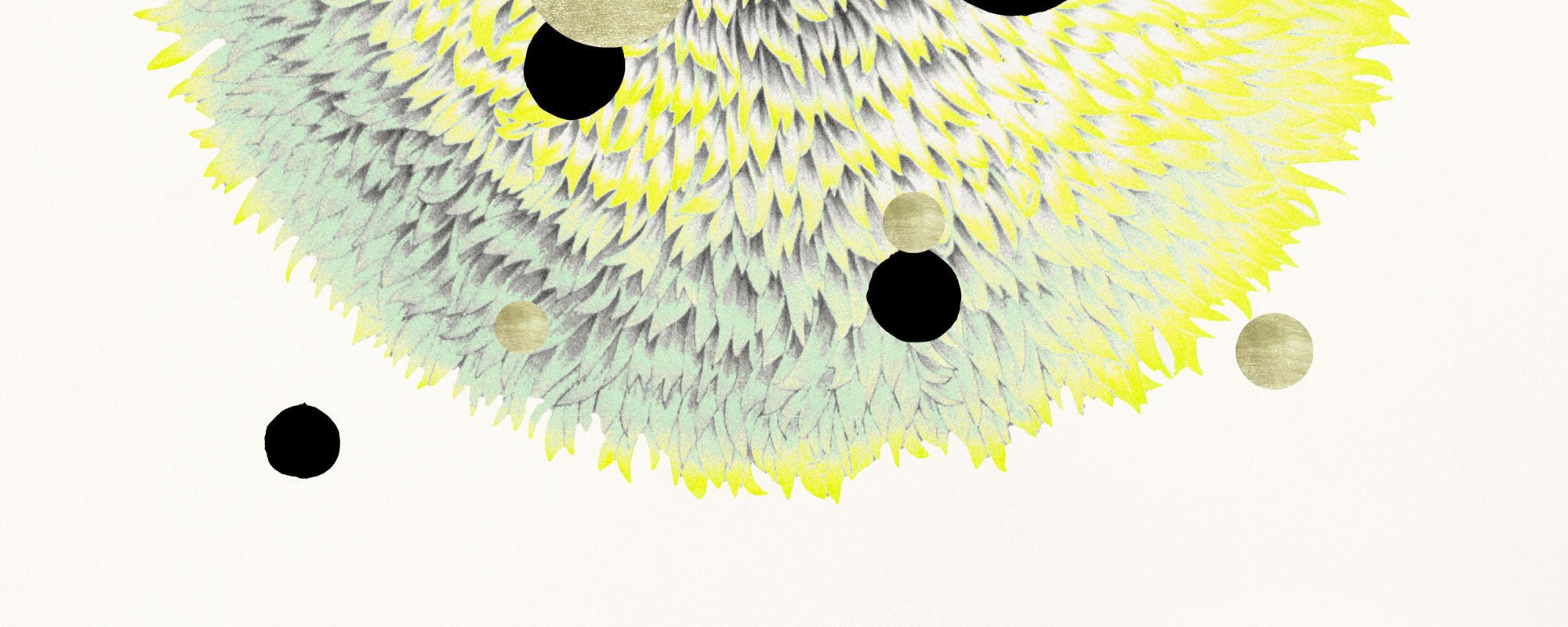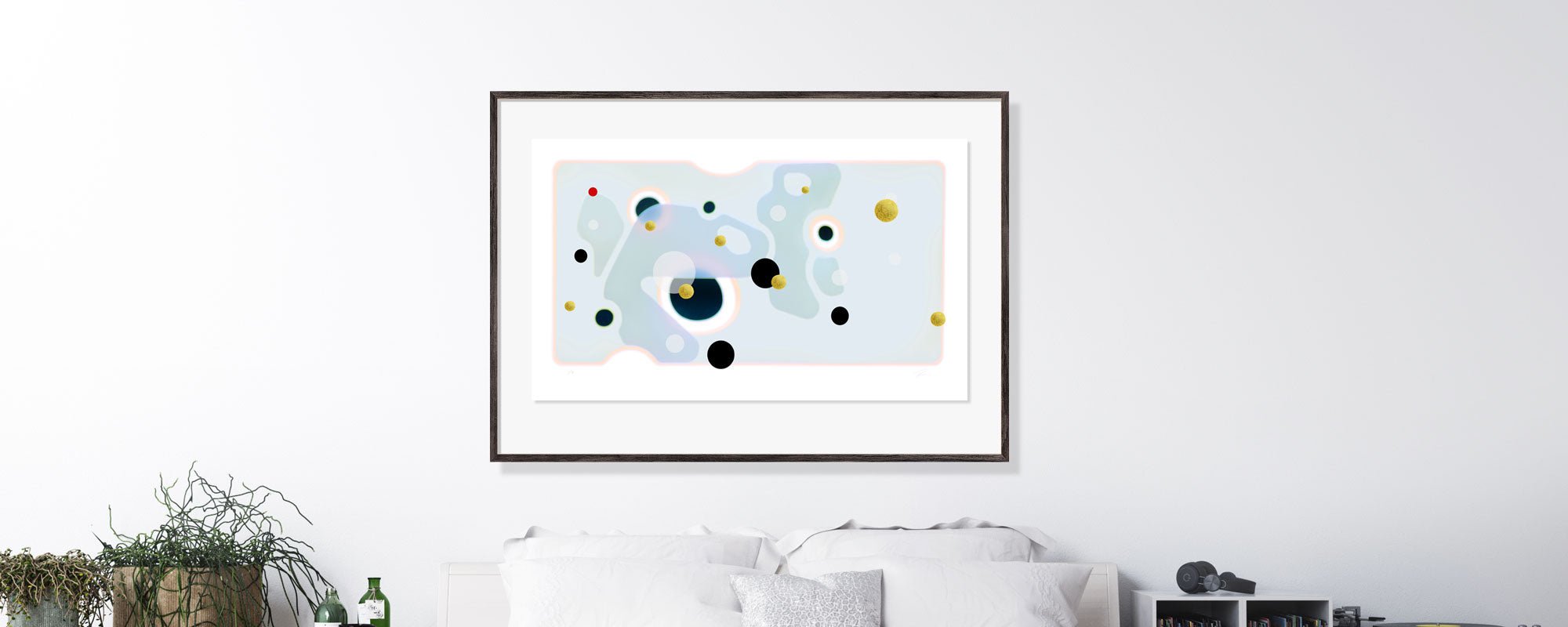
Giclée print quality - what makes the difference?
A print can look beautiful on a screen and still lose its gravitas when physically placed in a room. This is precisely why giclée print quality is not a technical detail in the margin, but the very difference between wall decoration and a work with presence. When colours, paper, depth, and surface work together, that special serenity arises, which only accomplished production can provide.
For design-conscious homes, studios, receptions, and hospitality environments, it is often the quiet qualities that determine the overall impression. Not the loud ones. But the precision one first perceives with the eye and then with the body. A giclée print should not just reproduce a motif. It should carry it.
What does giclée print quality actually mean?
Giclée is not just a fancy word for "good print". It denotes an advanced printing method where the motif is reproduced with pigment-based ink on art paper or canvas in high resolution and with great colour accuracy. In practice, giclée print quality is about how closely the finished work matches the character of the original – and how beautifully it ages.
The decisive factor is not one element alone. Quality arises from the interplay between the image file, printer technology, colour management, ink, material, and finish. If just one link falters, the whole quickly falls apart. You can have a strong motif, but if the paper is flat or the black tones drown, the work loses its tension. Conversely, a well-produced giclée print can highlight even subtle transitions, tactile details, and complex nuances with a conviction that ordinary poster prints rarely can match.
Why giclée feels different on the wall
The biggest difference is often felt in the depth. Pigment ink provides a more refined colour saturation than standard prints, especially in shadows, muted tones, and complex transitions. This matters in motifs where the atmosphere lies between the colours and not just in the contours of the motif itself.
A good giclée print also has a calmness in its surface. There isn't the harsh, almost plastic reflection often associated with cheaper prints. Instead, one gets a more sensory readability, where the light gently falls on the paper or canvas. This is precisely where an art print begins to behave like art and not as a mass-produced reproduction.
For buyers with an eye for interior design, this is a significant point. The artwork must be able to live with daylight, changing seasons, and different materials in the room – wood, stone, textile, glass. High quality makes the print more architectural. It stands out more clearly but appears less obtrusive.
The materials that elevate giclée print quality
The paper is not just a carrier. It is an active part of the artwork's expression. An exclusive cotton rag paper often provides a soft, matte surface with depth and tactility, which is particularly well suited for poetic compositions, photographic works, and image surfaces with fine tonal shifts. A smoother fine art paper, on the other hand, can provide sharper definition and more graphic precision.
Canvas has a different presence. It adds structure and a more painterly character, which can be ideal if the motif needs volume and a more gestural appearance. However, canvas always changes the reading of the artwork slightly. Small details are perceived differently on a woven surface than on smooth paper. Therefore, the right choice depends on the nature of the motif, not just taste.
The same applies to grammage and white tone. A heavier paper typically gives a more exclusive feel and better stability, but it must suit the visual temperament of the work. A cool paper tone can highlight clear contrasts, while a warmer tone provides more softness and intimacy. Quality is therefore not about "the most possible". It is about precise material matching.
Pigment ink, colour depth, and durability
When discussing giclée print quality, pigment ink quickly comes into play for good reason. Pigments settle differently on the material than dye-based inks and are known for their colour stability and long lifespan. This makes a real difference if the artwork is to last for many years without significant fading.
But durability is only half the story. The other half is tonality. Pigment inks can reproduce deep blacks, nuanced grey tones, and saturated colours with a complexity that is especially evident in the quiet parts of an image. This is where quality is revealed. Not in the most vibrant colours, but in the transition between them.
If a print is to function in a refined interior, this characteristic is crucial. An artwork can be striking, but it should not be shouting. Controlled colour depth is far more interesting than pure intensity.
Colour management is the invisible discipline
Many talk about paper and ink, fewer about colour management. Yet, this is often where the difference between a respectable print and an uncompromising print arises. Colour management is about the motif being translated correctly from screen to print, so that temperature, contrast, and nuance progression are preserved as accurately as possible.
Without precise calibration, skin tones can shift, dark areas can become blocked, and delicate mid-tones can disappear. This is particularly critical in art prints, where the mood of the image often lies in the subtle relationships between tones. A technically sharp print can therefore still be a poor print if the colour language is incorrect.
For collectors and interior-conscious buyers, this matters because the artwork must remain true to its intention. Not just resemble the original in broad strokes, but retain its rhythm, air, and balance.
Giclée print quality and finish
Finish is often the last thing one notices, but the first thing one feels. A clean edge, a precise margin, a well-placed signature, or hand-finished details can significantly elevate the experience. Especially in limited editions, finish is part of the artwork's integrity, not just a decorative addition.
This also applies if a print incorporates gold leaf, relief, deckled edges, or other tactile elements. Here, the production must be exceptionally precise. Otherwise, there is a risk that the handmade appears accidental rather than refined. The best finish never seems applied. It feels inevitable.
At a studio-rooted brand like StoltzeStudio, this uncompromising approach is central because the artwork must not only be beautiful at first glance but also withstand prolonged contemplation, where details and materiality continue to reveal themselves.
When is a giclée print worth the money?
The short answer is that it depends on the intention. If you want a temporary expression, often change motifs, or just need to fill a wall quickly, a standard print is often sufficient. But if the artwork is to have longevity, interact with the architecture, and carry a more curated atmosphere, the difference in quality is rarely cosmetic.
A giclée print is typically more expensive because materials, the printing process, and quality control are more costly. It is not a price surcharge for more luxurious wording. You pay for colour stability, precision, surface quality, and a much stronger physical experience. For many, that is precisely the point. You are not just buying an image, but a work that can withstand repeated attention.
How to assess quality before purchase
First, look at the level of detail. Are dark areas vibrant or merely black? Do light areas have nuance, or do they burn out? Then notice the material. A good fine art paper has character even before the motif is fully perceived.
Also inquire about the production, even if the information is presented discreetly. What type of ink was used? What paper or canvas? Is the work produced as an open edition or a limited edition? Is there a signature, numbering, or hand-finishing? This kind of information speaks to both value and intention.
Finally, trust your physical sensation if you see the artwork in person. Quality does not only communicate through specifications. It is felt in weight, surface, and the way the motif holds the light throughout the day.
A well-chosen giclée print doesn't necessarily make more fuss. It does something rarer. It creates an image you will never tire of looking at.