Art Trends in Premium Home Decor Now
There is a distinct difference between a home with expensive furniture and a home with genuine visual authority. The latter often emerges where art is allowed to define the rhythm of the space. This is precisely why art trends in premium home decor say more about how we live than about fleeting trends. They point to a shift towards works with materiality, substance, and a more personal form of luxury.
In the premium segment, art is no longer just about filling an empty wall. It functions as an architectural counterpoint, mood-setter, and conversation starter. This applies to classic city apartments, newly built villas, and hospitality environments where the decor needs to feel cohesive rather than merely decorated. The best art doesn't just make a room prettier; it makes it more precise.
Art trends in premium home decor right now
The most significant movement is away from the generic. For many years, large, neutral abstractions were the safe choice in exclusive homes. They still exist, but buyers with discerning taste are increasingly seeking works that have a clear hand, a tactile surface, and a curated intention. It should be calm, but not anonymous.
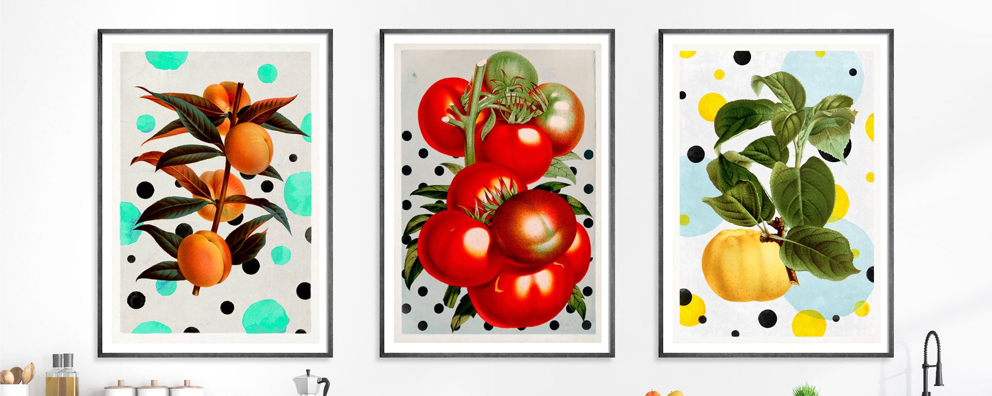
We also see a greater interest in works that balance art and design. Not understood as something neat and harmless, but as compositions that consciously work with color, archival material, collage, graphic tensions, and refined finishing details. A work should ideally be sophisticated in its expression while retaining a sense of human creation.
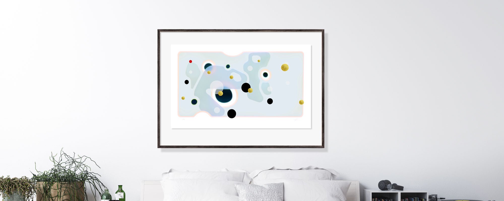
This is a crucial nuance. Premium today rarely means maximum polish. On the contrary, handcrafted elements, small irregularities, and visible process traces have gained higher status because they create presence. When the surface bears traces of gold leaf, tactile pigments, or a consciously worked structure, a kind of stillness arises that mass-produced wall art cannot replicate.
Materials with tactile depth
Material choice has become crucial. In premium home decor, a work is not only judged by its motif but by its entire physical presence. Exclusive paper with weight and a fine, matte surface provides a different tranquility than smooth standard prints. Canvas can add warmth and volume, especially in rooms with soft textiles, stone, wood, and subdued lighting.
The same applies to finishes. Hand-finished details add a discreet luxury because they only truly reveal themselves when light hits the work. This type of quality doesn't shout; it unfolds gradually. For design-conscious buyers, this is often where the difference is felt – in the slow experience of material, edge, scale, and surface.
However, there is an important caveat here. The more tactile and detailed a work is, the more it depends on placement and light. A sophisticated art print in a dark corner loses some of its effect, while a more graphic and high-contrast work can better carry the room in dimmer conditions. It's not a question of better or worse, but of precise curation.
Larger formats, but with more breathing room
Another clear art trend in premium home decor is the use of larger formats with fewer distractions around them. While many previously worked with dense gallery walls, more are now choosing one dominant piece or a minimalist diptych solution. The result feels calmer, more architectural, and often more exclusive.
Large works create scale and confidence in a room. But the size must be balanced with the proportions of the walls, ceiling height, and the visual weight of the furniture. A monumental piece above a low sofa can be powerful, while the same format in a narrow hallway can feel intrusive. Premium decor rarely relies on volume alone; it relies on balance.
This also means that negative space has become an active part of the decor. An empty wall is no longer a problem to be solved as quickly as possible. It can help give the artwork the necessary dignity. When a work is given space around it, the experience becomes sharper and more sensory.
Curated series instead of random purchases
A mature home often displays a collection, not just individual impulse buys. Therefore, series, limited editions, and works with a clear mutual kinship play an increasingly important role. This is especially true for buyers who desire a cohesive aesthetic across the living room, bedroom, home office, or reception area.
The advantage of a series is not just coherence. It also allows for variation within a clear aesthetic framework. A home can accommodate multiple moods if they are related in materiality, toning, or visual language. Here, numbering, signature, and the character of the edition become more than technical details; they reinforce the feeling of exclusivity.
For some, original works will be the natural choice. For others, curated fine art prints offer greater flexibility, especially if one desires several works of the same quality and tone. One is not automatically finer than the other. It depends on budget, room type, and the relationship one wishes to have with the work. In a home with high aesthetic discipline, an exquisite Giclée print on exclusive paper can be more compelling than a less successful original work.
Colors become more tactile and less loud
The color palette in premium interiors is moving towards saturated, earthy, and nuanced tones. We see fewer loud statements and more shades that feel mineral, smoky, or chalky. Sand, espresso, ink blue, olive, burnt umber, dusty burgundy, and warm grays create a depth that works particularly well with natural stone, oak, walnut, brushed metal, and textured fabrics.
This doesn't mean that strong colors have disappeared. But they are used more precisely. A deep saffron, an oxidized blue, or a field of dark carmine can be the element that gives the room nerve. The difference is that color now less often stands alone as an effect. It is part of a more composed whole.
In art, the same applies. The works that linger visually are often those where the color is not just seen, but felt. It must have weight. It must be able to withstand different lighting conditions throughout the day. A premium home lives with the light, and the art should do the same.
The personal replaces the performative
Many design-conscious buyers are tired of art that primarily signals someone has followed a trend. Instead, a new form of discreet individuality is emerging. Works can be poetic, complex, or a bit enigmatic, as long as they feel authentic in their intention.
Here, collage, archival motifs, and visual transformations become particularly interesting. They can add depth without being illustrative. They can be both cultivated and open. And they fit well with interior design where one desires layers rather than clear messages.
However, a personal choice requires courage. A work with character often divides opinions more than a neutral motif. In return, it rewards the owner over time. The longer one lives with it, the more details emerge. This is a quality that premium buyers are increasingly seeking – not immediate consensus, but long-lasting resonance.
How to choose art for a premium home
The best place to start is not with the color of the sofa, but with the temperament of the room. Is it a place for tranquility, concentration, conversation, or arrival? Art should reinforce the underlying mood, not fight it. A bedroom often calls for lower contrast and a quieter composition, while a dining room can carry something darker, more dramatic, or graphically precise.
Next comes scale and materiality. A room with many hard surfaces benefits from works with softer textures or warmer tonality. Conversely, a room with heavy curtains, carpets, and upholstered furniture can be elevated by a sharper composition with a graphic edge. Premium decor rarely relies solely on volume; it relies on tension under control.
Frames also deserve attention. A poor framing can undermine even a strong work. In exclusive interiors, one often sees narrow, carefully coordinated frames that support the character of the work without becoming decorative for their own sake. Glass choice, spacers, and passe-partout are more significant than many realize.
For those who desire a more studio-rooted approach, it can make sense to seek out places where curation, material quality, and the physical art experience are considered a unified discipline. StoltzeStudio works precisely in this field, where the finish, edition, and sensory presence of the work are just as important as the motif itself.
The most compelling home is rarely the most finished. It is the home where every work feels thoughtfully chosen, and where beauty does not stand alone, but is countered by substance. If art is allowed to set the tone, the decor becomes less about impressing and far more interesting to live in.