Guide to collage-based art posters in the home
A collage-based art poster can transform a room without making the wall too loud. Where a photograph often captures a single gaze, and a graphic poster relies on clarity, collage works with shifts: an archival excerpt, a hand-drawn surface, a fragment of color, an unexpected texture. This guide to collage-based art posters is about choosing pieces that don't just fill an empty space, but add rhythm, depth, and a more personal visual language to the home.
Collage is particularly well-suited for design-conscious interiors because it can be both precise and open. It gives the eye something to return to, but doesn't require the rest of the room to become a backdrop for the art. It's precisely the balance between the complexity of the composition and the tranquility of the space that determines whether the artwork feels relevant year after year.
What defines a strong collage poster?
A successful collage poster is never merely a collection of elements. Its quality lies in the editing: what the artist has chosen to omit, where shapes are allowed to meet, and how empty spaces create pauses between motifs. The best collage possesses an inner discipline, even when it appears spontaneous.
Look for the tension between materials and visual worlds. A botanical find might meet a monochrome color field. An antique figure might stand against a sharp, contemporary geometric form. Torn paper edges, grainy photographic details, and transparent layers add a tactile sensation, even when the artwork is printed as a fine art print.
Colors are often the quickest way into the selection, but they shouldn't stand alone. A poster in dusty blues, warm earth tones, or deep burgundy can be beautiful, but also ask what the composition does. Does it have a clear focal point? Does it create movement on the wall? Or does the visual information become so dense that it competes with the room's other materials? This depends, among other things, on whether the piece is to hang in a quiet bedroom, a lively hallway, or above a long dining table.
Guide to collage-based art posters by room
Don't start with the wall dimensions alone. Start with the room's tempo. In a bedroom, collage art often works best when it has space around it and a limited color palette. Opt for organic shapes, subdued contrasts, and motifs that invite slow contemplation. An overly energetic collage can make the room more active than desired at the end of the day.
In the living room, the artwork can carry more complexity. Here, a larger motif with architectural fragments, graphic surfaces, or figurative traces can serve as a focal point. If the sofa is simple and the textiles are calm, the art can take up more space. If the room is already characterized by patterns, colorful rugs, and many books, a collage with a clear background or a more reduced expression will create a better counterpoint.
The hallway often tolerates the unexpected. It's a transitional space where a sharp crop, a striking contrast, or a smaller series of collage posters can set the tone immediately. In the home office, you can advantageously choose a piece with structure rather than noise. The collage should stimulate the eye without stealing concentration.
In hospitality environments, creative offices, and reception areas, scale becomes particularly important. A single large piece lends authority and tranquility, while a carefully composed gallery wall makes the experience more editorial. Here, each motif should have a role. Don't choose four pieces because there's space for four frames, but because their colors, periods, or forms engage in a conversation.
The format shapes the experience
A collage with many small details only truly comes to life when the format allows it space. In a small print, a finely constructed composition can lose its layers, while a larger format allows the paper's textures, contrasts, and crops to emerge. A format of 50 x 70 cm, approximately 20 x 28 inches, often works as a compelling solo piece above a smaller console or in a narrow wall zone.
Above the sofa or dining table, a larger format can create the necessary gravitas. As a rule of thumb, the art should occupy about two-thirds of the furniture's width, but this rule is not sacred. A narrow, vertical collage can be more elegant than a wide piece if the ceiling height is substantial or if the room needs an upward movement.
Let the wall's empty space also be part of the composition. A poster squeezed between a lamp, a doorframe, and a piece of furniture loses its precision. Collage art already works with relationships between elements. It deserves a placement where its own pauses can be felt.
Paper, pigment, and finish are not details
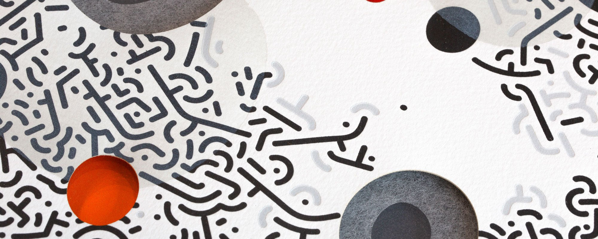
You choose the motif with your eye. You choose the material with your hand and with time. A cheap, glossy poster can flatten even a sophisticated collage, because high gloss often highlights reflections rather than the work's nuances. A matte or lightly textured art paper, on the other hand, gives colors and black surfaces a calmer depth.
Giclée print is a relevant choice when color precision, fine transitions, and durability matter. The technique reproduces details with great sensitivity, especially in collages with visible paper fibers, transparent layers, and archival material. Pigment-based inks on exclusive paper can retain the character of the artwork much better than a standard printed poster, provided it is not exposed to harsh, direct sunlight.
Some works are further enhanced by hand finishing. A discreet detail in 24-karat gold leaf, for instance, can catch the daylight in a way that printing ink cannot. It's not an effect that needs to dominate. When applied with a sure hand, it becomes a subtle shift in the work – something you discover up close.
For limited editions, you should consider whether numbering and signature matter to you. It doesn't automatically make the work better, but it emphasizes a closer connection to the artist's process and a more limited production. For collectors and those who desire a home with fewer, more conscious choices, this edition logic can be a significant quality.
Framing: Give collage art a clear edge
The frame should not compete with the collage. It should define the transition between the artwork and the room. A narrow frame in natural wood adds warmth and pairs well with works featuring organic shapes, paper textures, and earthy tones. Black wood or aluminum creates a more graphic, urban look and works particularly well around collages with clear contrasts.
A passe-partout can be beautiful, but not always necessary. It gives the artwork breathing room and a more gallery-like presence, especially for smaller formats. Conversely, a collage with strong edges or a deliberately uneven composition can appear more direct and modern when the motif is closer to the edge of the frame.
Choose glass with care. Standard glass is fine in many rooms, but anti-reflective glass can be a valuable upgrade in bright homes with large windows. It costs more, but also makes the artwork more present at all times of the day. UV protection is particularly relevant if the wall receives a lot of sun.
How to build a gallery wall with collage art
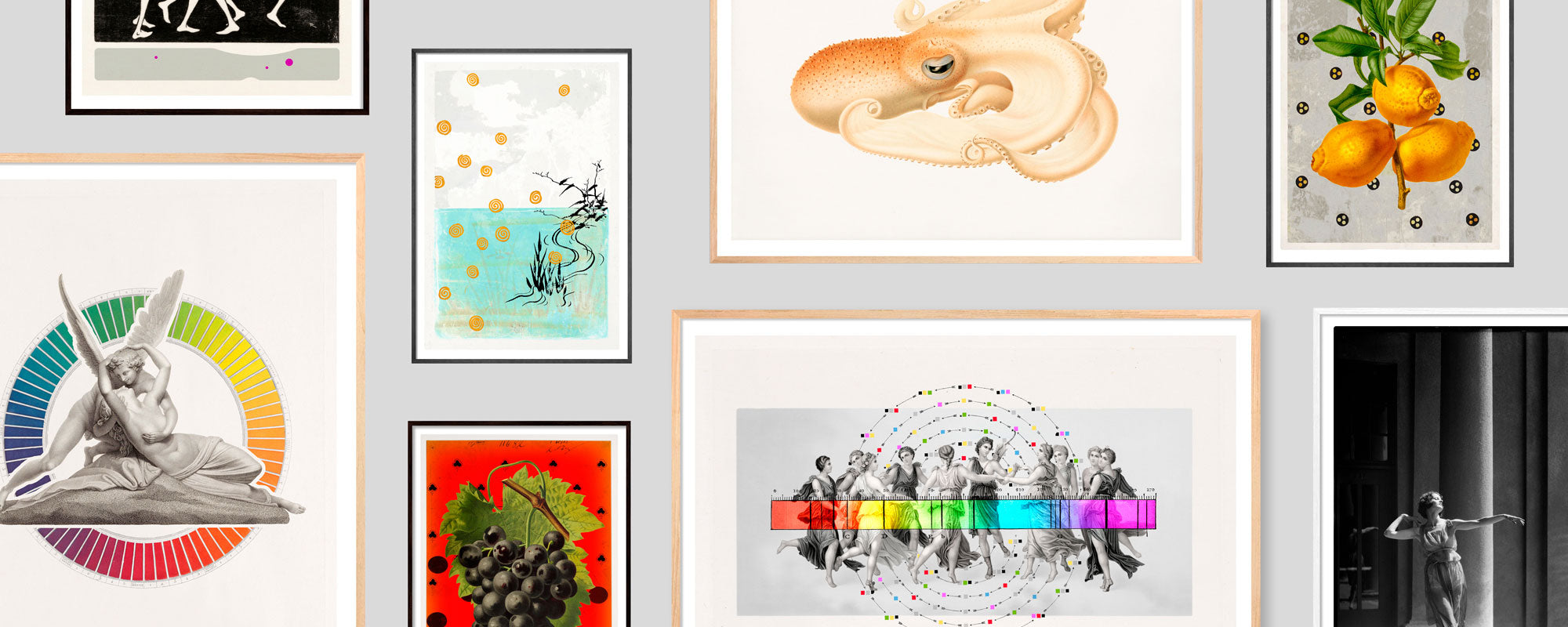
A gallery wall becomes strong when it has a common idea, not necessarily when the frames are identical. Collage posters can be connected through a repeated color, a related period feel, or a common contrast between the figurative and the abstract. A single piece may well be the most striking, but the others should support the whole rather than merely echoing its energy.
First, lay the works on the floor and move them around before hanging anything. Start with the largest or most visually heavy motif and build out from there. Keep the distance between the frames consistent – often around 5 to 8 cm – so that the wall is perceived as one cohesive composition. If the works have very different sizes, an invisible centerline can create order without making the arrangement rigid.
A home doesn't become more personal by displaying everything at once. Feel free to give a collage space to stand alone, especially if it contains many traces and layers. The quiet wall around the artwork isn't empty. It's part of the experience.
At StoltzeStudio, collage is understood as visual transformation: found elements, color, form, and craftsmanship are brought together into poetic compositions that can live long in a space. It's an approach that makes the art poster more than decoration – it becomes an object with its own gravitas.
Therefore, don't just choose the collage that matches your sofa's color this season. Choose the one that continues to open up as the morning light changes its surface, as the room gets new furniture, and as you discover a detail you hadn't noticed before.