Seven ways to style an art gallery wall
A gallery wall is not a collection of items that happen to hang next to each other. It is a composition where format, color, paper, frame, and spacing are allowed to interact. The phrase "seven ways to style a gallery wall" points to a simple desire: to make the wall feel personal without becoming random. It doesn't require a large room or an endless collection. It requires an eye for rhythm.
The strongest gallery wall gives the eye something to wander through, but also a place to rest. Therefore, don't start with the nail, but with the artworks. Lay them on the floor, feel their weight, and look for connections: a repeated shade, a related motif, a common graphic energy, or the contrast between the quiet and the striking.
Seven ways to style a gallery wall
1. Create calm with a precise grid
A grid is the most disciplined solution - and precisely for that reason, it can be particularly effective. Choose artworks in the same format, preferably with identical frames, and place them with exactly the same spacing. The result is architectural, calm, and very convincing above a sofa, in an entrance hall, or in an office where art can add character without visual noise.
A grid doesn't have to consist of identical motifs. On the contrary, different collage works, photographic details, or graphic compositions can gain greater tension when the hanging keeps them together. Uniformity in frame and passe-partout creates the structure, while the art is allowed to vary within it.
2. Build a salon wall with a clear anchor
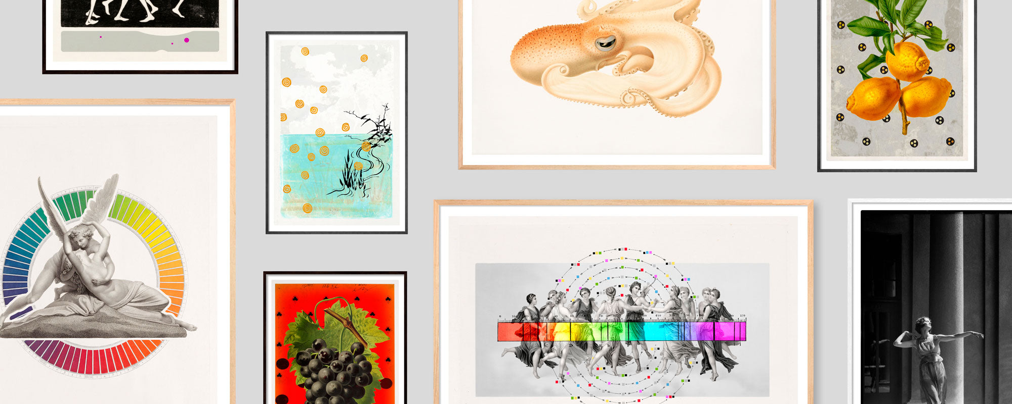
The organic salon hanging seems immediate, but the best versions are rarely improvised. Start with one anchor: a larger work with a distinct presence. This could be a canvas, a large fine art print, or a motif with a dark color field. Then build outwards with smaller formats.
Keep the outermost works within an imaginary frame, so the wall has a unified silhouette. Feel free to vary the frames, but let at least one element be repeated - for example, black wood, brushed oak, or warm brass tones. It is the contrast between freedom and the underlying order that gives the salon wall its refined lightness.
3. Let one color lead the conversation
Color is the quickest way to cohesion, even when the motifs are very different. Choose a shade that already exists in the room: the deep blue of a velvet chair, the dusty green tone of a wall color, or the warm ochre of a rug. Let it reappear in several works, without necessarily dominating every single one.
A gallery wall in related tones can feel like a sensory breathing space, especially in rooms with many materials. If you want more excitement, use a single contrast as a concentrated point - a red motif among muted earth tones or a gold leaf detail in an otherwise cool composition. The contrast must be deliberate. A small, golden reflection can tie an entire wall together as light moves through the room.
4. Mix formats, but repeat proportions
Large and small works create a more lively rhythm than a series of identical sizes. The challenge is that mixed formats can quickly feel scattered. The solution is to repeat proportions. For example, let a large vertical work respond in two smaller vertical formats, or place a wide, horizontal print as a counterpoint to a group of narrow works.
Think in terms of weight rather than centimeters. A dark motif can visually occupy more space than a light work of the same size, and a powerful frame adds more weight than a very narrow profile. Lay the composition on the floor first, and take a step back. If one area feels heavy, it often doesn't necessarily mean more pictures are needed, but rather a work with the right visual counterweight.
5. Give materials a role
Art is not just the motif. The surface of the paper, the depth of the print, the tactility of the frames, and any hand-finished details are all part of the experience. A Giclée print on exclusive art paper has a different intimacy than a canvas, and precisely that difference can make a gallery wall more interesting.
Feel free to combine a matte, graphic print with a work where 24-karat gold leaf catches the light, or with an original where brushstrokes and material can be read up close. But use material contrasts thoughtfully. If everything shines, shouts, or has strong texture, the wall loses its pause. One special work often gains greater power when surrounded by quieter surfaces.
6. Curate art as a narrative, not a theme
A gallery wall doesn't have to be built around a literal subject like the sea, flowers, or cities. Instead, it can be connected by a mood: melancholic, optimistic, dreamy, or sharp. An archival motif, an abstract color field, and a poetic figure can coexist if they share the same emotional temperature.
This is often the most personal way to curate. Choose works you keep returning to, rather than works that merely match the wall color. Colors can change. Art with presence often gets to stay. A limited edition with numbering and signature can hold a special place here - not because it should stand alone, but because its history adds another layer of depth to the wall.
7. Use air as an active element
One of the most common mistakes with a gallery wall is filling all the gaps. Air is not an absence of decor. It is part of the composition. Narrow spacing creates intensity and makes a group into one cohesive surface. Larger spacing gives individual works more autonomy and can look beautiful in rooms where architecture, furniture, and art already have strong lines.
As a starting point, you can work with uniform spacing between the works, but the rules can be broken for a particularly large format or a lower-placed work. Don't hang out of habit too high. Art should meet the body and the gaze in the room. Above a sofa or sideboard, the overall arrangement should be closer to the furniture, so that the wall and interior feel like one scene rather than two separate layers.
When the gallery wall needs to find its own form
There is no correct mix of frames, sizes, and motifs. A strict grid can be exactly right in a colorful apartment, while an organic wall can add warmth to a minimalist space. It depends on the architecture, the light, and not least, how much art should fill everyday life.
Experiment slowly. Live with the works, move a single print, and notice what changes. The most convincing gallery wall doesn't feel decorated. It feels like a space that has gradually found its own language.