Best wall art for minimalist decor
Minimalism only becomes interesting when it doesn’t feel empty. Therefore, the best wall art for minimalist decor should not merely fill an empty space. It should create tension in the silence, unify the room's materials, and provide a resting place for the eye. A well-chosen piece can do more for a living room than an extra lamp, a new vase, or another cushion, because it adds a personal touch without disturbing the overall harmony.
In a home with few, deliberate choices, each element becomes more prominent. Wall art gets room to stand alone, and precisely for this reason, higher demands are placed on the quality of the motif, the tactility of the paper, the proportions of the format, and the finish of the frame. The goal is not necessarily a wall that looks minimalist. The goal is a room that feels clear, sensory, and precise.
Choose art that creates calm without being anonymous
Minimalist decor is often associated with neutral tones, clean lines, and open space around furniture. This doesn't mean that the art has to be colorless or cautious. On the contrary, a single piece with deep blue, burnt sienna, dusty green, or a graphic black field can become the room's most compelling focal point.
The crucial factor is composition. Look for motifs with a clear rhythm, a few strong forms, or a poetic balance between emptiness and detail. An abstract collage, an archive-based photographic motif, or a figurative composition with a reduced color palette can work beautifully because the piece has its own visual discipline. It tells something without explaining everything.
There's a difference between calm and neutrality. A motif with layers, texture, and a slight shift in expression can add warmth to an otherwise austere room. A piece that is too decorative, however, risks being perceived as mere filler. When the rest of the decor is simple, the art should ideally have an idea behind it.
Let the artwork lead the conversation
A good guideline is to choose art that you can continue to discover something new in even after several years. This could be an unexpected color transition, a visible paper texture, a cropped motif, or a hand-applied detail that changes with the daylight. This type of artwork brings presence to a minimalist home where much else is intentionally understated.
If you choose between an anonymous, pleasing print and an artwork with a distinct artistic signature, the latter will often enhance the room better. Not because everything has to be loud, but because authenticity can be felt. A limited edition, a signed print, or a hand-finished surface creates a connection between the studio, material, and home.
The best wall art for minimalist decor depends on the wall
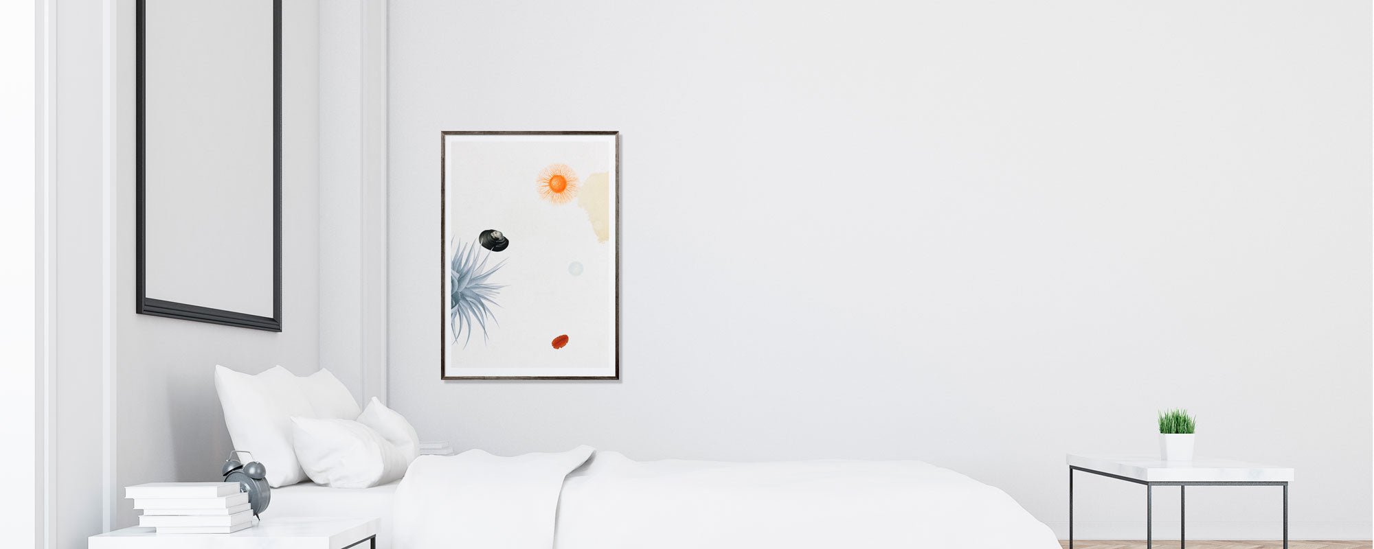
The most common mistake is choosing the format in isolation from the room. A beautiful motif can lose its power if it hangs too small above a large sofa or too heavily in a narrow hallway. In minimalist rooms, proportions are visible, so give them the same attention as the art choice.
Above a sofa or sideboard of considerable width, one generous piece can create a calm, gallery-like weight. Choose a format that is about two-thirds the width of the furniture. It doesn't have to be mathematically perfect, but the artwork needs enough physical presence to unite the furniture and the wall in one composition.
On a smaller wall, a vertical piece can extend the room and create direction. In a hallway, next to a bookshelf, or between two windows, a slender format can be more elegant than a wide motif that feels too imposing. Here, the white wall is not wasted space, but an active part of the hanging.
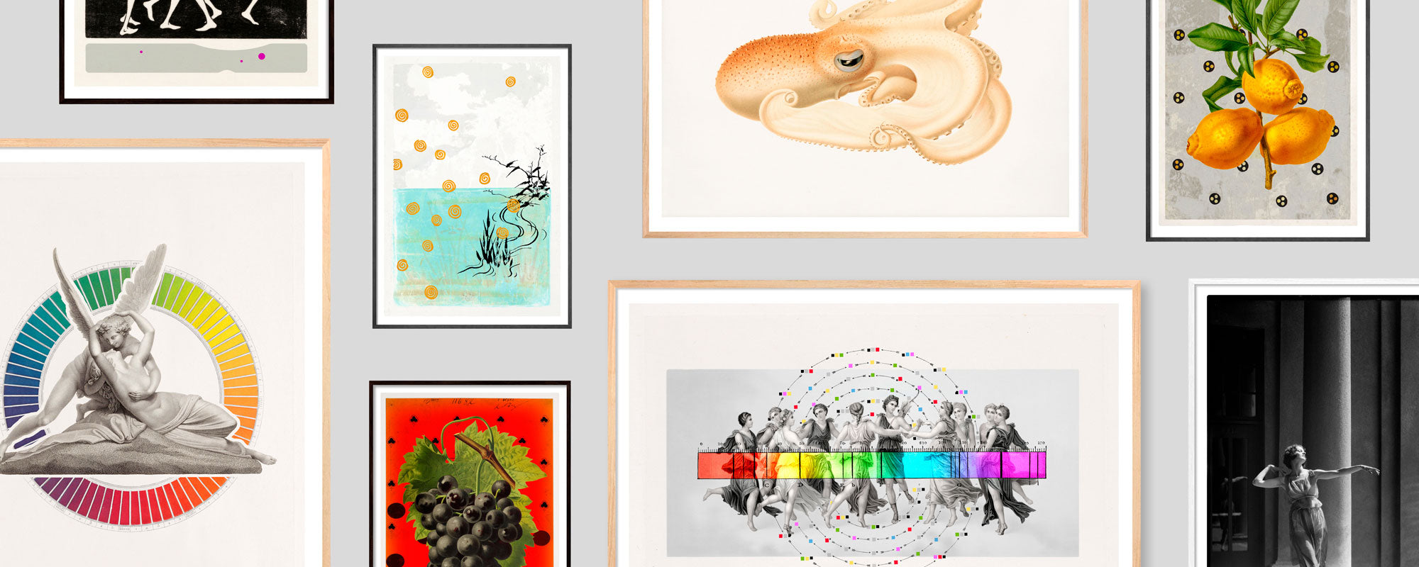
A gallery wall can also work in a minimalist interior, but it requires careful editing. Stick to a common color temperature, related frames, or clear spacing between the pieces. Three pieces with a shared tone can create rhythm. Twelve different motifs, formats, and frames will rarely feel minimalist, no matter how beautiful they are individually.
Material is part of the experience
Minimalism is often a material-conscious discipline. Wood, stone, wool, brushed metal, and ceramics are chosen not only for their function but for their surface and tactile quality. The same attention should apply to art.
A fine art Giclée print on exclusive art paper has a different depth than a standard print. The paper's fibers and matte surface allow the motif to appear with calm, especially in rooms with soft daylight. This naturally suits interiors where linen, limewashed walls, and oak already create a subdued materiality.
Canvas can be the right choice if the room needs more texture. The subtle structure gives the image surface a physical presence and can soften a room with hard, architectural lines. In a very compact home, however, paper behind glass can feel lighter and more precise. The choice depends on whether you desire a sharp graphic surface or a more painterly, sensory effect.
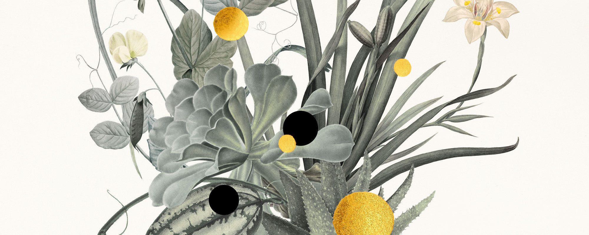
Hand-finished elements further alter the experience. A detail in 24-carat gold leaf is not just a luxurious mark. It catches the light differently throughout the day and adds movement to an otherwise subdued motif. Use it judiciously: In a room with many shiny surfaces, gold can become too insistent, while in a warm, matte palette, it can function as a quiet glow.
Framing should support, not compete
The frame is not an afterthought accessory. It is the transition between artwork and architecture, and in minimalist rooms, it makes the difference between a print on the wall and a complete art experience.
A narrow frame in natural wood highlights warmth and craftsmanship. Black wood or aluminum provides a more graphic, urban precision, especially around monochrome or high-contrast motifs. A light frame can be nice on a dark wall, but on a completely white wall, it risks dissolving the artwork if the motif is also very light.
A passepartout provides breathing room and can make a smaller piece appear more significant. It is particularly elegant with photographic motifs, collages, and paper artworks with fine details. Conversely, a large, edge-to-edge print in a simple frame can be stronger when the artwork needs immediacy and visual weight.
Also consider the glass. Non-reflective glass is a sophisticated solution in rooms with large windows, as it protects the artwork without making the light part of the motif. Standard glass may be sufficient in more subdued lighting, but it should never be a casual decision if the surface of the art is central.
Colors should be few, but purposeful
A neutral home doesn't need neutral art. Often, the room becomes more refined when the wall art introduces one well-chosen color that is subtly repeated elsewhere: in a chair, a book spine, a textile, or a ceramic object. The repetition should be hinted at, not overly obvious.
In cool interiors with gray, chrome, and black, earthy tones, deep reds, or golden details can add humanity. In warm rooms with wood and beige textiles, blue, black, or saturated green can create the necessary counterbalance. It's not about matching, but about creating a relationship between the room's temperature and the artwork's energy.
If in doubt, choose a motif with a limited palette and clear tonal depth rather than one with many competing colors. Minimalist decor tolerates contrast, but rarely visual confusion.
Give the art the space it deserves
An artwork should hang at a height where it can be viewed naturally. As a general rule, it works well when the center of the image is around eye level, but a sofa, a tall sideboard, or a low lounge area might call for slight adjustments. The most important thing is that the art feels anchored in the furnishings rather than floating haphazardly above them.
Also, let the wall space around the artwork be quiet. Minimalism loses its strength when every surface demands attention. A single piece above a sculptural chair or near a table with few objects can create more atmosphere than several small decorations grouped together.
At StoltzeStudio, curated fine art prints, limited editions, and hand-finished details come together in an expression that truly understands this balance between the poetry of the image and the tranquility of the room. This is art created to be lived with, not just glimpsed quickly.
Therefore, don't choose wall art as a final solution for an empty wall. Choose it as the beginning of the mood you want to come home to. When motif, material, and format are harmonized, minimalism doesn't become less personal. It becomes more precise.