What is a giclée print?
You often see it mentioned in connection with fine art, limited editions, and curated walls – but what exactly is a giclée print, and why does the term matter? For the design-conscious buyer, the answer is not technical embellishment. It's about how a piece feels in the room, how the colors stand out, and whether the print has the tranquility, depth, and materiality that mass-produced reproductions rarely achieve.
At its core, a giclée print is a high-resolution art print produced with pigment-based inks on a professional inkjet printer, typically on archival paper or high-quality canvas. But this brief definition isn't quite enough. The crucial aspect lies in the interplay between the file, ink, printer, color management, and substrate. When all stages are executed with uncompromising precision, you get a print with significant color depth, fine tonal transitions, and a surface that retains the work's character with much greater accuracy than a standard print.
What is a giclée print in practice?
The word giclée comes from French and refers to the way ink is sprayed in microscopic droplets. In practice, the term is now used for fine art prints where the reproduction quality is significantly higher than in ordinary poster production. Therefore, it's not just a clever label. It's a production method with clear quality requirements.
A true giclée print is usually printed with pigment ink rather than dye ink. Pigments provide a more lightfast and stable reproduction over time, which is crucial if a work is to retain its expression for years rather than seasons. Simultaneously, printing often occurs on acid-free materials developed for art prints, where the paper's texture, weight, and tone contribute to the overall experience.
This is also why two prints of the same motif can be experienced very differently. One version may appear flat and harsh in color, while the other has an almost velvety depth. The difference is rarely solely in the motif. It lies in the materials and the professional discipline behind it.
Why giclée is chosen in fine art
When artists, studios, and collectors choose giclée, it's not just due to durability. It's because the method can translate the nuances of an original work with particular precision. Delicate shadows, complex skin tones, matte transitions, muted colors, and dark areas with details require a printing technique that doesn't collapse in contrast or lose its tension.
For works with collage, painterly textures, photographic layers, or hand-drawn details, this is particularly important. Here, a cheap print can quickly obscure what makes the motif alive. A giclée print, on the other hand, has the potential to preserve visual integrity, so the work still feels cohesive, balanced, and tactile.
This does not mean that giclée is always the right choice for everything. If the purpose is merely cheap decoration for a short-term setup, other print forms are often sufficient. But if the work is to hang in a home, office, or hospitality environment where materiality and quality are indeed perceived by the eye, the difference becomes clear.
Giclée print vs. ordinary poster
The most common misconception is that giclée is just a more expensive poster. This is a simplification that overlooks almost everything important.
A standard poster is often produced in high volume on thinner paper, with simpler color management and less focus on archival longevity. It can look good from a distance, especially in strong graphic motifs. But the moment you get closer, you often see the difference in black tones, skin colors, shadows, and transitions. The same applies to the paper's surface. Where a poster can feel smooth and industrial, a giclée print typically has a more refined tactility.
This doesn't mean that one category is morally better than the other. They simply serve different purposes. The poster is often democratic, fast, and decorative. Giclée is more curated, more material-conscious, and closer to the art object.
The paper is not a detail
To understand why giclée is experienced differently, one must look at the paper. Paper is not just a carrier. It is an active part of the artwork.
A smooth cotton-rag paper typically provides a soft, sophisticated reproduction with high detail sharpness and a matte elegance that suits both photography and graphic compositions. A more textured fine art paper can add a tactile surface to the work, reminiscent of traditional art paper and supporting painterly or organic motifs. Canvas, in turn, provides a different experience – more corporeal, more object-like, and often suitable if one desires a more classic or gallery-like presentation.
There is no universal winner here. It depends on the character of the motif and the atmosphere one wishes to create in the room. A poetic, understated work can lose some of its tranquility on the wrong paper. Conversely, a complex motif can gain precisely the weight it requires if the substrate is chosen correctly.
What characterizes a good giclée print?
A good giclée print can be recognized by several things, even without being a technician. The colors appear balanced rather than aggressive. The dark areas still have air and details. The transitions between tones are smooth, not harsh or digital. The paper feels substantial, and the entire print has a sense of calm about it.
Furthermore, serious productions will often be made on archival materials and with documented lightfastness. If the work is published as a limited edition, it will typically be numbered and signed, which adds both collector's value and a clearer connection to the artist's practice. It is not the signature itself that makes a print good – but it says something about the intention behind the release.
Another significant factor is file quality. Even the best paper cannot save a poor image file. If the original is not properly photographed or scanned, or if the colors are not precisely adjusted, the result will never be entirely convincing. Giclée is therefore as much a discipline as it is a machine.
When does giclée make the most sense?
Giclée makes particularly good sense when you want a work that will hold visually over time, and where material quality is part of the purchasing decision. This applies in private homes, where art should not just fill a wall, but create rhythm and presence. It also applies in professional environments, where receptions, meeting rooms, hotels, or creative workplaces need art with more character than standard decoration.
It also makes sense if you are attracted to editions. When a motif is published in a limited edition as a giclée, an interesting balance arises between accessibility and exclusivity. The work is not unique, but it is also not anonymous mass production. It exists in a more curated field, where craftsmanship, choice of materials, and edition logic matter.
At an atelier-anchored brand like StoltzeStudio, this is precisely where giclée gains its full strength – as the meeting between artistic integrity, tactile materials, and a production that takes the work's expression seriously.
What you should ask before buying
If you're considering a giclée print, it's worth being curious about more than just the motif. Ask what paper or canvas is used, if the ink is pigment-based, and if the materials are acid-free and archival. It's also relevant to know if the work is produced in an open edition or as a limited edition.
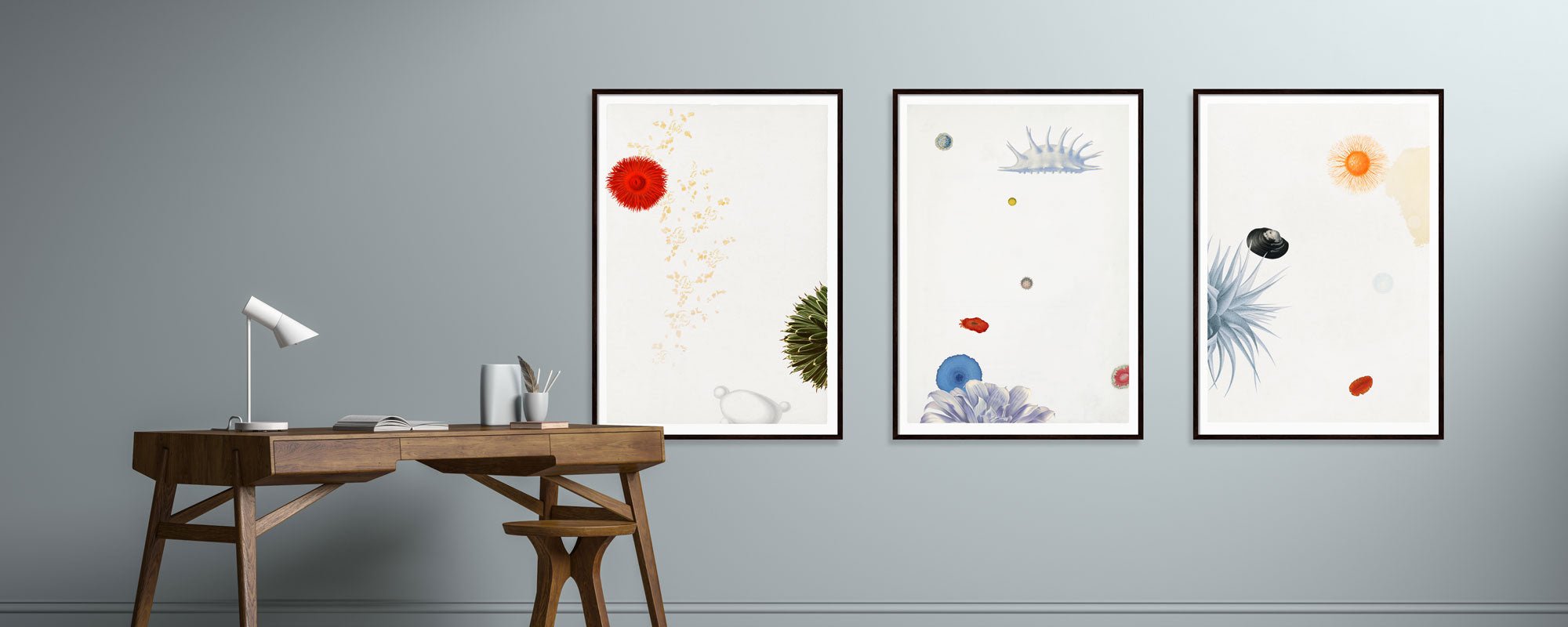
Frame choice also plays a role. A refined print can easily lose some of its character in poor framing. Glass, distance to the motif, matting, and wood type affect the overall experience more than many realize. A giclée print deserves a presentation that does not counteract the paper's tone and the work's visual rhythm.
At the same time, it's worth having realistic expectations. Giclée is not magic. It doesn't transform a weak motif into great art, and it doesn't make every reproduction identical to the original. But when motif, production, and materials interact, you get close to an experience that feels both cohesive and lasting.
Is giclée worth the money?
The short answer is: it depends on what you're buying it for. If you're primarily looking for cheap wall filler, giclée is rarely the most rational solution. However, if you choose art with the same care as you choose furniture, textiles, and lighting, it makes good sense to invest in a print where the quality can be seen and felt.
Precisely in those spaces where aesthetics should be more than superficial, the difference becomes clear over time. The colors last better. The paper ages more beautifully. And the artwork retains the dignity that prevents you from getting tired of it after a few months.
Perhaps the most useful way to look at it is this: A giclée print is not just a reproduction. It is an interpretation of a work in a medium where craftsmanship, material, and precision are part of the experience. Once you've seen the difference between a print that merely fills a wall and a print that creates presence, the question becomes less technical – and far more sensory.