What is a giclée print?
An image can look beautiful on a screen and still completely fall apart when printed. The colors lose depth, the surface appears flat, and what was meant to be a work of art ends up as decoration. That's why the question of what a giclée print is is not just technical. It's about the difference between something you hang up to fill a wall and something you choose to live with.
What exactly is a giclée print?
A giclée print is a fine art print produced with high-resolution inkjet technology, archival pigment inks, and art-quality paper or canvas. The term is especially used to distinguish exclusive art prints from standard production, where materials and color management are often more industrial than refined.
The crucial factor is not just the printer. It's the interplay of several elements - the digital file, the color profile, the pigment ink, the medium, and the way the work is produced. When all parts are correctly aligned, you get a print with great color depth, precise nuances, and a surface that preserves the character of the motif with remarkable serenity.
A giclée print is often used for photography, illustration, painting, collage, and digital works where the artist desires a reproduction with high integrity. Especially in limited editions, it makes sense because format, colors, and materials can be controlled with much greater precision than in mass-produced posters.
Why is it called giclée?
The term comes from the French word gicler, which means to spray or atomize. It refers to the way the ink is applied in microscopic droplets. In practice, the word is now used as a quality designation in the art world, but it's worth being a little vigilant.
Not everyone who uses the term necessarily works at the same level. A print does not automatically become exclusive just because someone calls it giclée. If the materials are mediocre or the color management is imprecise, the fancy word helps very little. Therefore, it makes more sense to look at the process than at the label alone.
What distinguishes a giclée print from a regular poster?
The difference is often felt before it can be explained. A regular poster is typically produced for volume. The paper is often thinner, the printing method faster, and the colors are optimized for price and scale rather than for richness of nuance and durability.
A giclée print, on the other hand, is created with a different ambition. The paper has more weight, more texture, and a surface that either absorbs the color softly or allows it to stand with sharp clarity, depending on the desired effect. Pigment inks provide a more sophisticated color reproduction and better lightfastness than many standard prints. The result is not just prettier. It feels more present.
However, there is a trade-off. Giclée costs more. It is a more expensive production method, and it places greater demands on both file quality and material selection. If the motif is temporary, very graphic, or intended as quick seasonal decoration, a regular poster may be entirely sufficient. But if the work is to have longevity, depth, and collectible value, the difference is real.
The materials matter more than many think
When talking about fine art prints, paper is often reduced to a practical detail. In reality, it is a large part of the work's mood. A matte cotton paper can give the motif a soft, almost velvety presence. A lightly textured art paper can emphasize a painterly character. Canvas creates a different physicality and can be obvious if one desires a more tactile expression.
In a well-produced giclée print, the paper is not just a carrier of the motif. It is an active part of the experience. The white tone, gram weight, and surface structure affect how the light falls and how the colors are perceived in the room. This is precisely where premium prints differ. Not by loud effect, but by the quiet precision that continues to last.
Colors, details, and tonality
One of the most significant reasons to choose giclée is the depth of the colors. Pigment-based printing technology can reproduce very fine transitions between light and dark areas, which is crucial in works with atmosphere, shadows, skin tones, dusty nuances, or complex collages.
This also applies to black. In cheap reproductions, black often becomes either gray and lifeless or too harsh and closed. In a good giclée print, dark tones are allowed to be deep without swallowing the details. This gives the work a different kind of serenity. You don't just see the motif. You see the layers within it.
Much depends on the original work here. Some motifs benefit significantly from giclée, while others do not have the same need. A simple graphic composition with few surfaces can easily stand strong in other print forms. But when the image works with tactility, subtle transitions, or a poetic, almost painterly balance, giclée truly comes into its own.
Durability is not a side note
For many buyers, the question of durability is crucial, especially if the work is to be part of a lasting interior design or collection. A giclée print produced with archival pigment inks and quality media is designed to retain color and character far better than standard prints, provided it is handled and framed correctly.
This does not mean that the print is indestructible. Direct sunlight, high humidity, and cheap framing materials can still shorten its lifespan. But the starting point is stronger. When investing in premium wall art, it is precisely this kind of uncompromising quality that you pay for - not as luxury for luxury's sake, but as a respect for the work's longevity.
Is a giclée print an original?
The short answer is no and yes, depending on how one understands originality. A giclée print is fundamentally a reproduction of a work, not the only existing object. But in artistic practice, it can still be an original art object if it is created as a deliberate edition, approved by the artist, and produced under carefully controlled conditions.
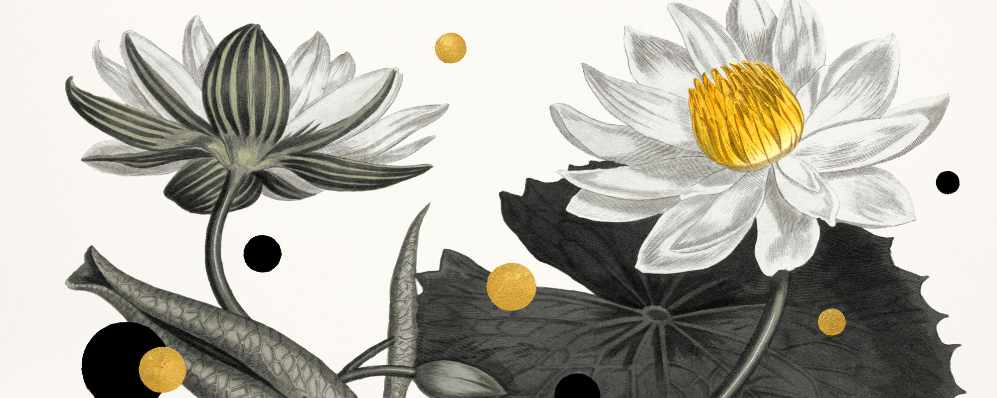
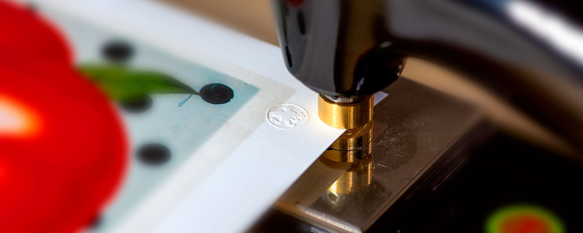
This is why numbering, signature, and edition size matter. They indicate that the work has not just been copied but published as a curated series with a clear framework. In some cases, the print is also hand-finished with special details, such as gold leaf or manual interventions, making each copy more individual. Here, one moves away from pure reproduction and closer to a work with its own physical identity.
When does it make sense to choose giclée?
If you want art for a home, an office, or a hospitality environment where materiality and atmosphere are part of the whole, giclée is often the right choice. This is especially true when the motif needs a certain visual weight that can carry a room without shouting.
It also makes sense if you are buying limited editions or works where the artist's intention lies in the detail. Here, a cheaper reproduction would often remove precisely what you are paying for - the nuance, the depth, and the sensory credibility.
Conversely, giclée is not necessarily needed for everything. If the budget is tight, or if the work is only to be used for a short time, other print forms may be more rational. Quality also means choosing correctly for the purpose.
What should you look for before buying?
When a work is described as giclée, you should pay attention to more than just the word itself. Ask about the paper type or canvas, the ink quality, the edition format, and whether the print is signed or numbered. This tells much more about the work's level than marketing alone.
It's also worth looking at the character of the motif. Does the medium match the work? A poetic photograph can gain an almost tactile stillness on matte cotton paper, while a more dramatic or tactile work can unfold beautifully on canvas. When production and motif speak the same language, that kind of unity arises which characterizes truly successful art prints.
At a studio like StoltzeStudio, this connection is central - not just delivering a print, but allowing materials, finish, and artistic intention to meet in a unified expression.
A giclée print is therefore not just a technique. It is a choice to give the image the surface, the depth, and the dignity it deserves. If in doubt, don't just look at the motif. Look at how it has been made physically present.