Giclée print or art poster - what should you choose?
An artwork might look like the right choice on screen but feel wrong when it hangs on the wall. That's precisely why the question of giclée print or art poster is not a technical detail, but an aesthetic choice with significance for atmosphere, materiality, and durability.
For some, it's about price. For others, it's about depth, paper quality, and the tranquility a well-executed piece brings to a room. If you decorate with care and desire art with presence rather than mere decoration, the difference is worth understanding.
Giclée print or art poster - the short difference
An art poster is typically produced in larger editions on lighter paper, focusing on accessibility, visual effect, and price. It can be beautiful, graphically sharp, and perfectly suited for an informal decor where the motif is more important than the material's weight.
A giclée print, on the other hand, is a fine art printing technique where the motif is printed with high pigment quality on exclusive paper types or canvas. Here, the ambition is not merely to reproduce an image, but to preserve nuances, depth, and texture with a precision closer to the artistic original.
The difference is not always visible from a distance. It is often felt up close. In the surface. In the movement of light across the paper. In the way the colors remain calm, saturated, and vibrant at the same time.
What is a giclée print?
Giclée is a printing method developed for artistic reproductions, where the quality must be high enough to honor the details of the work. This includes color gradations, shadows, textures, and transitions, which easily flatten out in simpler printing forms.
A giclée print is usually produced with pigment-based ink on acid-free fine art paper or canvas. This provides more refined color reproduction and significantly better archival stability. In short: A giclée print is made to last, both visually and physically.
This is especially relevant if you are attracted to poetic compositions, photographic nuances, collages with depth, or works where the choice of paper is part of the experience. Here, the substrate does not just carry the motif but becomes an active part of the work's character.
What is an art poster?
An art poster is often more democratic in its format. It makes it easier to bring artistic motifs into the home without moving into a premium price range. That is a legitimate quality in itself.
Posters are typically printed in larger editions and on more standardized paper types. The focus is often on a clean and decorative expression rather than collector's quality or edition logic. This does not mean that the result is without aesthetic value. A well-produced art poster can be strong, charismatic, and exactly the right choice for a kitchen, a teenager's room, a creative workspace, or a gallery wall in constant evolution.
However, if you are looking for that special feeling of texture, depth, and uncompromising finish, a poster will rarely achieve the same as a giclée print.
The material changes the entire experience
When faced with two seemingly similar motifs, it is often the material that determines whether the work appears refined or flat. Fine art paper has a different weight, a different porosity, and a different ability to absorb color. This creates a sense of calm in the image, which many design-conscious homes benefit from.
An art poster on thinner paper can appear more direct and graphic. This can be a plus if you want something light, urban, and less formal. But in rooms where you work with tactile surfaces, muted tones, natural materials, and conscious curation, a giclée print will usually fit in more naturally.
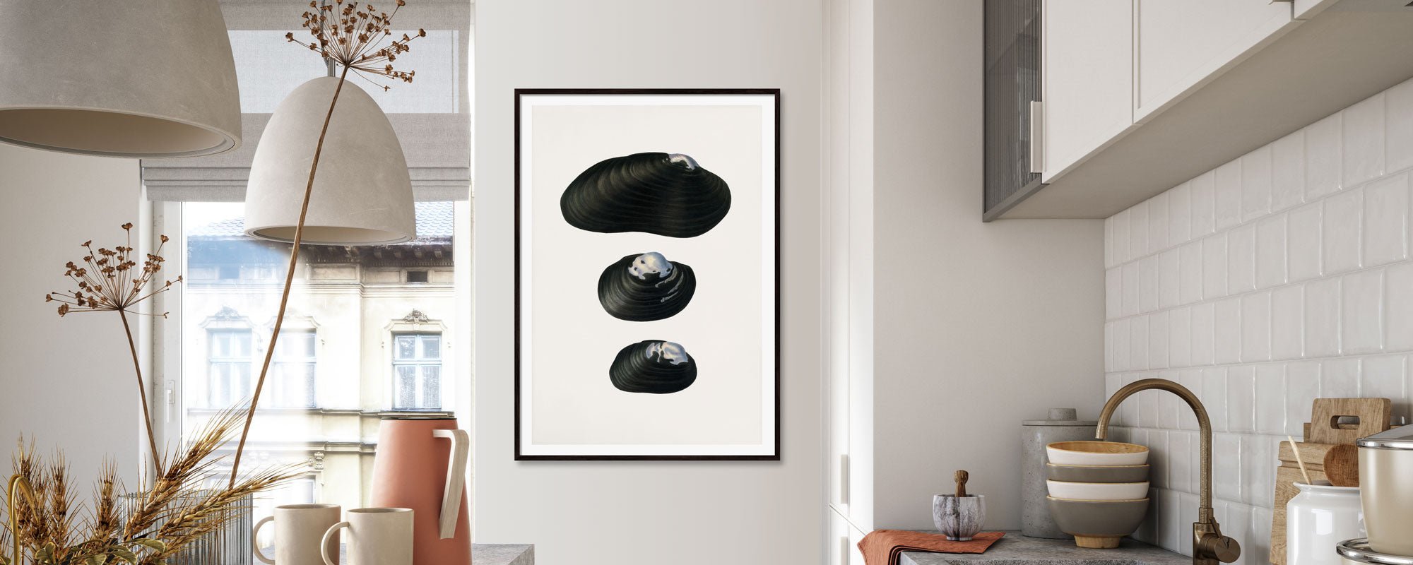
The same applies to framing. An exclusive print often tolerates – and deserves – a more elaborate presentation. Glass, passe-partout, and frame will interact with the artwork rather than just holding it up on the wall.
Color depth, details, and light
One of the most overlooked differences when choosing between a giclée print or an art poster is how the work reacts to light. In morning light, side light, or subdued evening lighting, a high-quality print will often retain more layers. Nuances are not just clearer; they are experienced as more subtle.
This is especially noticeable in works with delicate skin tones, dusty color fields, dark shadows, or complex textures. Where a poster can deliver the motif clearly and effectively, a giclée print also delivers the atmosphere surrounding the motif.
If you value visual sophistication, this is a significant difference. Not because everything has to be formal, but because good rooms thrive on nuances.
Durability is not just a practical matter
Durability is often reduced to how long a print can survive sunlight. But in a more curated home, durability also concerns connection. Will you still want to live with the artwork in five or ten years?
A giclée print is typically made with much greater resistance to fading and degradation. This makes it ideal if you view your purchase as a genuine investment in your environment – private or professional. Hospitality spaces, offices, living rooms, and bedrooms with a calm, conscious aesthetic benefit from works that do not lose their integrity over time.
An art poster can still be the right choice if the need is more temporary, seasonal, or flexible. There is no shame in choosing lightness if that's what the room calls for.
When does an art poster make the most sense?
There are situations where a poster is the most precise solution. If you want to build a large gallery wall, change things more often, or experiment with motifs and formats, it makes sense to keep the material choice more open.
The same applies if you prefer a more relaxed, graphic, or playful expression. Not all rooms need gravitas. Some need energy, pace, and visual spontaneity.
An art poster can also be ideal if you fall in love with a motif primarily for its idea, color, or composition – and less for its collector's aspect or tactile quality.
When is a giclée print the right choice?
A giclée print comes into its own when the artwork is intended for a more permanent place. When you furnish a room with fewer, stronger elements. When you want art not just to fill a surface, but to add depth.
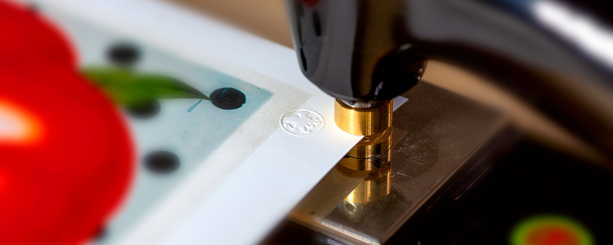
It is also the obvious choice if you value limited editions, signing, numbering, or handcrafted details. Here, you move away from reproduction as mere decoration and closer to a work with its own identity.
At an atelier-based art studio like StoltzeStudio, this very difference is central. When print, paper, finish, and edition are considered as a whole, the result becomes more than a motif on a wall. It becomes a sensory extension of the room.
The price difference - and what you're actually paying for
A giclée print usually costs more than an art poster. This is not due to branding alone, but to materials, printing technique, edition size, color management, and often a higher degree of artistic control. You pay for precision, durability, and an experience that remains beautiful up close.
This does not mean that more expensive is always better. If your goal is to create visual variety with lower risk, the poster can be both smart and stylish. But if you are looking for a work that you will carefully frame, live with for a long time, and perhaps take with you from home to home, the premium quality makes sense.
The question is therefore less about what something costs, and more about what it needs to convey.
How to choose between a giclée print or an art poster
Start with the room. Is it a place for contemplation or a place with more movement? Then consider the distance to the artwork. If it is to be experienced up close, the quality of the paper becomes far more important. Also, think about the time horizon. Is this a fleeting infatuation, or a work you want to accompany you for a long time?
Be honest about your relationship with details. Some people immediately see the difference in pigment depth, paper structure, and finish. Others react mostly to the motif and format. Neither is more correct, but they lead to different choices.
And then there's the simple test: If you feel the urge to get really close to the work, study its surface, and see how the light falls on it, you are often already leaning towards a giclée print.
The best choice is not the most expensive, but the most precise. When the artwork, material, and room speak the same language, the whole falls into place – quietly, confidently, and without demanding attention.