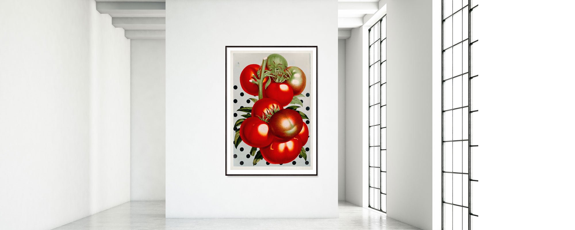
How to frame art prints correctly?
A striking art print can transform a room in seconds. But the wrong framing can do the opposite – flatten the motif, disrupt proportions, or steal attention from what should truly speak. When asking how to frame an art print, the answer is therefore not just about technique, but about balance, understanding of materials, and respect for the work's inherent character.
An art print deserves a frame that not only fits in size but also in mood. Framing is the quiet discipline surrounding the artwork. It should support the composition, elevate the quality of the paper, and create a sense of calm between the motif and the space.
How to frame art prints with the right proportion?
The first choice is rarely the color of the frame. It's the proportion. A print with space around the motif often requires different framing than a motif that goes right to the edge. If the work is printed on exclusive cotton paper with a distinct texture or deckled edges, the framing should allow the paper to breathe visually.
Many choose a frame exactly the same size as the print. This can work for graphic posters and more direct compositions, but fine art prints often benefit from having more space around them. Here, a passe-partout or a larger frame can create a more gallery-like experience, where the motif gains weight instead of appearing cramped.
However, there is no universal rule. Small works can become more intimate in generous framing, while large works sometimes stand strongest without extra distance between the image and the frame. It depends on the intensity of the motif, the tone of the paper, and the wall it will live on.
Choose a frame according to the work's language
The frame should be read as an extension of the work, not as a separate decoration. A poetic, understated print with organic tones often calls for wood, oak, ash, or a matte, dark profile with texture. A more graphic or photographic motif can carry a slender black or white aluminum frame, where the line is clean and precise.
If the print contains warm pigments, gold leaf, or tactile details, a frame with a little depth may be more becoming than a completely flat standard profile. Depth creates shadow, and shadow creates presence. Conversely, too prominent a frame can quickly become overwhelming, especially if the motif already has high visual energy.
The safe choice is rarely the most interesting, but it should still be disciplined. An ornate frame can be beautiful, but only if it truly complements the work's temperament and the room's architecture. In modern interiors, it is often the simple, well-tuned frame that lasts the longest.
Wood, metal, or lacquered profile?
Wood adds warmth and texture. It is particularly suitable for art prints where a more sensory and cohesive expression is desired. Metal appears cooler and more minimalist but can be precisely right for sharp lines, monochrome motifs, or photographic prints. Lacquered profiles lie somewhere in between and can either disappear elegantly or create a subtle contrast.
The crucial factor is the finish. High gloss can appear harsh around a soft motif. A matte surface absorbs more light and often feels calmer. Similarly, a very yellow oak can be beautiful in one room and disruptive in another. The frame must communicate with the artwork, but also with the light in the room.
Passe-partout is not just decoration
A good passe-partout creates distance between the glass and the print, but its most important function is visual. It gives the artwork a pause zone. Especially art prints with delicate details, subtle color transitions, or hand-finished elements gain more depth when the motif is not right up against the frame profile.
White is the most common choice, but not all white is the same. Cold, stark white passe-partout can appear too sharp around a print on natural white art paper. A softer, warm-toned white often yields a more refined result. Black passe-partout can add drama, but it can also enclose the motif if the colors are already dark.
The width matters at least as much as the color. Too narrow a passe-partout often looks haphazard. Too wide can become too solemn. As a rule of thumb, the passe-partout should feel generous enough to create calm, but never so dominant that it becomes the main character.
Glass: the detail you only notice when it's wrong
Glass is often chosen last, even though it significantly impacts the experience. Standard glass can work fine in rooms with soft light and few reflections, but in many homes, glare will tear the motif apart throughout the day. Therefore, anti-reflective glass or museum glass is often a significant upgrade, especially for works with many nuances or dark areas.
UV protection is also not a technical luxury. If the print hangs in a room with a lot of daylight, protective glass helps preserve the depth of colors over time. This is especially true for pigment prints and works on exclusive paper types, where the material's quality is part of the experience.
Here it is worth being honest about the budget. Museum glass is more expensive, but the difference is clear. If the work has high value - aesthetic, economic, or emotional - it is often worth the money. For more informal posters, ordinary glass or acrylic may be sufficient.
How to frame art prints without damaging the paper?
The most beautiful framing loses its value if the print is mounted incorrectly. Art prints should never be taped directly with regular tape or glued flat against the backing board. This can permanently damage the paper and make later reframing impossible.
Use acid-free materials and reversible mounting methods. This is especially important for limited editions, signed prints, and works on cotton paper. The paper should be able to move slightly with humidity without creasing or becoming unnaturally stretched.
If the print has raw edges or a beautiful paper edge, it may be worth considering float mounting, where the entire sheet is visible. This gives a more studio-like and collector-oriented expression. However, it places greater demands on precise mounting and that the backing and spacing are meticulously executed.
Framing should suit the room - but not be subordinate to it
An art print should live within an interior, but it should not dissolve into it. If everything is matched too closely – beige motif, beige passe-partout, beige wall, beige frame – the result can be very neat and very forgettable. A little tension is often what gives the work life.
In a calm, Nordic room, a dark frame can create necessary weight. In a more color-saturated home, a light oak or warm white profile can give the work the space it needs. If the work hangs above a sofa, sideboard, or console, the width and visual weight should feel in tune with the furniture below. Not identical, but related.
There are also situations where harmony is deliberately broken. A delicate, almost meditative print in a striking black frame can become more contemporary. A graphic motif in natural wood can gain more humanity. Good framing is not just about rules, but about conscious tensions.
When standard sizes are not the best choice
Many buy pre-made frames in standard sizes, and that makes good sense for certain posters. But with high-quality art prints, custom framing will often significantly elevate the overall impression. Not because it has to be extravagant, but because millimeters matter. Edge spacing, profile width, glass type, and backing material are what distinguish something temporary from something lasting.
If a print is produced with special margins, signed by hand, or in a slightly unconventional format, a standard frame will often feel like a compromise. And compromises are noticed. Especially in rooms where furniture, textiles, and lighting have otherwise been carefully chosen.
For those who desire a more curated experience, it can be worthwhile to seek advice. At an art and design studio like StoltzeStudio, they will typically view the work as a whole – paper, pigment, surface, format, and the atmosphere it should create in the room.
The classic mistake: choosing too quickly
Most mistakes are not due to bad taste, but to haste. One chooses the first frame that fits the dimensions, or the cheapest solution that looks somewhat right. But art prints are rarely something you only live with for a season. Therefore, they deserve a slower decision.
Place the frame against the print in daylight. Look at it in the morning and in the evening. Consider whether it highlights the paper's tone, or if it makes the work appear harsher. Also, think about distance. A frame that looks good up close can appear heavy on the wall.
The right framing rarely feels dramatic. It feels right because the artwork falls into place and gets the calm it should have had all along. When that happens, the print doesn't just become something hanging on the wall, but something you return to.