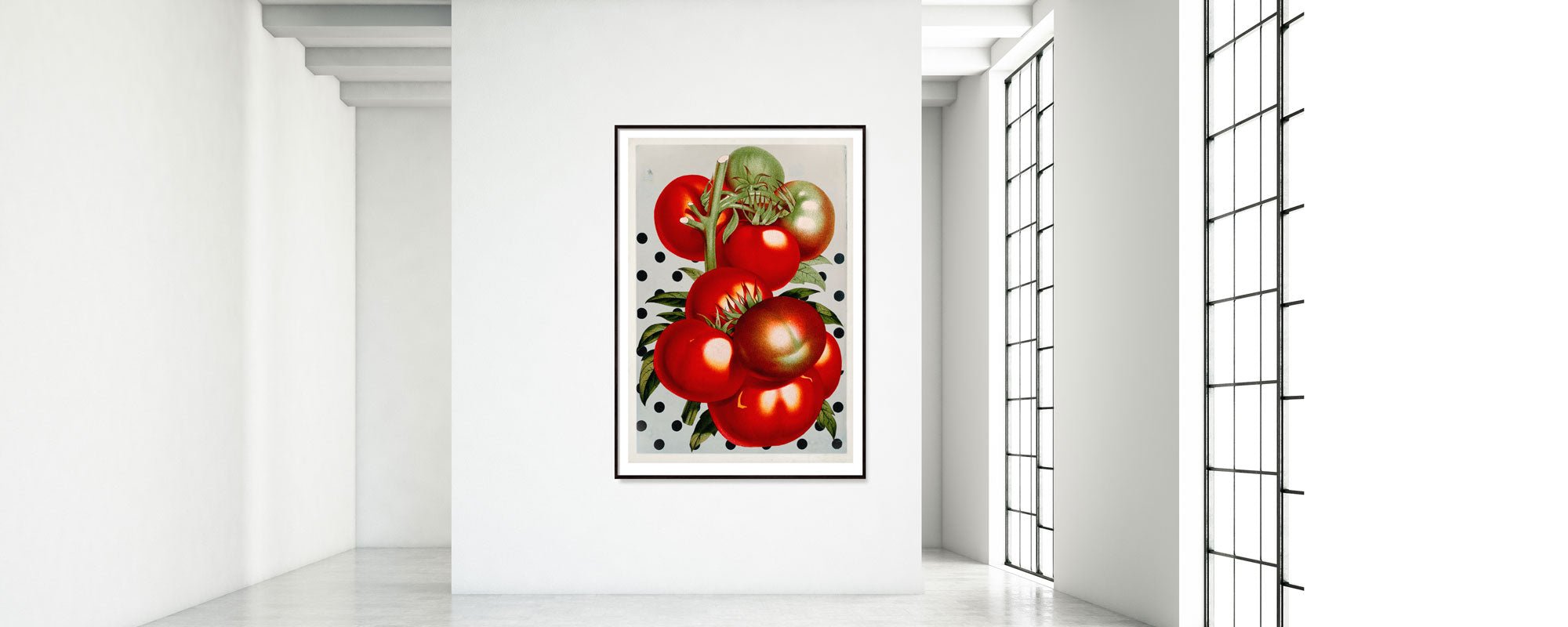
Art for stylish interiors with character
A stylish room quickly falls flat if the walls are silent. The right furniture can create order, but it's only with art for stylish decor that a home gains nerve, rhythm, and the discreet luxury that doesn't need to explain itself.
Stylish decor is often misunderstood as something ascetic. White walls, few objects, clean lines. But without a conscious artistic layer, simplicity can tip over into anonymity. The role of art is not to fill a void. It should add weight, atmosphere, and a feeling that the room is curated rather than just tidy.
What art for stylish decor actually requires
When choosing art for a stylish home, it's rarely about finding the most striking piece. It's about precision. The colours can be subdued, but they mustn't be dead. The composition can be calm, but it must still have tension. A good piece in a minimalist setting should be able to hold the gaze without shouting.
This is precisely why materiality means so much in this type of decor. A Giclée print on exclusive paper has a different depth than a flat standard poster. A hand-finished surface with gold leaf or texture adds light, variation, and presence that truly emerges when you move closer. In a stylish room, where every element counts, such details are not mere ornamentation. They become foundational.
Stylish decor also does not tolerate random choices. When everything else in the room is reduced to the essential, the art becomes more visible. This means that motif, format, and framing must all be carefully considered. A single piece can elevate the entire room. A wrong piece can make it unsettling.
How to choose art for stylish decor
The first question isn't what colour matches the sofa. The first question is what atmosphere the room should have. Should the living room feel warm and cultivated, almost like a sensory sanctuary? Should the office be sharp and focused? Should the entrance have a more graphic self-assurance? Art is best chosen based on atmosphere before palette.
In calm rooms, poetic compositions, archive-based motifs, and abstracted collages often work powerfully because they create depth without visual noise. In rooms with strong materials like stone, dark wood, or brushed steel, a piece with softer transitions or tactile layers can create the balance that makes the decor more human.
Format is the next crucial choice. Many buy too small. In a stylish decor, a piece with a generous scale often appears more convincing than several small, scattered pictures. One large piece above the sofa, dining table, or in an open-plan kitchen-diner creates calm because the eye has a clear focal point. Conversely, a smaller composition may be right for a more intimate room if intimacy is desired over monumentalism.
The framing should support the artwork, not compete with it. A slim wooden frame can add warmth to cool interiors. A simple black frame creates definition and graphic precision. Light oak or ash works beautifully in Scandinavian-inspired rooms, but it depends on the character of the artwork. There isn't one right solution. There is only the solution where the artwork, frame, and room appear as one cohesive decision.
Colours that create calm without being timid
Neutral is not the same as harmless. In stylish homes, you often see beige, sand, lime, black, grey, and warm white tones. Art that works within or close to this register can create an almost architectural coherence. But that doesn't mean everything should fade into the background.
On the contrary, a discreet break can make all the difference. A deep ochre, a dusty blue, an oxidized green, or a hint of burgundy can give an otherwise monochrome room a refined pulse. The key is dosage. In stylish decor, colour is most convincing when experienced as a conscious accent, not as a decorative afterthought.
Black and white works still have their place, especially in rooms where sharpness and graphic clarity are desired. But even here, nuance is crucial. Black doesn't have to be harsh, and white doesn't have to be sterile. The tone of the paper, the depth of the print, and the composition of the motif determine whether the result is sophisticated or too cool.
When the art's surface becomes part of the decor
In stylish rooms, we often talk about lines, proportions, and colour fields. But surfaces are just as important. A piece with a tactile character provides a counterpoint to smooth kitchen fronts, polished concrete, glass, or uniform walls. This kind of contrast makes a room more vibrant.
Here, craftsmanship is not a technical detail. It is an aesthetic quality. Fine art prints with precise colour reproduction, canvas with textile depth, and hand-finished elements have a presence that mass-produced reproductions rarely match. This is especially noticeable in homes where materials have already been carefully selected. When the sofa, countertop, and lighting are chosen for their quality, the art should be able to bear the same level of uncompromising quality.
Limited editions also add another kind of calm. Not because a numbered work is automatically better, but because it is often created with greater artistic intention and less decorative opportunism. You feel the difference between something developed as a genuine artwork and something primarily designed to fit everywhere.
Placement is as important as the artwork itself
The most well-chosen artwork loses its power if hung incorrectly. Stylish decor is sensitive to proportions, and art should be placed with the same discipline as furniture. The centre of the artwork should usually meet the eye naturally, but it depends on ceiling height, furniture, and the room's rhythm.
Above a sofa, the artwork should be wide enough to feel related to the furniture. Too small formats make the wall appear unfinished. In a dining area, art can be hung slightly lower because it is experienced while seated. In narrow passages or entrances, vertical formats often work strongly because they emphasize height and create elegance in movement through the room.
There are also situations where art can advantageously stand rather than hang. A larger framed piece leaning against the wall on a console or a low shelf can give a more relaxed, studio-like expression. However, this requires that the rest of the room is disciplined. Otherwise, the gesture risks appearing temporary rather than intentional.
Stylish does not mean impersonal
Many are so intent on maintaining a clean expression that they choose art they don't actually feel anything for. The result is correct, but not engaging. The best art for stylish decor is not just visually harmonious. It also has a tone you want to live with.
It might be a piece with quiet drama, a motif with traces of memory, or a collage that slowly reveals itself over time. In premium interiors, personality is rarely loud. It lies in the well-chosen shifts - the small unexpected colour change, the asymmetrical balance, the tactile finish that catches the light differently morning and evening.
This is also where curation becomes more important than trends. Trends in home decor change quickly, but works with artistic integrity last longer because they are not created to imitate a style. They are created to stand on their own merit. When placed in a well-composed room, that kind of luxury arises which feels understated and completely self-assured.
A more refined look at art for stylish decor
There is no single recipe, because stylish decor can be both soft and strict, Nordic and international, warm and graphic. Some rooms call for bright, airy works with poetic lightness. Others need more contrast, more depth, more material weight. The crucial thing is that art is not chosen as the last step in the process, but as an active part of the room's identity.
At StoltzeStudio, we often see how materials, edition logic, and hand-finished details can change the experience of an otherwise simple room. Not by overpowering the architecture, but by giving it soul.
If a room already feels orderly but still lacks warmth, focus, or personal resonance, it's rarely more furniture that's needed. It's usually one piece of art, chosen with sharpness and sensibility, that makes the whole thing fall into place.