How do you choose the right art poster?
An art poster shouldn't just fill an empty wall. It should change the way a room is experienced—bringing colors together, creating a visual pause, or adding the excitement that makes an otherwise well-decorated home feel personal. So, when the question is, how do you choose an art poster, it's less about following a trend and more about reading the room, the light, and your own taste.
The right poster rarely feels like a quick decision. It has a visual weight that you continue to discover, even when it's not the first thing you see when you enter the room.
Start with the room's atmosphere, not the wall's measurements
It's tempting to start with the size of the empty wall. But before you get out the tape measure, it's worth considering what the room lacks. A minimalist room with light surfaces can carry a collage with strong contrasts or a deep, saturated color field. A home with many materials, books, and textiles, on the other hand, might benefit from a more serene composition with space, graphic clarity, and a few precise tones.
Look at the room as a whole. What light comes in during the morning? Is the wall visible from the sofa, the dining table, or only when you get close? An art poster at the entrance can certainly make a clear first impression, while a piece in the bedroom often works best when it creates a more subdued, sensory sanctuary.
Colors don't have to directly match the furniture. It often becomes more refined when the poster has one tone that speaks to the room and one tone that breaks it up. A dusty blue, for example, can mirror a textile, while a warm orange or golden detail adds life. It's the tension between resonance and counterpoint that makes a decor vibrant.
Choose a motif you can keep looking at
Art for the home should evoke an immediate reaction, but it shouldn't expend all its energy at first glance. Don't just ask: Do I like it? Also ask: What will I discover when I look at it again in six months?
Poetic compositions, archival motifs, and visual transformations often have this quality. They contain an element of displacement—something familiar put together in a new way. It could be a landscape that almost dissolves into color, a photographic motif with an unexpected cropping, or a collage where past and present meet on the same surface.
The choice of motif also depends on the role the artwork is intended to play. If you want to create calm, a piece with a limited palette and clear compositional balance can be powerful. If you want to add character to a neutral living room, a more expressive motif can serve as the room's conversation starter. Neither is more correct. The crucial thing is whether the artwork is allowed to be itself rather than just decoration.
Make room for the unexpected
Many automatically choose botanical motifs for green rooms and abstract art for modern interiors. But the most interesting solution often lies just beside the expected. A stringent graphic poster can provide structure to a soft, tactile decor. A dreamy, figurative work can soften an architectural, monochrome living room.
Don't choose a motif because it fits into a category. Choose it because it creates a precise mood you want to live with.
The format determines the artwork's authority
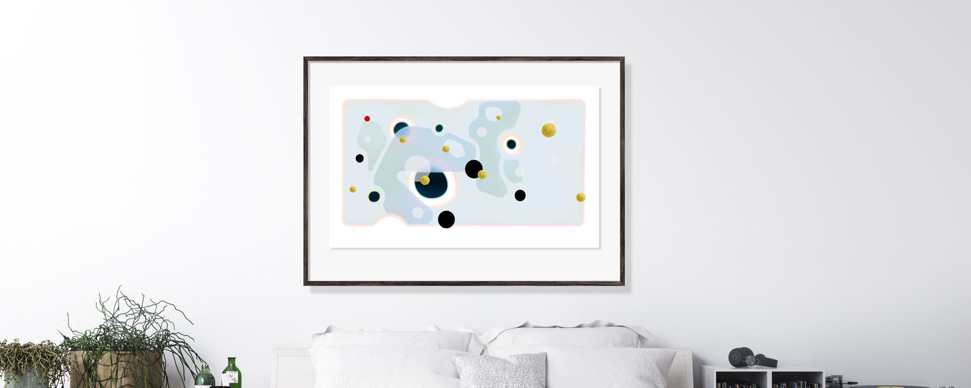
A beautiful motif can lose its power in too small a format. Especially above sofas, beds, and dining tables, small posters often become visual parentheses instead of a genuine presence. As a rule of thumb, a work above a sofa should have a width of about two-thirds of the furniture's width, either alone or as part of a collective hanging.
In American homes, you can think in both centimeters and inches. A 50 x 70 cm format corresponds roughly to 20 x 28 inches and works beautifully in smaller zones, by a desk, or as part of a wall with multiple works. For a larger wall, 70 x 100 cm, approximately 28 x 40 inches, can provide the calm and presence that a single piece requires.
High ceilings don't necessarily call for many posters. Often, one generous format is more convincing than a dense cluster of small frames. Conversely, a gallery wall can be the right solution in a hallway or by a staircase, where the works are experienced in motion and at close range.
One poster or a gallery wall?
Choose one piece when the motif has an independent strength, or when the room needs a clear focal point. A gallery wall is more suitable when you want to create rhythm, collect travel memories, photographs, and graphic works, or give a larger surface a more vibrant expression.
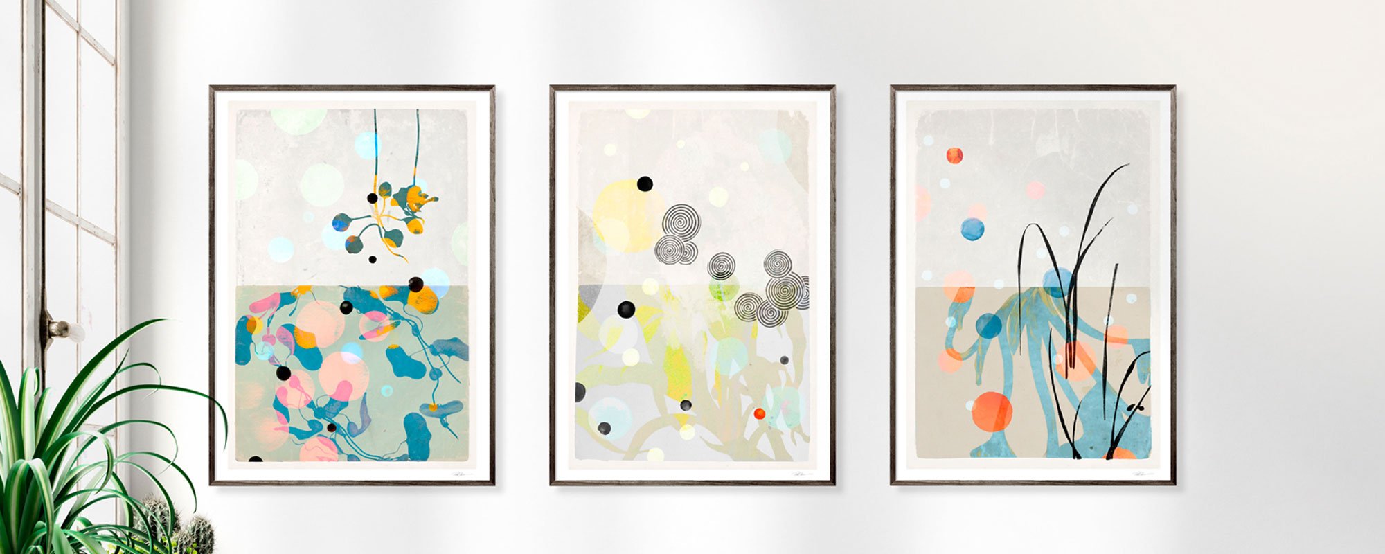
If you put together several art posters, let one decision be repeated: either a common color tone, a related frame quality, or a consistent format. Without such a connection, even good works can compete instead of conversing.
Paper, print, and finish are part of the artwork
A poster is not just its motif. The surface of the paper, the depth of the colors, and the precision of the print determine whether the image appears flat or gains an almost tactile quality. A Giclée art print on exclusive art paper reproduces nuances and details with a richness that is particularly noticeable in works with fine transitions, collage elements, or photographic structures.
Matte paper has a calm, museum-like character and reduces glare. It works well in rooms with plenty of daylight and for works where color and texture should be experienced without reflections. Canvas can add a more painterly texture and a softer presence but also requires a motif that can bear the altered surface.
Limited editions add another form of significance. When a work is numbered and signed, it becomes more closely linked to the artist's process and to the specific edition. Hand-finished details, such as gold leaf, further change the experience: Light moves across the surface throughout the day, and the work gains a lively, almost ceremonially changing expression. Here you pay not only for the motif but for materiality, time, and uncompromising execution.
The framing should support, not overpower
The frame is the artwork's architecture. A sleek black frame provides graphic precision and can create contrast around light or organic motifs. Oak and other warm wood types draw the work into a more tactile, Scandinavian atmosphere. A light frame can make a poster appear light and ethereal, while a dark frame gives weight and contour.
Passe-partout is not always necessary, but it can make a big difference. The white border adds distance between the image and the frame, giving even a smaller format more space and authority. It is particularly beautiful with fine art prints that have details deserving close attention.
Avoid choosing a frame solely based on the rest of the home's metals or wood types. Repetition can create order, but too perfect coordination easily becomes predictable. A frame should be allowed to have its own character, as long as it respects the tone of the artwork.
See the artwork in the light it will live in
The same print can be experienced markedly differently in cool northern light, warm afternoon light, and artificial lighting after dark. Therefore, do not hang the work until you have seen it against the wall color and in the room's actual light. A motif with warm undertones can appear more subdued on a gray wall, while deep blue or green colors often gain a special intensity against whitewashed, light surfaces.
Direct sunlight is beautiful but requires thought. Even high-quality prints should be protected from prolonged, harsh exposure. Placement is part of the care for the artwork, just as framing and choice of materials are.
At StoltzeStudio, this attention to format, finish, and tactility is part of the curation: Art should not just be seen on a screen, but experienced as a physical presence in the room.
Buy with thoughtfulness
The most well-chosen art poster is rarely the one that fits everything right now. It is the one that still feels precise when the sofa is moved, when the season changes, and when the home gets new layers. Allow yourself to choose the artwork with a view to a long-term relationship. When a motif keeps calling to you, it has probably already found its wall.