7 Picks for the Best Art for a Minimalist Home
A minimalist room reveals everything. The precise joint in the floor, the movement of light across the wall, the texture of a piece of linen - and the quality of the art you choose to keep. Therefore, the best art for a minimalist home is not about finding the most discreet piece, but about choosing a work with enough presence to carry the silence.
Minimalism is often misunderstood as absence. In its strongest expression, it is rather an editing: fewer objects, clearer materials, and better decisions. Art can be the element that breaks the strict order with a poetic composition, an unexpected color shift, or a tactile surface. It should not fill the room. It should anchor it.
1. Choose one work with real weight
The safe path in a minimalist home is rarely a dense hanging of small motifs. When the walls have space, a single work becomes much more present. A large art print above the sofa, an original work by the dining area, or a calm composition in the hallway can define the entire rhythm of the room.
Weight is not just about centimeters. A smaller work can be monumental if the motif has concentration and the framing is chosen with precision. Conversely, a large work can disappear if it lacks contrast with the wall, furniture, and light. Therefore, look at the visible surface, not just the paper size. Passepartout, frame profile, and distance to furniture are part of the work's architecture.
A good starting point is to let a work above a sofa occupy approximately two-thirds of the sofa's width. The rule is not immutable, but it provides a harmonious scale. In smaller rooms, a vertical work can be more convincing than a wide format because it lifts the gaze and creates space around it.
2. Let color create tension, not noise
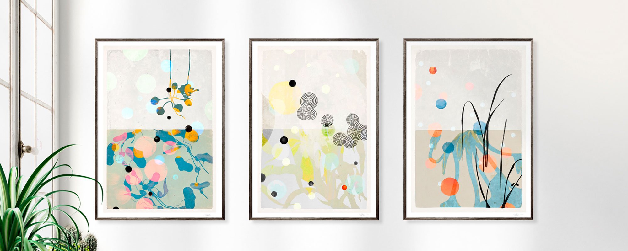
A neutral home does not need neutral art. On the contrary, a touch of cobalt, deep red, ochre, or green can give the room the tension that makes a subdued interior vibrant. The difference lies in the role of color: it should be deliberate and confined rather than spread out in many small accents.
Feel free to choose a work where one tone is repeated in a pillow, a book spine, or a ceramic glaze, but avoid matching too literally. Art should not function as a color chart for the interior. It can introduce a nuance not found elsewhere if it also has a calm tonality or a clear compositional approach.
In rooms with whitewashed walls, oak, and natural textiles, dusty pigments appear particularly beautiful. On cool, white surfaces, black-and-white archival motifs, graphic collages, or deep blue tones can add precision. If the home already has strong materials like travertine, marble, or dark wood, a simpler motif can provide the necessary pause.
3. Choose a motif according to the room's pace
Minimalist homes become most interesting when the art's motif responds to the room's function without becoming illustrative. The dining room often tolerates works with energy - a collage, an abstract figure, or a motif with architectural breaks. Here, the conversation can get a visual counterpart.
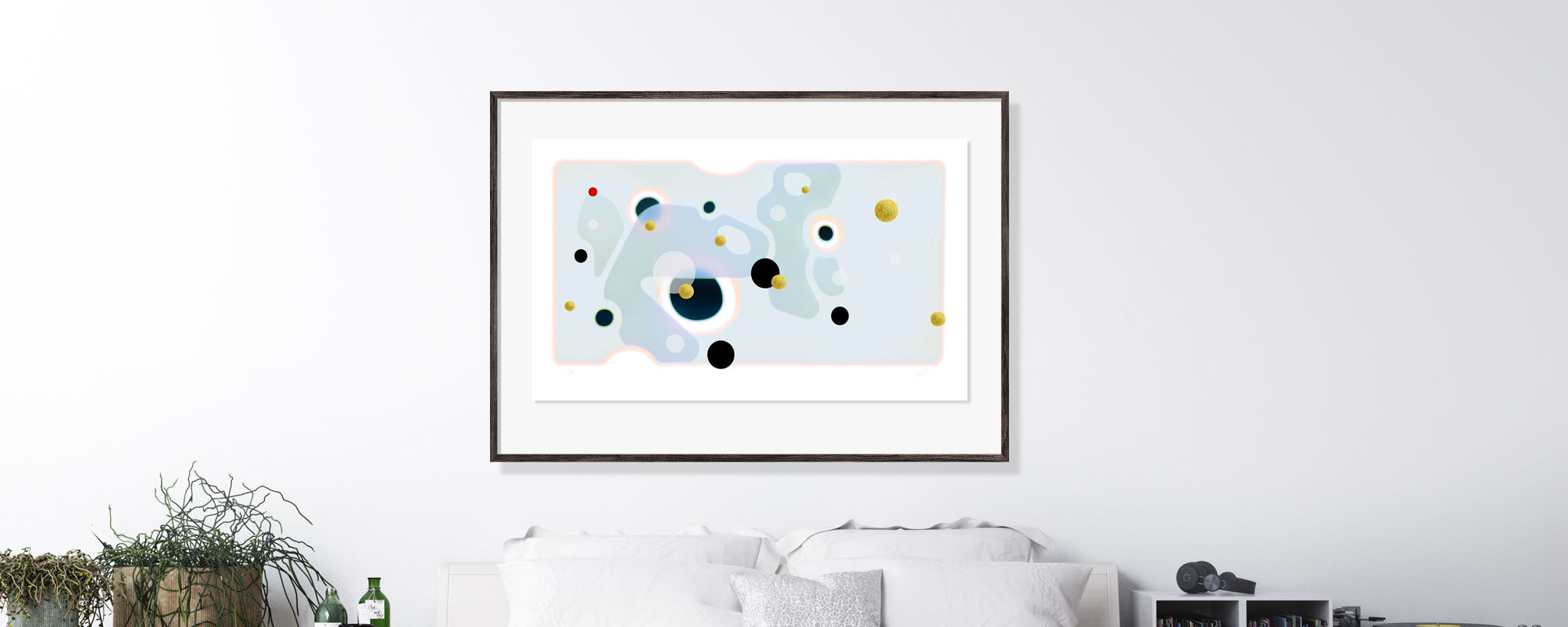
The bedroom typically calls for longer gazes. Soft forms, foggy landscapes, botanical fragments, or reductive color fields can create a sensual refuge without demanding attention at bedtime. This does not mean the art should be anonymous. A work with subdued intensity often becomes stronger the longer one lives with it.
In the hallway, you can be bolder. The room is experienced in brief glimpses, and a distinctive motif makes the arrival personal. Choose one work with a clear eye-catcher rather than a series of decorative solutions. A minimalist home does not need repetition. It needs editorial certainty.
4. Prioritize materials that reward close contact
In a home with few visual elements, the material becomes visible. A Giclée art print on heavy, exclusive paper has a different depth than a thin standard print, especially when daylight moves across the pigment. The paper's fibers, the matte surface, and the saturation of colors are not small details - they are a significant part of the experience.
Canvas can be the right choice when you want a more painterly presence and a work without reflective glass. It works particularly well in larger, open spaces where the surface can be read from a distance. A framed paper work, on the other hand, can add finesse and graphic sharpness, especially in homes with clean lines and precise carpentry details.
Hand-finished details like gold leaf change the work with the light and give an almost tactile dimension to a simple wall. But use them with care. In a home with many shiny surfaces, gold can become too decorative; against matte walls, wool, wood, and stone, it gains a refined, subdued glow.
5. Give the frame the same attention as the art
A frame is not packaging. It determines whether the work feels integrated, floating, or foreign in the room. For minimalist homes, narrow profiles in oak, black, or warm aluminum are often safe choices, but safety is not always the same as character.
Light oak creates continuity in Scandinavian interiors and highlights warm pigments. A black frame provides structure and can unite a more complex motif. An off-white or natural-colored frame can be beautiful around delicate works, but requires a clear difference between the frame, paper, and wall so as not to dissolve the work.
Also consider glass. Anti-reflective glass is valuable on walls with a lot of daylight or opposing windows because it allows the motif to stand out clearly. Regular glass can work well in more protected locations and sometimes gives a beautiful, lively reflection. The choice depends on the room, not on a fixed rule.
6. Work with the empty space around the piece
The most common mistake is hanging art too high or too close to other elements. A minimalist home does not require all walls to be activated. On the contrary, an unbroken surface can make the chosen work appear more generous and more valuable.
As a rule of thumb, hang the center of the work around eye level, often about 145-155 centimeters from the floor, but always adjust to the furniture below. Above a sideboard, the distance should feel like a relationship, not two separate surfaces. Above a sofa, the work can come closer to the back than one initially thinks - typically with 15-25 centimeters in between.
Take a trial hanging seriously. Cut paper to the size of the work, tape it up, and observe it morning, noon, and evening. Minimalist rooms are sensitive to proportions. A simple test can prevent the kind of compromise that later continues to irritate the eye.
7. Buy art you will continue to discover
The best art for a minimalist home is not necessarily what looks perfect in the first photo. It is what has more layers than its immediate decorative effect. A motif with a strange cropping, a shifted silhouette, or a discreet trace of the hand's work can gain new life as the seasons, light, and other objects in the home change.
This is where limited editions and signed works gain particular value. Numbering and signature are not just a matter of rarity; they point to a concrete artistic process and a deliberately limited edition. When a print is also produced with precise pigments and possibly finished by hand, it becomes an object with its own materiality - not just wall decoration.
At StoltzeStudio, this idea meets collage, archival images, and hand-finished surfaces. The decisive factor, however, is always your space and your gaze. A work should not demonstrate that the home is minimalist. It should make being in it more personal.
Therefore, let the final decision be slow. Stand with the work, feel the paper, see the color in the light where you actually live. When art both creates calm and leaves a slight unrest, it has found its place.