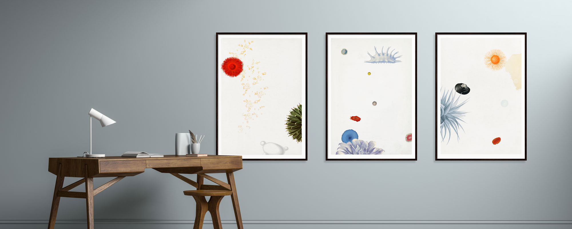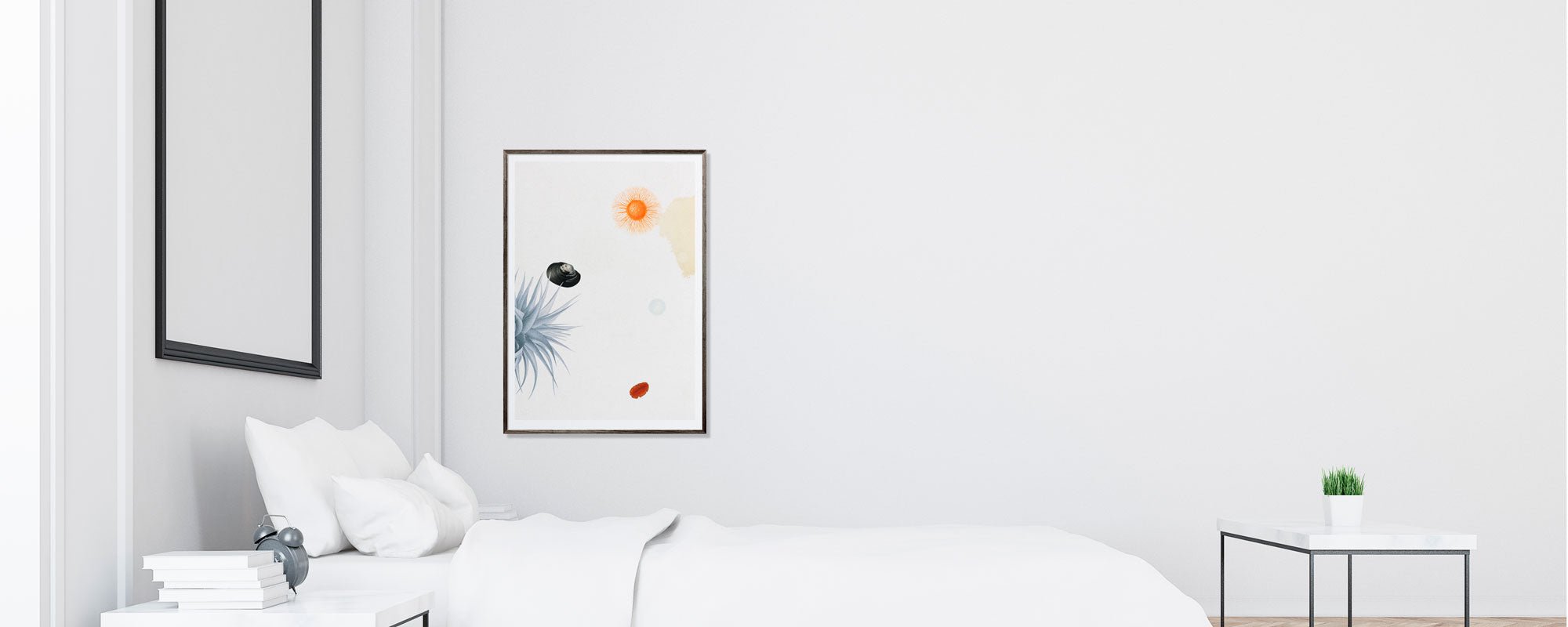
Art for calm spaces with a lasting presence
A tranquil room is rarely created by absence alone. It arises when everything in the room works in the same direction - light, materials, proportions, and art that makes the wall settle down instead of demanding attention. Precisely for this reason, art for tranquil rooms is not the same as anonymous wall decoration. The right art adds presence, depth, and a quiet form of gravitas that makes the room more livable.
Many misinterpret tranquility as something neutral. They choose safe beige tones, small motifs without character, or works that completely fade from consciousness. The result is often neat, but also flat. A tranquil room needs art with integrity - works that hold the gaze without disturbing it. There is a difference between something discreet and something dead.
What characterizes art for tranquil rooms?
Art that works in a quiet interior usually has a precise balance between form, color, and rhythm. The composition may be simple, but it must not be empty. There must be something to dwell on. This could be a subdued collage, an archival motif with patina, a poetic abstraction, or a figurative work where the mood is more important than the motif's explanation.
The color palette plays a central role, but not in the predictable way. Tranquil rooms do not necessarily require bright colors. On the contrary, deep earth tones, dusty blues, charcoal grays, or warm off-whites can create more visual calm than cool standard tones. The crucial thing is that the colors feel balanced and materially grounded.
Scale also matters more than many think. A work that is too small in a generous room can seem nervous. A work that is too overwhelming in an intimate room can tip the mood from calm to dominance. Art for tranquil rooms is therefore not just about the motif, but about the relationship between the work and the architecture around it.
Tranquility is not the same as an absence of character
The most successful tranquil rooms often have a clear identity. They are not sterile. They are curated. There is a consciousness behind every choice, and precisely that consciousness makes the room feel light. When the art is chosen with precision, the rest does not need to compete.
A work with a tactile surface, subtle tonal shifts, or handcrafted details can imbue a room with an almost meditative quality. The eye registers the depth, even when the overall impression is subdued. This is where materiality becomes crucial. A print on exclusive paper with a velvety surface speaks differently to the room than a glossy mass-produced poster. Canvas creates a different physicality. Gold leaf, used sparingly, can add warmth rather than sheen.
This is an important nuance, especially in bedrooms, reading nooks, lounge areas, and offices where visual noise is undesirable. Here, the art should not perform. It should live in the room.
How to choose art for tranquil rooms
The first question is not what matches the sofa. It is what mood the room should convey over time. A room that needs to soothe the shoulders requires works with a slow visual pulse. Motifs with many harsh contrasts, aggressive symbolism, or hectic energy can be excellent art, but they are not always the right choice here.
Start with the light. North-facing rooms often carry cooler tones beautifully, but they benefit from works with depth and warmth in the material. South-facing rooms tolerate more muted shades without losing vibrancy. In rooms with changing daylight, art with subtle layers often works best, because the work changes character throughout the day instead of remaining static.
Then consider the role of the walls. Should the art be a focal point or part of a quiet whole? Above a sofa or bed, the work may well have volume and presence. In an entrance hall or narrow passage, a more vertical format can create elegance without taking up too much space. In a home office, the art can advantageously be focused and rhythmic, so it collects thoughts instead of scattering them.
Finally, colors. If the rest of the room is already tonal and subdued, the art does not need to disappear into the same key. Often, small shifts are more effective - a dusty olive against whitewashed walls, a warm umber in a bright room, or a darker work that gives the room a foundation. Tranquility often arises through low-volume tension, not through total uniformity.
Motif, abstraction, or collage?
There is no single correct category. It depends on how you want the room to be perceived. Abstract works can create openness and allow for interpretation, which often suits rooms needing mental lightness. Figurative works can provide humanity and narrative, but they should have a quiet intensity rather than dramatic effect.
Collage and archive-based motifs have a special strength in tranquil rooms because they can contain both history and restraint. They add layers without noise. When executed with confident composition and a sense of patina, they often become the point in the room one returns to again and again.
Materials make a bigger difference than you think
In premium interiors, quality is quickly revealed. Not necessarily through something ostentatious, but through how the surface receives light. Therefore, art for tranquil rooms should be chosen with as much attention to materials as to the motif.
Giclée prints on exclusive paper have a saturated, refined depth that is particularly well-suited for quiet environments. The colors are precise, and the paper's texture gives the work a calm authority. Canvas can add more softness and physical warmth, especially in rooms with textiles, wood, and tactile surfaces. Limited editions with numbering and signature also give the work another kind of weight. One senses that it is something chosen, not just something bought.
Hand-finished details, however, require consideration. In a tranquil room, they should function as low-key accents, not as effects. A subtle use of 24-karat gold leaf can catch the light in an almost whispering way, but only when the rest of the work holds back. It is precisely the uncompromising execution that makes the difference.
Placement is part of the work
Even powerful art loses its effect if hung incorrectly. In tranquil rooms, there should be air around the work. Not necessarily a lot, but enough for the motif to breathe. A dense arrangement among many objects quickly creates unrest, even if each individual element is beautiful.
The center height should be adjusted to the room's use. In living areas, art should often be experienced while seated, not just standing. Above furniture, proportions are crucial. A work spanning about two-thirds of the furniture's width will often feel harmonious, but rules are not absolute. A narrow, tall work can be more precise than a wide format if the architecture calls for verticality.
Frames are not just a technicality. They are part of the mood. Oak, dark walnut, black, or a simple light frame can significantly change the work's temperature. For tranquil rooms, frames that support the work without drawing attention to themselves often work best. Glass should be chosen carefully, especially in rooms with a lot of daylight, where reflections can disturb the experience.
When tranquility should feel personal
The most compelling tranquil room is never generic. It bears traces of the person who chose it. Therefore, it is worth asking yourself what you actually respond to when you see art. Is it the stillness of the motif, the depth of the material, a particular color, a memory, or a composition that brings order to the gaze?
Here lies the difference between trend and longevity. Trends provide quick answers. Art with lasting presence poses a more demanding question: Can you live with this work long enough for it to become part of the room's rhythm? If the answer is yes, you are closer to the right choice.
At a studio-rooted universe like StoltzeStudio, this kind of curation becomes particularly meaningful because the work is not merely chosen for its motif, but for its entire genesis - from paper and pigment to finish and format. It is felt in the room.
Tranquil rooms don't need more clutter. They need better choices. When art is chosen with a sense of proportion, materiality, and poetic gravitas, something rare emerges: a room that not only looks harmonious but actually feels like a sensory breathing space to inhabit.