Art print on exclusive paper explained
A good print is revealed not only in the subject matter but in the surface, the weight, and the way light falls on the paper. Therefore, art prints on exclusive paper are not a decorative detail, but a crucial part of the artwork's character. When the paper is chosen with precision, the colors gain more depth, black tones achieve more tranquility, and the fine transitions acquire an almost tactile presence that standard paper rarely can convey.
For the design-conscious buyer, the choice is therefore about more than finding a motif that suits the space. It's about choosing an object with material integrity. A print should be able to live on the wall for years and still feel well-considered, sensual, and uncompromising in its execution.
What does art print on exclusive paper mean?
The term is often used broadly, but in its true meaning, it points to a special connection between artistic originality, advanced printing techniques, and high-quality archival paper. These are typically fine art prints, often produced as giclée with pigment-based inks on acid-free papers with high durability and a surface carefully matched to the motif.
The exclusivity is not just in the price or the paper weight. It lies in how the material interacts with the image. A soft, matte cotton paper can give a collage work or a poetic photographic motif an almost velvety calm. A slightly textured sheet can add depth and character, especially when the work has organic transitions, graphic layers, or painterly details.
This is also where the difference between wall decoration and collectible print becomes clear. When paper, pigment, and format are curated as a whole, a visual weight emerges that the eye immediately recognizes.
The paper is not a background, but a co-creator
Many first think of the motif and then of the frame. But in an art print, the paper is the very stage of the image. The surface dictates how colors are absorbed, how precisely details stand out, and whether light areas appear airy or flat.
Exclusive paper will often be acid-free and lignin-free to ensure long durability. It can be made from cotton or alpha-cellulose, and both can be excellent. Cotton paper is often associated with a soft, refined depth and a very exclusive expression. Alpha-cellulose, on the other hand, can deliver impressive sharpness and color intensity. There isn't one right solution. It depends on the character of the work.
If the motif works with dusty nuances, subtle shadows, or an almost meditative visual space, a matte, museum-grade paper will often be the most convincing choice. If the work, on the other hand, has greater color saturation or requires more contrast, a paper with slightly more resilience in the surface may be better. Exclusivity is precisely about the precise match, not about automatically choosing the heaviest paper variant.
Surface, weight, and tone
Three properties are particularly important: surface, gram weight, and the paper's base tone.
The surface can be smooth, lightly textured, or more distinctly tactile. A smooth surface highlights sharpness and detail, while texture can give a more organic and artistic feel. The gram weight affects not only durability but also the experience of the work as an object. A substantial sheet feels more present, especially when handled unframed in a studio or showroom.
The base tone is more subtle but often crucial. Some papers are cool white, giving a clear, modern look. Others have a warm, almost ivory tone, which can suit works with an archival feel, collage, or more subdued palettes. This nuance may seem small on a screen, but on the wall, it changes the entire temperament of the work.
Why giclée makes a difference
When talking about art prints on exclusive paper, one rarely gets around giclée. Not because the word itself guarantees quality, but because the method makes it possible to reproduce a work with a precision and depth that suits the fine art format.
Giclée is a high-resolution printing technique that uses pigment inks rather than standard colors. This provides more nuanced color reproduction, strong lightfastness, and smooth transitions without harsh breaks. For works with many layers, transparent fields, or delicate black tones, this means a lot.
However, it is worth stating that the printing technique never stands alone. Even the best printer cannot save a poor paper choice or insensitive color management. Quality arises from the interaction between file, printer, ink, and paper. This is precisely why the best art prints feel curated rather than industrially produced.
The sensory difference in the room
A premium print should not only look good up close. It should also affect the atmosphere of the room. This is one of the most overlooked reasons for choosing better materials. Exclusive paper reflects light more subtly than cheaper, smoother alternatives, giving the work a calmer presence.
In the living room, this means less clutter and more depth. In an office or hospitality environment, it creates a more cultured surface, where the art feels integrated into the architecture rather than tacked on. This difference is difficult to explain technically but easy to feel when standing in front of the work.
Matte fine art papers, in particular, have a special ability to absorb the gaze. They don't shout. They hold the motif and invite longer attention. For many collectors and design-conscious customers, this is precisely the quality that makes a print worth living with over time.
Craftsmanship, edition, and finish
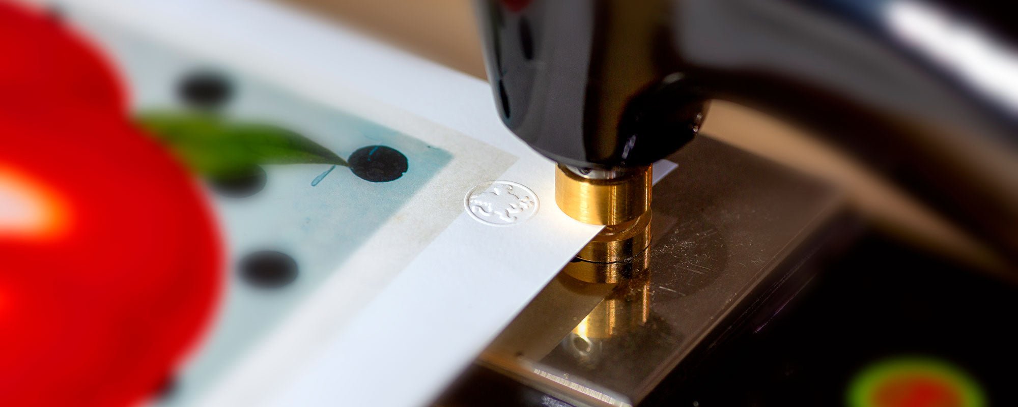
Exclusivity also arises in what lies beyond the print itself. Numbering, signature, and limited edition add collectible value to the work, but also a sense of closeness to the artistic process. The same applies to hand-finished details, where a print is enhanced with, for example, gold leaf or other manual interventions.
This type of finish is not relevant for all works. Some motifs benefit from purity and restraint. Others gain an extra dimension when the surface is broken by something handmade, adding light, unpredictability, or tactile contrast. Here, balance is crucial. A refined art print does not tolerate effects for the sake of effects.
At an atelier-based brand like StoltzeStudio, it is precisely this uncompromising approach that makes the difference. When work, paper, and finish are treated as a unified composition, the print takes on the character of a true art object.
How to choose the right art print on exclusive paper
The best choice rarely starts by asking what is most exclusive. The question is rather what suits the motif and the space where the work will reside.
If you desire a calm, sophisticated expression in the bedroom, living room, or lounge, a matte cotton paper will often be an obvious choice. It supports subdued colors and poetic compositions with a special softness. If the work needs to appear more graphic or sculptural in a modern interior, a smoother fine art paper may be more precise.
The format also plays a role. Large works require paper that can carry the scale without losing elegance. Small and medium-sized prints, on the other hand, can gain a lot from a distinct paper texture, as they are experienced more closely. Frame selection should be considered from the beginning, as glass, passe-partout, and moldings change both light, depth, and the visual temperature of the paper.
There is also a practical consideration. Very matte papers can be more sensitive to touch during handling, while smoother surfaces are sometimes easier to work with. This does not make them better, but it is a real difference, especially if the work needs to be relocated or included in high-traffic projects.
When is a cheaper paper sufficient?
The honest answer is that it depends on the purpose. If you are buying a print for a temporary space, an informal styling, or a project where budget is more important than archival quality, a simpler paper may suffice. Not all walls require museum quality.
But if the work is to be a permanent element in the home, if the motif has fine nuances, or if you want an experience with more depth and material awareness, the difference will be clear. This is especially true for art that is to be seen again and again. Over time, one rarely tires of quality. One often tires of compromises that were visible from the beginning, however.
A good art print has a quiet authority. It doesn't need to explain itself, and it doesn't try to impress with superficial effect. It stands there with its weight, its texture, and its precision - making the room more complete. If you choose with an eye for both motif and material, the paper becomes not just a carrier of the image, but a part of the presence you will live with every day.