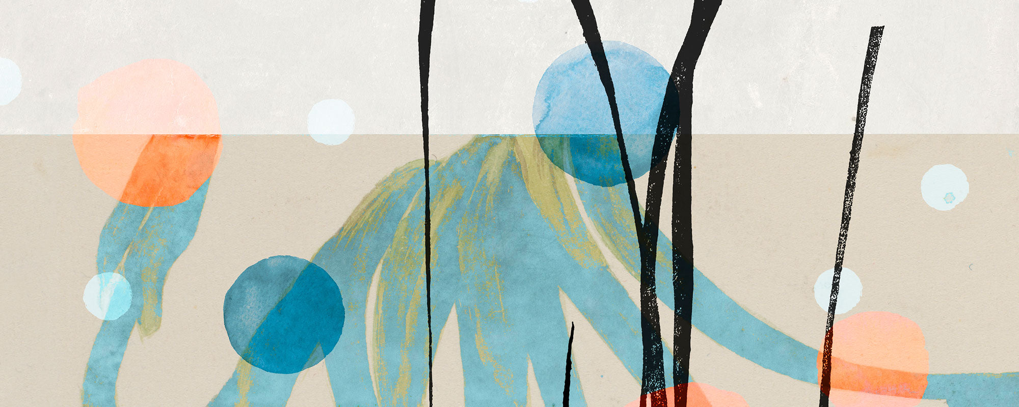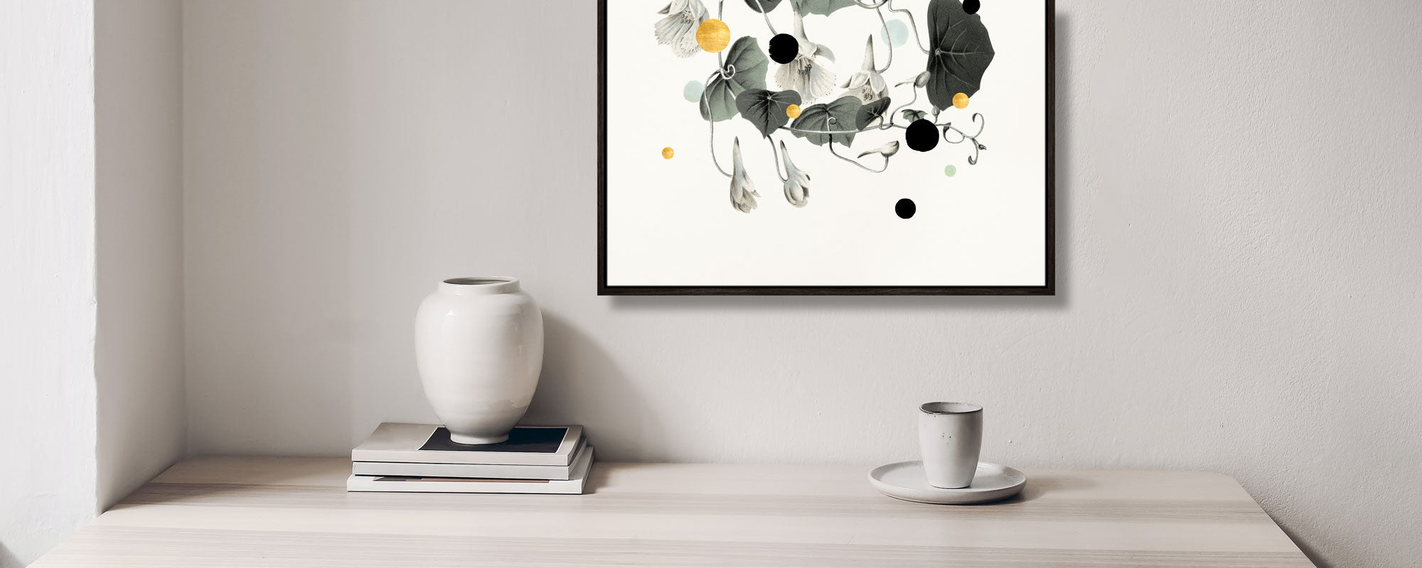
The strongest trends in art for hospitality environments
A lobby can be precise, discreet, and well-furnished – and still feel like a space you just pass through. Art is often the element that changes that experience. It adds rhythm, reflection, and a visual temperature that makes a hotel, a restaurant, or a members-only club environment a place guests remember. Trends in art for hospitality environments are therefore not just about what looks current on a wall. They are about creating an identity that can be felt long after check-out or the last cup of coffee.
For the hospitality industry, art has moved from being mere decoration to being an integral part of the guest journey itself. A well-chosen piece can slow down the pace upon arrival, give a corridor character, or spark a conversation that extends a dinner. At the same time, the most interesting projects place higher demands on curation: the artworks must be able to withstand architecture, daylight, materiality, operation, and an audience with many different perspectives.
Art as the signature of the place
The strongest hospitality environments don't just borrow an aesthetic. They build a unified visual language where art, furniture, lighting, and surfaces are in a deliberate relationship with each other. Here, art is not the last thing hung up when the project is finished. It is an active part of the space's dramaturgy.
This does not mean that every piece must match the color of the sofa or repeat the interior's palette. On the contrary, more depth often arises when art introduces tension: a raw collage against polished stone, a poetic figure against stringent woodwork, or a graphic motif that breaks an otherwise muted room. The right contrast gives the eye a place to pause.
For hotels and restaurants with ambitions for a distinct profile, generic city motifs and anonymous reproductions are on their way out. Guests quickly see through art chosen solely to fill a surface. Instead, there is a demand for works with a clear artistic sender, a visible process, and a quality that can withstand being seen repeatedly.
Current trends in art for hospitality environments
Tactile surfaces and visible craftsmanship
The digital everyday has made the physical more valuable. Therefore, works with clear materiality are gaining ground: deep pigments, texture in the paper, canvas with presence, and details that only emerge when you get close. A giclée print on exclusive paper can have an entirely different calm and weight than a standardized poster, especially when the color reproduction is nuanced and the framing is chosen with precision.
Hand-finishing adds an extra dimension to this trend. Gold leaf, painted interventions, embossing, or small variations make the work less interchangeable and more vibrant. In a lobby with many quick passages, such details become a quiet invitation to pause. It's luxury that doesn't need to be loud.
However, there is a practical balance. Very fragile surfaces or strong relief may be less suitable in areas with heavy traffic, luggage, and frequent cleaning. Here, a framed edition with protective glass or a durable canvas can be the more lasting solution, without compromising artistic integrity.
Local narratives without tourist clichés
Guests want a sense of place, but rarely in the form of predictable postcard motifs. The current movement is towards local references filtered through the artist's gaze: archival images, coastlines, specific colors, the rhythm of the city, historical fragments, or botanical traces from the surroundings.
The interesting part lies in the transformation. A collage can bring together found motifs and give them a new, contemporary tension. An abstract composition can carry the memory of a harbor or a neighborhood without literally illustrating it. In this way, the work gains relevance for the traveler, but also for the local guest who doesn't need their own environment explained.
For a hospitality project in Copenhagen, the Nordic light sensitivity or the changing surfaces of the harbor can be a discreet starting point. In an American boutique hotel, it might be the area's musical, architectural, or landscape layers. The point is the same: the place should be discernible in the art, not reduced to branding.
Muted color, precise intensity
Neutral interiors still dominate many premium environments, but this does not mean that art should be colorless. On the contrary, color is used more purposefully. Dusty mineral tones, deep ultramarine, ochre, burgundy, and soft green shades create a richness that works beautifully with wood, natural stone, wool, and brushed metal.
Instead of spreading many visual messages across the entire property, several projects work with single color accents. A striking piece at the reception, a series in the elevator area, or a color-saturated composition at the bar can define orientation points in the building. This makes the interior more coherent and helps guests intuitively navigate the spaces.
The muted palette is particularly well suited for wellness, private dining, and suites, where art should support rest and presence. In more energetic restaurants or creative lobbies, on the other hand, a graphic, high-contrast series can provide the necessary pulse. It depends on whether the room should make the guest land, stay, or move on.
Series instead of individual wall decorations
A single strong piece can carry a wall. But in larger hospitality environments, series are often the more convincing solution. The repetition of format, thematic approach, or color creates a visual thread through multiple rooms, without the experience becoming monotonous.
A numbered limited edition is particularly relevant here. It gives the project exclusivity and makes it possible to work with related pieces in different formats. In corridors, meeting rooms, and suites, the series can create calm through recognition, while each piece still has its own character. This is a more refined approach than buying large quantities of identical prints.
However, curation should allow for breathing room. If everything is part of the same series, a hotel can quickly feel like an exhibition hall with too strict a direction. Therefore, let a striking original, a sculptural frame, or a piece with a different materiality break the rhythm in selected places.
Art beyond the expected wall
The placement of art is becoming increasingly architectural. It meets the guest in niches, along staircases, in the transition between restaurant and lounge, or as part of wall panels and custom-built shelves. This makes particular sense when the work is conceived together with light and sightlines from the outset.
In hospitality environments, distance is crucial. A work that functions from the other end of a lobby must have a different compositional strength than a smaller print by a table where the guest sits close. Large surfaces often require clear forms and a confident color balance. Intimate zones tolerate more complexity, finer textures, and images that reveal themselves gradually.
Art at the bar or in the cafe also deserves special attention. This is where many guests wait, meet, and stay longer than planned. A poetic piece can create a sensory breathing space in an active room, while a sharp graphic composition can give the place a more urban energy. At StoltzeStudio, the encounter between studio, gallery, and coffee culture is a reminder that art is experienced most strongly when it is allowed to be part of everyday life.
From procurement to curation
The most common mistake is to choose art too late in the process. When all materials, wall colors, and lighting plans are already set, the art is forced to adapt instead of contributing. An early curatorial direction makes it easier to decide on scale, color palette, budget, and which rooms should have the most visual weight.
Start with the desired feel of the place rather than a specific style. Should the guest encounter tranquility, a cosmopolitan vibe, warmth, or intellectual edge? Only then does it make sense to evaluate artists, techniques, and formats. Also consider the light throughout the day. A work with gold leaf can change character beautifully in low evening sun, while reflections from glass can be distracting in a brightly lit foyer area.
Art for hospitality must be commercially viable, but it must not feel like a sales floor. When the selection is personal, the materials are well-crafted, and the works have room to breathe, art becomes a generous part of the hospitality. Give the guest something that doesn't require an explanation – but still makes them want to take a second look.