Trends in sensory home art now
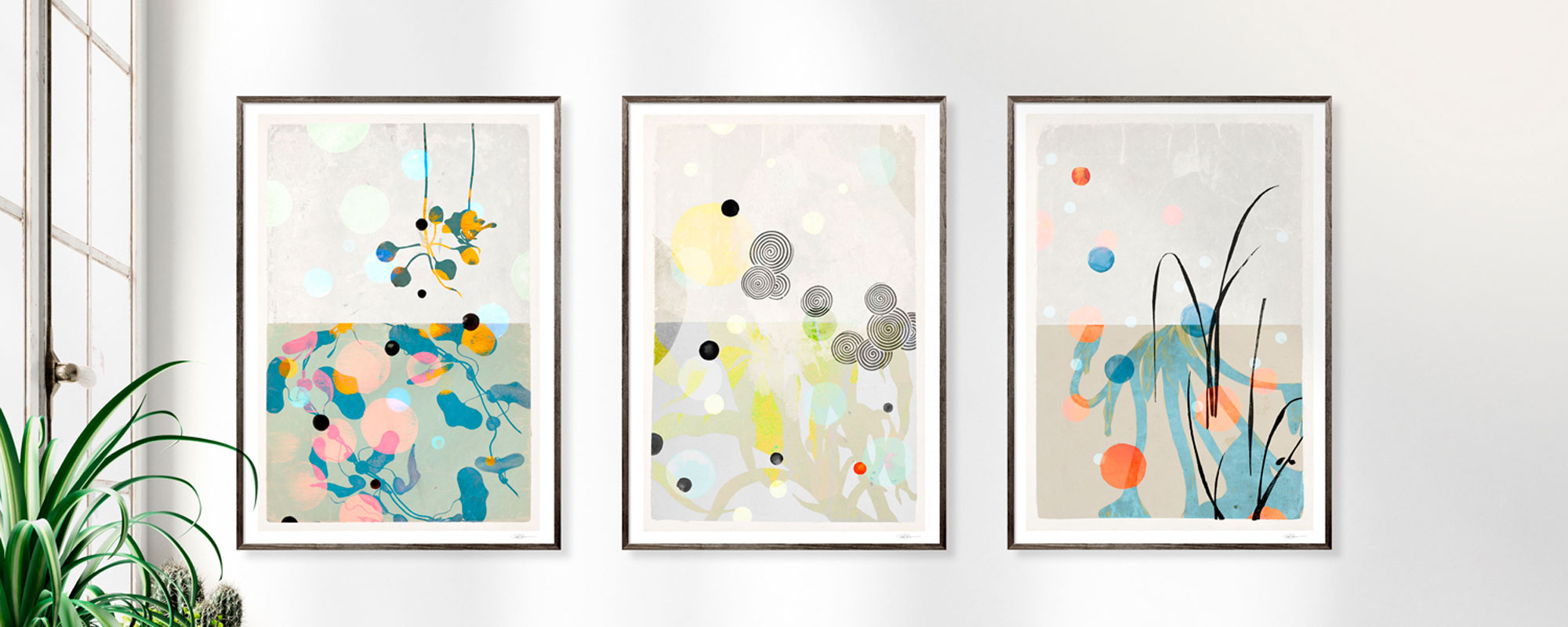
There's a distinct difference between a room that's merely decorated and a room that's felt. When examining trends in sensory home art, it's precisely about that difference - about artworks, materials, and compositions that bring inner calm, depth to one's gaze, and a more personal connection to the home.
This isn't a fleeting trend driven by an obsession with ornamentation. It's a counter-movement to slick surfaces, quick purchases, and visual noise. Sensory home art appeals to those who desire more than just a splash of color on the wall. They seek presence, texture, and artistic integrity. Art that doesn't just fill a space, but gives the room a pulse.
What characterizes trends in sensory home art?
The strongest movement right now is a shift from the purely decorative to the experiential. Art is increasingly chosen for its ability to influence a room's atmosphere. Not necessarily dramatically, but precisely. An artwork can be quiet, as long as it's intense.
This is evident in the choice of motifs, but even more so in the materiality. The weight of the paper, the texture of the canvas, the depth of the pigment, and the handcrafted details play a much larger role than before. While mass-produced wall art often thrives on quick recognition, sensory home art thrives on slow quality. It doesn't demand attention with volume. It holds it with finesse.
Concurrently, there's a growing interest in artworks that feel curated rather than algorithmic. This means less focus on standardized image solutions and greater demand for limited editions, signed prints, and original works with a clear artistic hand.
Tactile materials become part of the experience
One of the most significant trends is the tactile shift. Art shouldn't just be seen. It should be felt with the body. That's why surfaces with character are increasingly prevalent in both private homes and sophisticated hospitality environments.
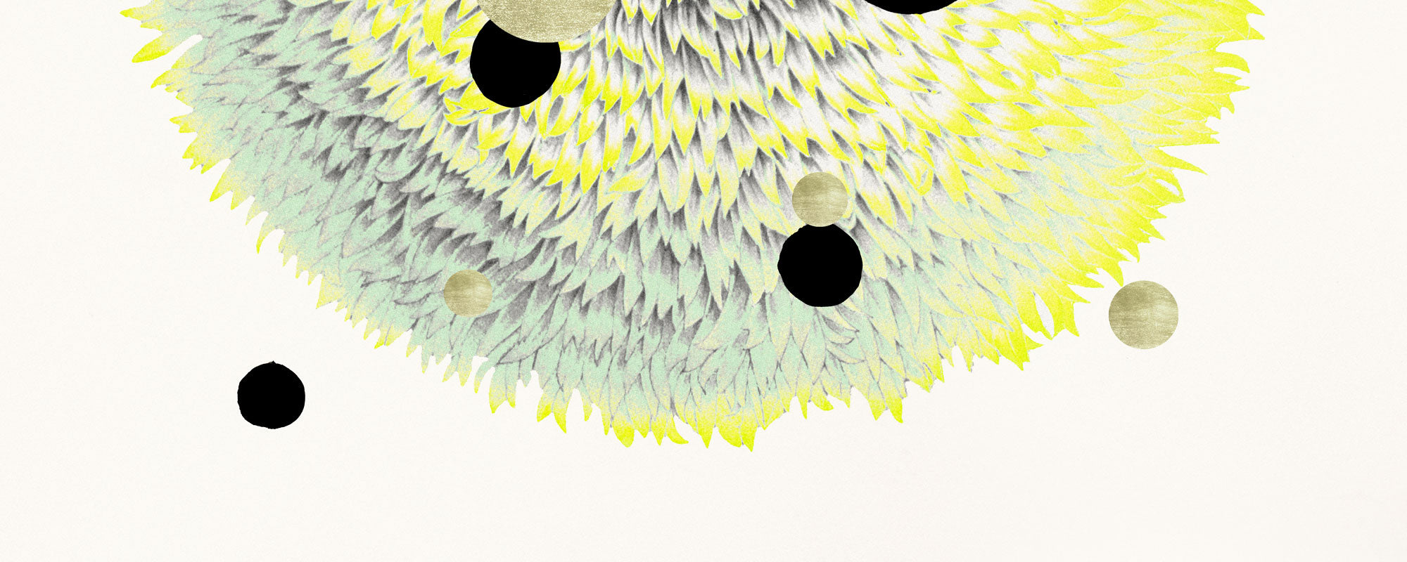
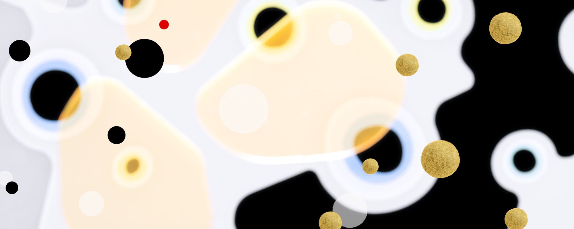
Giclée prints on exclusive cotton paper have gained new status because they reproduce nuances with an almost velvety depth. Canvas feels less polished and more architectural. Hand-finished elements - such as gold leaf, raised layers, or visible brushstrokes - add a kind of tangible luxury that cannot be fully replicated in standard prints.
This is also where a clear distinction emerges between premium art and generic wall decor. The sensory rarely arises solely from the motif. It lies in the encounter between the eye and the material. A subdued artwork can appear almost magnetic if the paper has the right weight, or if the light is caught in a subtle gold detail.
However, there's a trade-off. The more tactile and refined an artwork is, the more it demands from its placement and lighting. A hand-finished print will not come into its own in a dark corner with cold overhead lighting. Sensory art rewards careful consideration.
Muted palettes with warm undertones
The colors in trends within sensory home art are moving away from harsh contrast and towards more complex, calm scales. This doesn't mean beige monotony. On the contrary. The most interesting palettes work with layers of limed sand, dusty olive, oxidized red, deep umber, hazy blue, and warm broken whites.
The crucial thing is that the colors feel alive without shouting. They must be able to carry daylight, twilight, and artificial light with the same dignity. A sensory palette changes character throughout the day, thereby creating a richer experience in the room.
For many homes, this means a transition from high-contrast statement art to works that integrate more intelligently into the whole. Not invisibly, but integrated. A poetic collage in earthy tones can have a far greater impact than a noisy motif because it anchors the room in an atmosphere rather than an effect.
Naturally, this depends on the architecture of the home. In very minimalist interiors, a warm, tactile artwork can add humanity. In classic rooms, the same tones can emphasize depth and continuity. In more eclectic homes, the task is often to create calm among different objects. Here, the art's palette becomes an anchor point.
Curating rather than quick filling
Another important development is that more people are choosing fewer artworks – but better artworks. This is a mature trend. Instead of filling every wall, one or two strong pieces are chosen, given space to make an impact.
This is linked to a desire for the home as a sensory sanctuary. Over-curated gallery walls can be vibrant and personal, but they can also create unrest if everything competes for attention. Therefore, a more disciplined approach is now seen, where proportion, space, and placement are weighted higher.
A large piece above a sofa, a vertical format in a passageway, or a smaller series with precise spacing can create greater presence than ten disconnected choices. Curation is not about strictness for strictness' sake. It's about allowing each work to have the resonance it deserves.
Here, sensory home art also differs from trend-driven styling. Good curation is based on architecture, light, materials, and life rhythm. Not just on what looks good in a quick photo.
Hand-finished details and edition logic
There's a clear appetite for works with traces of decision and hand. Numbering, signature, subtle variations between copies, and manual finishing details give the work a different kind of presence. Not as a status symbol alone, but as proof of an original process behind it.
This is particularly relevant in a market where much visual content has become frictionless and infinitely reproducible. When a print is produced in a limited edition, or when the surface is individually refined, the work gains a different weight in the home. One doesn't just buy a picture. One chooses a specific rendition of an artistic work.
For the design-conscious buyer, this is a crucial difference. Limited editions don't automatically create quality, but when edition logic is combined with uncompromising production and a strong visual world, a rare balance between accessibility and exclusivity emerges.
A studio like StoltzeStudio understands precisely this balance – between the authenticity of the atelier, curated precision, and the sensory finish that makes the work present in everyday life.
Art that creates mood rather than theme
Previously, art in the home was often chosen based on themes: botanical, abstract, black-and-white, graphic. This approach still exists, but the most refined movement is heading in a different direction. You don't choose a theme first. You choose a mood.
This changes the question from "What does the artwork depict?" to "What does the artwork do to the room?" Does it provide stillness? Tension? Warmth? Contemplation? A gentle hint of melancholy? The best poetic compositions can hold multiple answers at once.
This is also why collage, archival motifs, and visual transformation are strong. They create layers and resonance. The viewer doesn't finish with them at first glance. This type of visual world is particularly well-suited for homes where a more sophisticated and slow aesthetic environment is desired.
How to choose with greater precision
If you want to work consciously with sensory home art, it's wise to start with the room and not with the desire to own something pretty. Look at the light first. Is it soft, sharp, cool, golden? Then assess the room's materials. Wood, stone, textile, and metal react differently to the art's surfaces.
Also, consider scale. A small, highly tactile piece can be powerful in an intimate space but disappear in a large living room. Conversely, a monumental format can be precisely what unifies an open living area. It doesn't just depend on the wall's size, but on the distance from which one experiences the artwork.
Finally, one should consider whether to choose a work that blends with the room's tone, or a work that creates a deliberate tension. Both can be right. One solution provides calm. The other provides edge. The crucial thing is that the choice feels intentional.
Sensory home art is not a trend to simply copy. It works best when chosen with an eye for materiality, mood, and longevity. A good artwork does not become less interesting when the season changes. It grows with the room, with the light, and with the person who lives with it. That is perhaps the most valuable trend of all.