Abstract organic art prints for modern spaces
Some artworks speak loudly. Others change a room by slowing down the pace. Abstract organic art prints fall into the latter category – they add movement without disturbance, character without being intrusive, and a kind of visual tranquility that many modern homes and workspaces lack.
This is precisely why this type of art has become a natural choice for design-conscious interiors. While clean lines, smooth surfaces, and architectural minimalism can be beautiful, they can also become cold. Organic forms provide a counterpoint. They soften the space, create rhythm, and give the eye something more sensual to rest upon.
What characterizes abstract organic art prints?
Abstract organic art prints exist in the tension between the free and the precise. They are abstract because they do not necessarily depict anything recognizable. They are organic because the forms feel alive – like contours borrowed from nature, the body, the landscape, shadows, or the inherent logic of growth.
The organic expression is not just about soft curves. It can also be found in the surface, in the movement of color, or in the asymmetry of the composition. A surface may be open. A form may appear displaced. A tone may fall slightly unevenly. This is often where the artwork acquires its humanity.
The strongest prints in this category balance intuition and discipline. They appear spontaneous but are rarely accidental. Every curve, every void, and every color field contribute to a whole that feels calm, even when complex.
Why they work so well in modern interiors
Modern spaces often have a clear architectural structure. Lines, proportions, material transitions, and light are carefully considered. This is precisely why the role of art becomes crucial. It shouldn't just fill an empty wall. It should add a new dimension.
Abstract organic art prints do this particularly elegantly because they work with contrast without conflict. In a room with steel, stone, oak, or glass, they add something more sensual. In a neutral palette, they can create depth with earthy tones, chalky nuances, black, sand, ochre, or muted green tones. In more layered interiors, they can bring together elements that would otherwise appear too scattered.
There is also a practical strength in their openness. A figurative work can steer the mood very precisely. This can be an advantage, but it can also limit the room. Abstraction provides more breathing room. The viewer is allowed to engage with the artwork on their own terms, and this often makes this type of print more enduring in the home.
An artwork that does not tire
Many choose abstract art when they want something they can live with for a long time. This makes sense. When the motif is not unambiguous, the artwork reveals itself differently depending on the light, the season, and the context in which it hangs. The same print can be experienced as meditative in a bedroom, sophisticated in a living room, and focusing in an office.
This quality is particularly valuable if one invests in art with high material standards. A print on exclusive paper or canvas deserves a motif that holds the gaze over time – not just for the first week.
How to choose the right print for the room
The obvious question is not just what you like, but how the artwork should function in the room. A good art print elevates the whole. It must have a purpose beyond the decorative.
Start with scale. A large work with organic forms can create tranquility in a surprising way, especially above a sofa, a dining table, or a bed. Small works require more precision. They can be refined, but if the wall is large, they risk disappearing. Here, a series can be stronger than a single print.
Next comes the color scheme. If your interior is already nuanced with textiles, wood types, and materials, a more subdued work may be the right decision. If, on the other hand, the room is very clean and monochrome, the art print can certainly carry more tonal depth. This does not necessarily mean strong colors. Often, layers of beige, black, rust, dusty blue, or warm mineral tones are enough.
The composition is at least as important. Some abstract organic works are centered and calm. Others are more displaced and lively. The former fits beautifully in rooms where balance and calm are sought. The latter can add energy to thoroughfares, entrances, or work zones.
The material is not a detail
When talking about art prints in the premium segment, the material is part of the work's language. A motif with fine transitions and tactile nuances requires a printing quality that can support it. Giclée prints on exclusive paper typically provide a special depth and a more sophisticated rendering of the color's texture. On canvas, a different presence emerges – slightly warmer, a little more painterly.
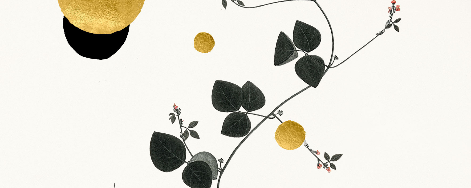
The finish also plays a role. Hand-finished details, texture in the paper, or discrete layers of gold leaf can significantly alter the character of the work. This is not decoration for decoration's sake. When done with discipline, it adds light, variation, and a more experiential surface.
Abstract organic art prints in different rooms
In the living room, this type of art often functions as an anchor. Not necessarily as the room's most dominant element, but as the work around which the rest falls into place. Here, larger formats can be particularly effective, as they give the composition room to breathe.
In the bedroom, softer, more open compositions often work best. Too sharp contrasts or too many elements can create visual disturbance. Organic forms in muted shades, on the other hand, provide a sense of calm without becoming anonymous.
In offices and hospitality environments, the balance is different. Here, the work should have character and direction. It must be able to withstand repeated glances and changing users. Abstract organic prints are well-suited because they appear curated and professional without locking the room into too concrete a narrative.
When curation makes the difference
Not all abstract prints are equally strong. This category is easy to underestimate, precisely because the expression can seem simple. But the difference between an ordinary decorative print and an artistically convincing work lies in proportions, materiality, color precision, and the ability to create tension without noise.
This is where curation becomes crucial. A well-chosen print does not feel randomly produced to fit in everywhere. It carries an artistic stance. One senses that someone has considered format, paper, edition, and finish. At an atelier-rooted brand like StoltzeStudio, this uncompromising approach is an essential part of the experience – not just the motif, but the entire physical presence of the work.
Limited edition or open edition?
It depends on what you are looking for. Open edition can be a strong choice if the focus is primarily on the visual interplay in the interior design. Limited editions add a different weight. Numbering, signature, and limited circulation give the work collectible value and a more personal relationship to the object.
There is no single right answer. If you buy art as part of a well-designed home, both formats can be relevant. If, on the other hand, you want something rarer and more present as an object, limited edition will often feel more satisfying.
The quiet luxury of organic forms
There's a reason why abstract organic works are perceived as more refined than much trend-driven wall art. They don't try to impress with effect. They work more slowly. They build mood through form, balance, and materiality.
It's a form of quiet luxury that suits both private homes and professional environments. Not demonstrative, but clear. Not cold, but controlled. And precisely for this reason, this type of art print remains relevant, even as interior design trends shift.
A good choice is therefore not about finding the most striking work, but the work that continues to reveal itself. When a print can add calm, depth, and poetic weight to a room without demanding attention, it has hit something essential.