Best wall art for office: how to choose
An office quickly reveals whether the space is intended as a workplace or just a place with a desk and chair. The light, materials, and walls either work with you or against you. Therefore, when discussing the best wall art for an office, it's not about filling empty surfaces, but about creating a space with concentration, character, and visual calm.
The best art for an office does something more precise than ordinary decoration. It sets a tone. It can sharpen a professional expression, soften a harsh interior, or give an otherwise neutral room a clear identity. For creative professionals, leaders, consultants, and design-conscious companies, wall art is often the element that makes the decor appear deliberate rather than accidental.
What characterizes the best wall art for an office?
Good wall art in a work environment must be able to withstand repetition. You look at it every day, often in the periphery, sometimes during short breaks, other times in the midst of concentrated work. Therefore, works with depth, texture, and compositional balance usually work better than motifs that try to do too much at once.
This doesn't mean that office art should be anonymous. Quite the opposite. But there's a difference between a work that keeps unfolding itself and one that shouts loudly for the first three days and then seems forced. Poetic compositions, graphic progressions, archive-based collages, and photographic works with a calm tension often have a strong place in the office because they provide both presence and breathing room.
Materiality also matters more than many expect. A print on exclusive, matte paper has a different presence than a glossy standard poster. Canvas can add warmth and weight. Hand-finished details give the work a discreet luxury, which is particularly effective in spaces where aesthetics and professionalism can stand side by side.
Choose art according to the office's function
The most elegant choice is not necessarily the same in all work environments. A home office requires something different than an executive boardroom, and a creative studio has a different rhythm than a meeting room.
In a home office, it often makes sense to choose works that create focus without making the room feel cold. Here, subdued color fields, tactile collage works, or graphic motifs with clear structure work particularly well. They provide a sensory breathing space during the workday and help the room feel lived-in, not just functional.
In meeting rooms, the art can have more direction. It should be able to support a room socially and professionally, without dominating the conversation. Here, larger works often work better than many small ones. A single, well-placed piece with a strong composition conveys more authority than a wall filled with medium-sized solutions without mutual relation.
In receptions, waiting areas, or customer-facing offices, art plays a representative role. It speaks to level, taste, and ambition. Here, limited editions or works with clear artisanal details can be particularly effective because they signal curation rather than standard decor.
The best wall art for an office is rarely the most literal
There is a specific type of office art that tries to resemble productivity. Typographic slogans, obvious cityscapes, or overly direct symbolism about success and innovation. It might seem obvious, but the result is often flat.
The most compelling office environments rarely choose the literal. They choose works that create atmosphere, resonance, and a sense of depth. Abstract compositions, refined photographic motifs, and works with historical or archive-based traces allow more room for reflection. They make the room more intelligent to be in.
This is precisely where curation becomes crucial. Art for the office should not be chosen solely based on color codes or size requirements, although both are important. It should be chosen based on the feeling the room should evoke. Should it be sharp and graphic, warm and tactile, or quiet and almost meditative? Once that decision is clear, the rest becomes easier.
Format, placement, and proportions
A good work can lose its strength if the format is wrong. Works that are too small above a large desk can make the wall seem unfinished. Works that are too large in narrow rooms can push the architecture out of balance. Proportion is not a detail. It is part of the experience.
Above a desk, horizontal formats often appear calm and unifying. They follow the line of the furniture and provide a natural visual anchor. On a narrow wall, a vertical work can create height and elegance. In larger offices or open workspaces, a striking work in a generous format can unify zones that otherwise feel disjointed.
Placement must also consider viewing angles and light. Art hanging behind a screen or in harsh backlighting loses much of its effect. If the work has subtle nuances, gold leaf, or textured surfaces, lighting becomes even more important. Office art should be subtly perceived, but it should not become invisible.
Colors that work with the room
Color choices in the office should neither be timid at all costs nor dramatic just for effect. The best solutions arise when the colors support the room's energy.
Soft earthy tones, deep blues, chalky grays, and warm neutrals often create a sense of calm and concentration. They are particularly suitable for rooms with many digital surfaces, as they provide a more organic place for the eye to rest. If, on the other hand, the office is very subdued, a work with controlled contrasts can add vibrancy without disturbing.
It also depends on the industry and personality. A law firm, an architect's office, and a publishing house do not need to speak with the same visual voice. Some rooms call for strict composition and understated tones, others for more artistic friction. The common denominator is that the color should feel chosen, not accidental.
Materials elevate the experience
If the goal is an office with longevity and integrity, material selection is central. High-quality Giclée prints provide a color depth and precision that standard prints rarely match. Exclusive paper with a matte, almost velvety surface gives the motif calm and weight. Canvas can work beautifully in more tactile or hospitality-inspired environments where a softer room feel is desired.
Frames play at the same level. A thin oak frame can make a work lighter and more architectural. A dark frame can unify a motif and give it more gravitas. Museum glass can be an important detail in offices with a lot of daylight, as it reduces reflections and allows the work to stand out more clearly.
When art is produced uncompromisingly, it can be felt, even from a distance. This is especially true for works with hand-finished details, numbered editions, or signed editions. They not only add value but a different kind of presence.
Single artwork or curated series?
It depends on the room's architecture and the story you want to tell. A single large artwork often has the most calm. It can define a room with a few strokes and provide an almost gallery-like clarity. It is often the strongest choice for meeting rooms, executive offices, and receptions.
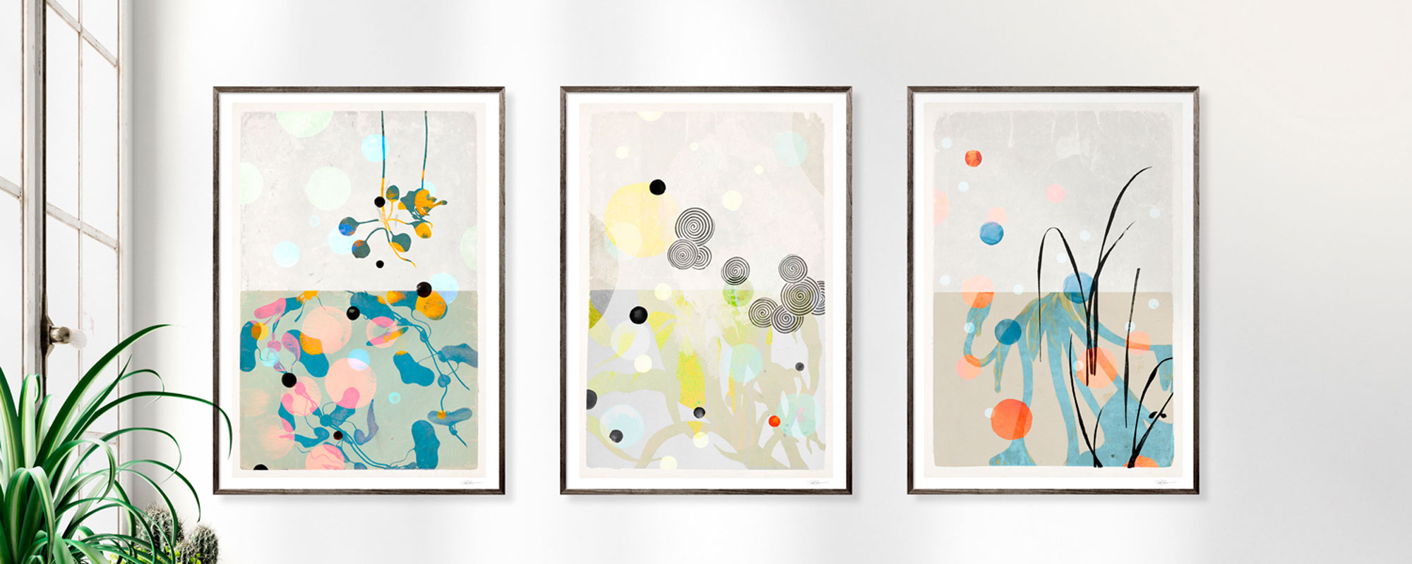
A curated series, on the other hand, can create rhythm in long hallways, larger work zones, or rooms where a more editorial atmosphere is desired. Here, it is important that the works speak to each other through tone, format, or thematic kinship. Otherwise, the installation quickly takes on the character of a collection rather than curation.
At a place like StoltzeStudio, this studio-anchored approach makes sense because works, formats, and finishes can be read as parts of a unified aesthetic attitude rather than standalone decoration.
When the office is also part of your brand
For many, the office is not just a place to work, but a space that others read. Clients, partners, candidates, and guests quickly perceive whether the surroundings are well thought out. Art here is a quiet but precise language.
The best wall art for an office supports the impression you want to leave. Not by being ostentatious, but by showing that quality, culture, and aesthetic judgment are an integral part of how you work. This is especially true in a time when many offices look remarkably similar.
A well-chosen work does more than beautify. It creates pause, precision, and personality. And precisely for this reason, the right art for the office is not the one that best fills the wall, but the one that makes the room fall into place.