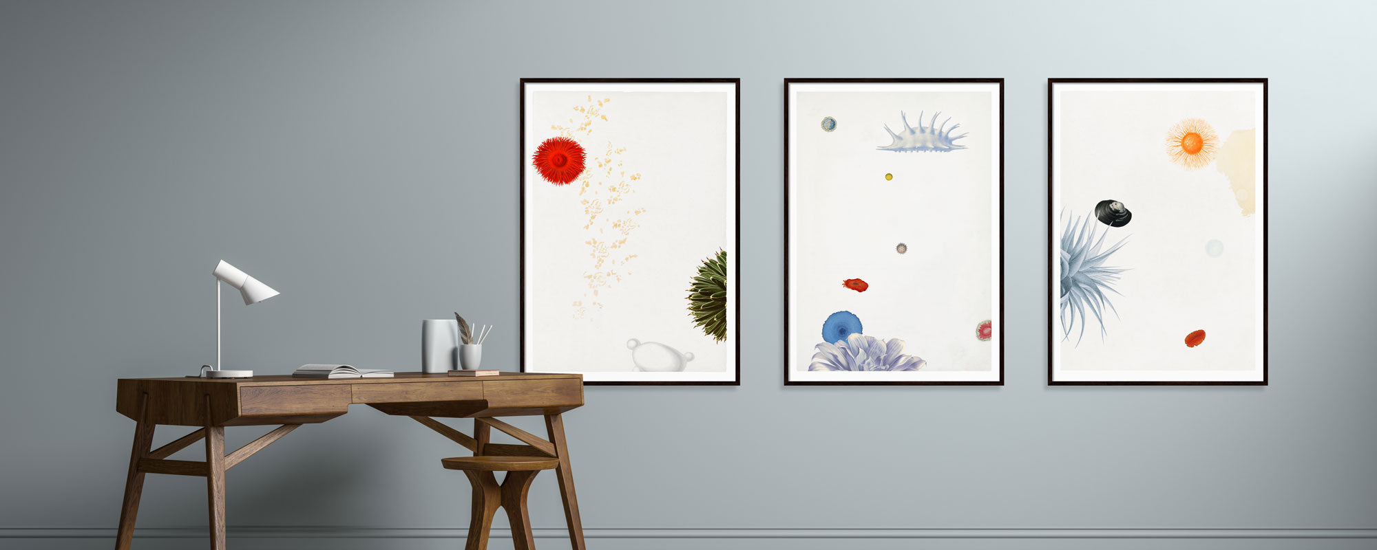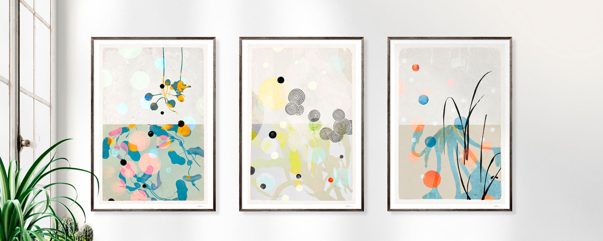
Guide to curated wall art for your home
A room quickly reveals itself through its walls. Not because they take up the most space, but because they set the tone for everything else – the light, the furniture, the rhythm, the calm. A guide to curated wall art is therefore not about filling empty surfaces. It's about creating a visual whole where each piece contributes presence, character, and precision.
Curated wall art differs from random decoration in its intention. Consideration is given to format, negative space, materiality, and the relationship between the artwork and the room. This doesn't mean everything has to match. On the contrary, the most interesting walls often arise in the tension between the strict and the poetic, between the graphic and the organic, between subtle nuances and a single work with clear weight.
What Curated Wall Art Actually Means
To curate is to select with discernment. In interior design, this means that art is not merely chosen because its color matches the sofa, but because the piece adds something the room is lacking. This could be depth, contrast, warmth, or stillness.
A curated wall rarely feels over-explained. It appears cohesive, but not overly polished. There can certainly be tension in the composition, as long as it is deliberate. For example, a hand-finished print with gold leaf can work beautifully in a muted interior precisely because it adds a discreet glow rather than a high level of visual noise.
This is also where quality becomes visible. The paper's surface, the depth of the pigments, the signature, the edition's limitation, and the frame's finish significantly change the experience. From a distance, many artworks look similar. Up close, they do not.
Guide to Curated Wall Art in Practice
The first question is not what you like. The first question is what the room asks for. A large, bright living area can accommodate works with scale and air, while a smaller entryway often benefits from a more concentrated composition. If you start solely with your own preferences, you risk buying good artwork for the wrong place.
Therefore, first look at the architecture. Where does the light fall? Where is the weight in the room? Is there a high ceiling, calm surfaces, distinctive materials, or many visual interruptions? Art should work with the room's lines, not against them. A vertical piece can lift a narrow wall, while a horizontal format can create calm above a low sideboard or sofa.
Next come the proportions. A classic mistake is to choose works that are too small. Especially above furniture, art should have enough volume to relate to what it hangs over. As a rule of thumb, the artwork or composition can fill about two-thirds of the furniture's width. But it depends on the expression. Minimalist art with a lot of negative space around it can easily be smaller if the intention is precisely stillness.
Colors require the same precision. Curated wall art does not need to slavishly repeat the room's palette. Often, it is more refined to work tonally. If a room is kept in limewashed, warm nuances, a work in dusty earth tones, charcoal black, and off-white can create depth without appearing decorative. Conversely, a single work with striking contrast can act as a spatial anchor if the rest of the decor is restrained.
Choose Fewer Works, But Choose Better
The strongest curation rarely arises through quantity. It arises through selection. One large composition with presence can do more for a room than six smaller works without mutual relation.
This does not mean that gallery walls are excluded. They simply require greater discipline. The works must communicate through tone, motif, rhythm, or material. If everything is different in color, size, and mood, the eye gets no direction. The result is often more noise than character.
Limited editions, signed prints, and works with clear materiality add something special here. They not only give the image surface value, but also a story. A Giclée print on exclusive paper has a different depth and tactility than standard production, and that difference is not just technical. It can be felt in the room.
Materials Change the Experience
When talking about wall art, the material is often overlooked in favor of the motif. This is a misjudgment. The material helps determine whether the artwork is perceived as sharp, soft, warm, graphic, or almost sculptural.
Paper often provides a more refined and intimate reading. It is particularly well-suited for works with nuanced transitions, collage elements, drawn details, and photographic archive traces. Canvas can add more volume and a more painterly presence, especially in larger formats or rooms that can accommodate a fuller surface.
The frame is also not a neutral choice. A narrow, dark frame can sharpen a work and give it architectural precision. Oak or lighter wood types add warmth and a more organic tone. If the artwork already contains many details, it is often wise to keep the framing calm. If the motif is simple, a strong frame can elevate the whole.
Hand-finished details deserve special consideration. Gold leaf, texture, or painterly interventions give the artwork a changing life in the light. This works best when the surroundings allow space for precisely that quality. In a room with too many shiny surfaces, the effect can be lost. In a more muted interior, it is allowed to glow.
How to Build a Wall with Calm and Tension
There are two overarching strategies, and both can be correct. One is the solitary artwork, where one motif is given space to stand alone. This choice works particularly strongly in bedrooms, entryways, and dining areas, where a sense of calm with a clear identity is desired.
The other is the composite composition. Here, the wall becomes a curated field where the relationship between the artworks is just as important as the artworks themselves. If you choose this path, start with the strongest piece and let the others support it. Think in rhythm rather than symmetry. Perfectly equal spacing between all frames is not always the most elegant. Sometimes a slight shift feels more alive.
Height matters more than many think. Art is often hung too high, creating distance rather than intimacy. As a starting point, the center of the artwork should be roughly at eye level, but above furniture, it can be a bit lower to maintain a connection to the decor. There should be air, but not a void.
If you are working with multiple pieces, lay them out on the floor first. This allows you to get a feel for the balance before you start on the wall. This method sounds simple, but it often saves both time and compromises.
What Suits Different Rooms
The living room can handle complexity. Here, art can have layers, texture, and a certain weight, because the room is used for extended periods and seen in changing light. In the bedroom, a more muted register often works stronger. Calm compositions, soft contrasts, and works with poetic restraint support the mood one wishes to remain in.
In the entryway, art should quickly set a clear tone. A single striking piece can work better than several small ones. In the home office, works with graphic precision or quiet intensity often provide more focus than overly narrative motifs. Hospitality environments and common areas again require a different balance, where art must both create character and be generous enough to meet many gazes.
Therefore, there is no single solution that fits everything. Curation is always context. The same artwork can appear exquisite in one room and wrong in another.
The Most Common Mistake
The most common mistake is buying art too quickly. Not because spontaneity is wrong, but because good rooms rarely arise through haste. When a piece is meant to live with you for years, it should be given time.
Look at what you keep returning to. Which motifs continue to hold your attention? Which colors feel right both morning and evening? Which materials speak with the rest of your home without disappearing into it? This type of selection is not slowness for slowness' sake. It is respect for the whole.
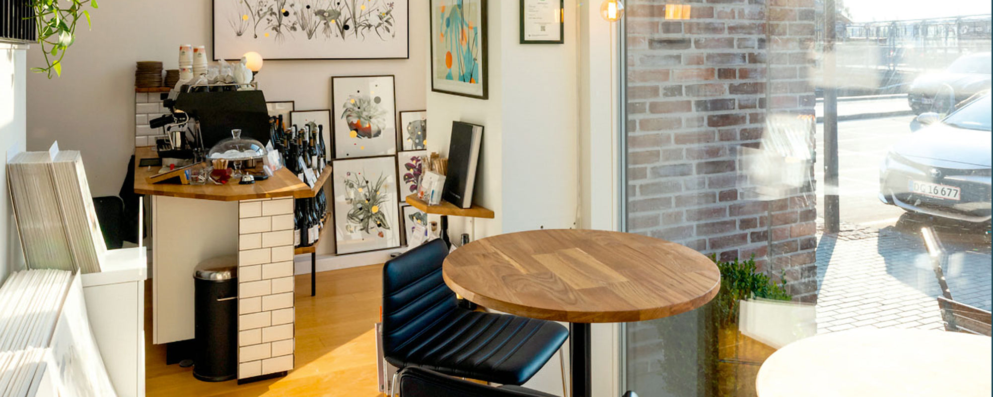
At StoltzeStudio, curation itself is part of the artwork's value – not just as an aesthetic filter, but as an uncompromising approach to the choice of paper, finish, edition, and visual integrity. It is this difference that makes wall art more than mere decoration.
A home rarely becomes stronger by having more things. It becomes stronger through better choices, thoughtfully placed. When art is allowed to be precise, sensory, and well-chosen, the wall does not just become prettier. It becomes more personal to live with.