


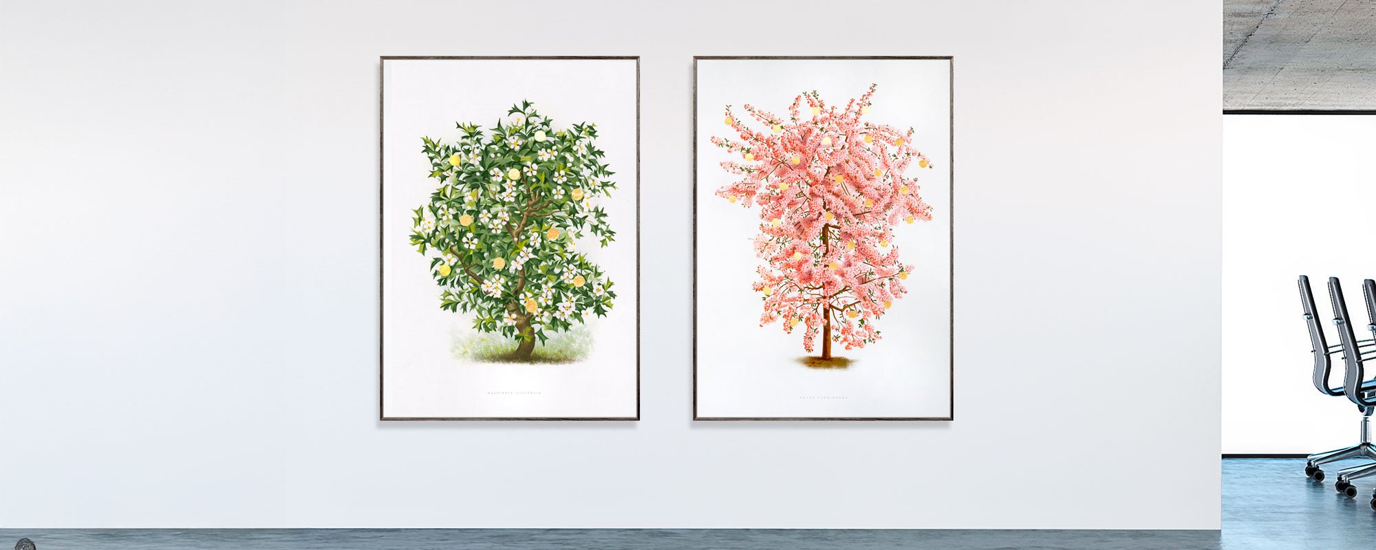
Guide to wall art in hotel interiors with artistic weight
A hotel room is rarely remembered for its bedspread alone. Rather, it's the view that greets the guest over the headboard, the tactile surface by the elevator, or the unexpected composition in the bar that lingers in memory. This guide to wall art in hotel interiors is therefore not about filling bare walls, but about creating a visual rhythm that makes a stay a site-specific experience.
Wall art is part of the hotel's hospitality. It can slow the pace after a day of travel, give a lobby its own pulse, or add a thoughtful touch to an anonymous hallway. When art is chosen with precision, it doesn't become decoration on the periphery, but a foundational part of the atmosphere the guest steps into.
Start with the hotel's narrative - not with the color swatch
The strongest art program springs from a clear idea of the place. Is the hotel urban and graphic, calm and tactile, historically rooted, or created as a sensory sanctuary from the city's pace? The answer should be evident in the works' motifs, scale, and materiality.
A boutique hotel with warm woods, whitewashed walls, and subdued lighting can support poetic compositions, organic forms, and works with visible traces of hand craftsmanship. A sharper, more architectural hotel can benefit from collage, abstraction, or photographic archival motifs, where lines and contrasts create energy without disturbing the space.
This does not mean that every piece must repeat the interior's colors. On the contrary, art is often most interesting when it creates a controlled tension. A deep ultramarine surface against warm oak or a work with gold leaf in an otherwise subdued room can add precisely the friction that makes the decor memorable. Cohesion is about temperament, not about tone-on-tone.
Guide to wall art in hotel interiors: Choose scale with calmness
Scale is one of the most crucial – and most overlooked – decisions. A small artwork on a large wall can feel like an apology, while an oversized motif in a compact room quickly feels visually intrusive. The art's format should be considered in conjunction with the wall's proportions, the furniture, and the distance the guest actually has to the piece.
Above a bed, one prominent artwork often works better than a dense salon hang. Here, the art is the first and last visual impression in the room, and the composition should have enough presence to stand up to the bed's volume. As a rule of thumb, the total width of the artwork can be about two-thirds of the width of the bed or headboard. This is not a rule to be followed mechanically, but a good starting point for balance.
In lobbies and restaurants, art can be more scenographic. Large formats can unify high ceilings and open spaces, while a series of related works can create direction through a long room. In corridors, repetition is particularly effective: not as hotel art in a uniform sense, but as a curated sequence where each work varies motif or color scheme within the same visual family.
Hang with respect for the guest's gaze. In common areas, the center of the artwork is typically placed around eye level for a standing viewer, but above seating and beds, the placement should be adjusted according to the furniture's weight. Art hung too high loses intimacy and appears to float above the room rather than belong in it.
Create zones with varying degrees of intensity
A hotel is not a single space. Guests move from the anticipation of arrival to the private tranquility of their room, from the social energy of the bar to the transitional space of the corridor. The expression of the art should follow this dramaturgy.
In the reception area, the artworks should make a clear statement. Here, a large collage, a limited edition, or an original artwork can define the hotel's visual voice in seconds. Choose one distinctive piece rather than a wall with many safe choices. It is precisely upon arrival that the guest should understand that the place has a consciousness of materials, culture, and details.
In the rooms, the task is more refined. The art should have personality but also allow for rest. Motifs with openness, depth, and a balanced color palette often work strongly because they can be experienced differently morning and evening. Avoid making each room an exhibition space with competing effects. A well-chosen composition with strong paper quality and nuanced print reproduction can be more compelling than several decorative elements.
Restaurants and bars tolerate a higher intensity. Here, color, graphic contrasts, and more complex visual surfaces can support conversation and atmosphere. However, this depends on lighting level and acoustics. If the room is already characterized by patterned textiles, travertine, brass, and vibrant lighting, the art should create focus rather than additional noise.
Materials must be able to withstand the hotel's daily life
A piece of art should not only look beautiful at the opening. It must maintain its integrity through changing light, cleaning, many guests, and daily operation. Therefore, material selection is both an aesthetic and practical discipline.
Giclée art prints on exclusive, acid-free paper have a special depth in colors and details. They are ideal when a hotel desires the tactile sensation of art on paper and a precise reproduction of collage, illustration, or photographic material. With UV-protective glass and a high-quality frame, they can function elegantly in both rooms and common areas.
Canvas can be the right choice when the artwork needs more physical volume or a softer, painterly presence. The surface often reduces glare compared to glass, which is an advantage in rooms with many light sources. On the other hand, canvas requires careful consideration in high-traffic areas where corners and edges can be more easily exposed.
Hand-finished details, such as 24-karat gold leaf, provide a particularly lively response to light. This is a strong quality in intimate lounges, suites, or private dining rooms where the guest gets up close. In a busy lobby, the same finish can be effective, but the placement must be deliberate so that the artwork is not reduced to a mere shining effect from a distance.
The frame is not an afterthought. It defines the transition between artwork and architecture. Dark wood can add weight to light walls, natural wood brings warmth, and a sleek, powder-coated frame emphasizes a more contemporary look. Use a few consistent framing principles across the hotel, but allow for variation where the room function calls for it.
Curate series rather than buying individual pieces haphazardly
A collection appears cohesive when there is a conscious relationship between the works, even when they are not identical. This relationship can lie in the colors, a recurring motif, a graphic technique, or the same artistic hand. The series gives the guest an experience that the hotel is composed as a whole.
This is particularly relevant on floor plans with many rooms. Instead of repeating the same image, one can work with an edition where each motif has its own variation. Numbered and signed limited editions add a sense of authenticity and collector's value, without the hotel losing visual coherence.
However, curation should not become too uniform. Guests are not looking for a catalog on the wall. Let a special piece break the rhythm by a staircase, in a suite, or at the transition to a restaurant. Such visual pauses create attention and make the movement through the house more sensory.