How to find art for the reception area with peace of mind
A reception area is assessed in seconds. The lighting, materials, smell of coffee, sound of conversations, and the first glance at the wall together create an impression of who inhabits the building. Therefore, how to choose art for your reception area is not about filling an empty space. It's about selecting a piece that gives the arrival weight, direction, and a quiet sense of character.
Art in a reception area needs to do something special: it must welcome many different people without becoming anonymous. It must function in motion, from a distance, and at eye level. And it must retain its presence on an ordinary Tuesday when the room is not filled with guests.
Start with the Reception Area's Role
Before colors, artist names, and frames are considered, the function of the reception area should be clear. Is it a calm arrival point in a creative studio, a precise welcome in a law firm, or a more sensory lounge in a hotel or showroom? The answer determines how much the artwork should command attention – visually as well as emotionally.
A reception area with high activity often calls for a composition with a clear structure. The artwork can have layers, texture, and details, but it must also cohere as one strong gesture from several meters away. In a smaller, more intimate space, a piece with finer traces, tactile surfaces, or poetic fragments can offer a slower experience.
Also, consider what the guest should see first. The wall behind the reception desk is typically the room's most significant placement but not always the only correct one. An artwork that greets the guest at the entrance can create a more immediate arrival. Art in the seating area, on the other hand, can transform waiting time into a sensory haven. Placement dictates the artwork's pace.
How to Find Art for a Reception Area with a Clear Visual Direction
The strongest reception area is rarely the most over-decorated. It has a visual idea that is felt before it is explained. The artwork can support the architecture, create a deliberate contrast, or act as the element that unifies the room.
If the interior is sleek, monochromatic, and characterized by stone, glass, or metal, a collage with organic forms, archival references, or saturated hues can add humanity. Conversely, a graphic, minimalist piece can bring precision to a room with many materials, textiles, and historical details. Contrast is effective when chosen with discipline.
It's tempting to choose art that perfectly matches the sofa, the accent color of the logo, or the tone of the carpet. But art should not be reduced to a color swatch. Instead, find a piece that has a related temperature: cool and architectural, warm and earthy, clear and energetic, or subdued and contemplative. This way, the room achieves coherence without losing tension.
Choose a Piece with a Clear First Impression
A reception area is not a private library where one can stand for a long time in front of a wall. The first glance must therefore be generous. It could be a striking color field, a clear silhouette, a rhythm in the composition, or a motif that captures the eye for a moment.
This doesn't mean the artwork should be simple. The best pieces often have a clear overall unity and a richness that reveals itself up close. From a distance, they function as a visual anchor. Up close, they reveal the texture of paper fibers, hand-applied gold leaf, a fine registration mark, or an unexpected transition between colors. This dual experience gives the reception area depth.
The Format Must Be Readable from a Distance
Works that are too small are one of the most common mistakes in reception area decor. A small format can be intense and beautiful, but it easily gets lost on a large wall or behind a wide desk. Here, it is often more convincing to choose one generous piece rather than several smaller ones that compete for attention.
As a rule of thumb, art should have a clear physical presence in relation to the wall and furniture. Measure the wall's free space, the width of the reception desk, and the typical distance a guest stands from it. A piece behind the counter should ideally feel like part of the room's architecture, not an afterthought.
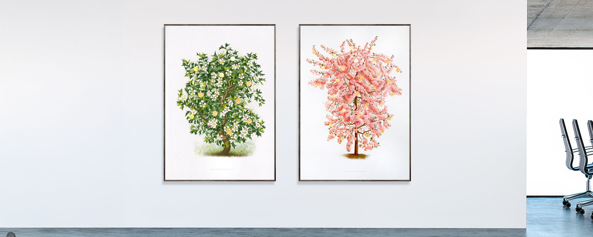
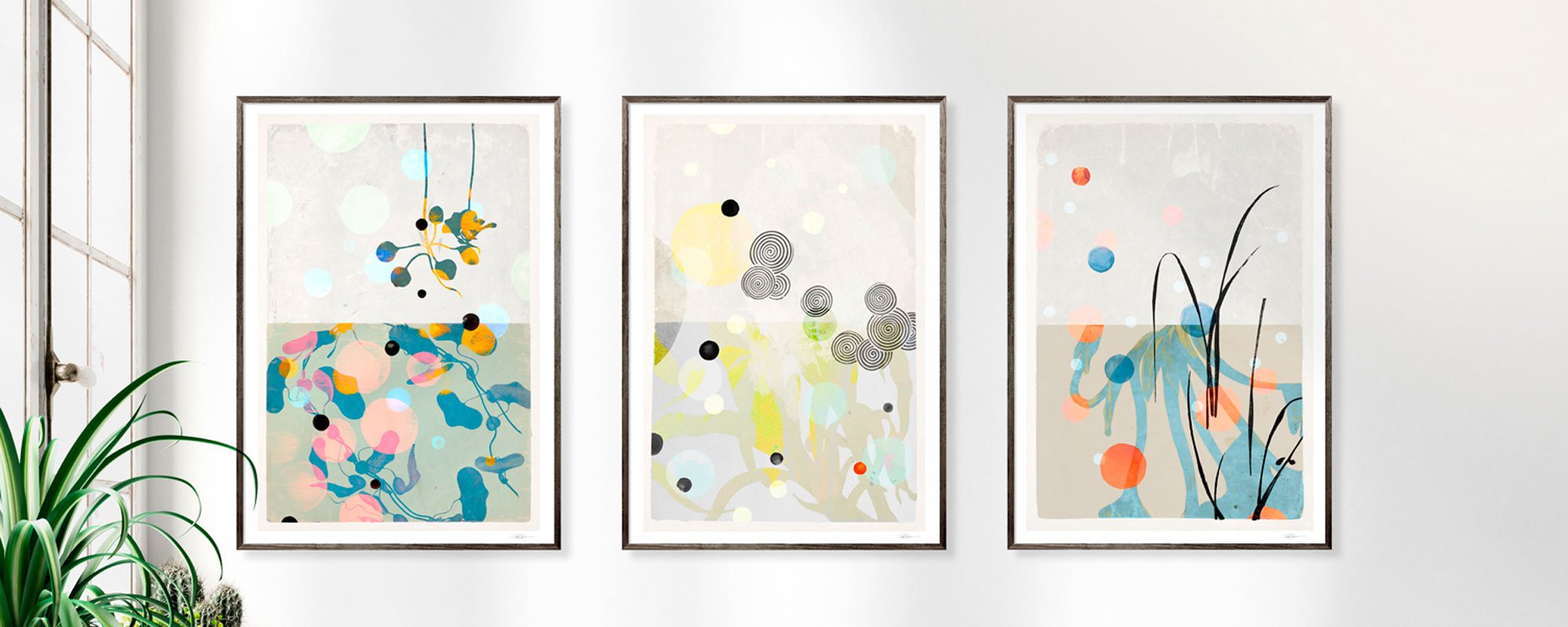
However, a large piece is not automatically the answer. In a narrow entryway, a vertical format can give the room height and calm. Above a low lounge area, a horizontal format can create balance. A series of two or three works can be powerful if each piece is related, and the rhythm between them is carefully orchestrated. The series should be read as a unified composition, not as a row of loose decorations.
Give the Artwork Space
Art gains authority from space. If the reception wall also has to accommodate signage, diplomas, screens, and notices, even an excellent artwork loses its impact. Decide early on what the wall should communicate. Should it be informative, or should it be an experience?
When art is given its own surface, it becomes a focal point. It offers the guest a place for their gaze to rest before the meeting, conversation, or day continues.
Materiality Creates the Premium Experience the Eye Senses
In a room where many people pass daily, the choice of materials becomes crucial. A fine art print on exclusive paper has a different depth and tranquility than a standard print. The paper's surface softly absorbs light, colors gain more nuance, and the artwork retains its tactile quality, even when viewed up close.
Canvas can be a strong choice when the reception area needs a more painterly and spatial presence. The textile surface adds warmth, especially in rooms with hard, reflective materials. A framed print, conversely, can sharpen the graphic expression and give the artwork a more precise, almost architectural edge.
Consider the lighting before choosing a finish. Direct spotlights and large window sections can create glare on glass, while a matte surface often preserves the motif's intensity from multiple angles. Frames should support the artwork rather than demand attention themselves. A slender wooden frame can emphasize warmth and craftsmanship, while black or aluminum gives a more austere look.
Hand-finished details also change the experience. Gold leaf reacts to light throughout the day, giving the artwork a lively but never jarring shift. In a reception area, this type of detail can make a big difference because it rewards the returning gaze.
Original, Limited Edition, or Open Edition?
The choice depends on budget, ambition, and the significance of the space. An original work has a unique physical presence and is ideal when art is to carry a significant part of the company's identity. It can become part of the place's story – something guests recognize and employees live with over time.
A limited edition is a refined choice when you want the collector's aspect, the signed presence, and a clear edition logic without necessarily investing in a unique piece. Numbering and signature add provenance to the artwork and make it more than a reproduction. For companies with multiple locations, related limited editions can create a coherent but not identical artistic line.
An open edition can be the right solution in larger environments where several rooms need to be connected, or where the art needs to be continuously updated. Here, curation becomes particularly important. Choose a few motifs with clear quality rather than many works that only share a color palette.
See the Art in the Light It Will Live In
An artwork can change character significantly from a studio to a reception area. Daylight brings out certain colors, while evening light can make other tones deeper or more subdued. Therefore, don't judge art only on a screen or in a neutral gallery. Look at the wall color, ceiling height, traffic flow, and the surfaces that reflect or absorb light.
It's also worth investigating how the artwork functions with people. The reception area is a space of movement, coats, bags, changing faces, and often many visual signals. A good choice remains clear without being overbearing. It gives the room a level of uncompromising quality, but still allows the meeting between people to be central.
StoltzeStudio specifically works with pieces where curated motifs, exclusive paper qualities, and the traces of the hand are clearly visible. This type of art is particularly well-suited for reception areas that want more than a pretty wall – they want an experience with its own substance.
Finally, choose the artwork that you want to encounter again and again. The art in the reception area should not just impress at the opening. It must be able to follow the rhythm of the day, welcome the unknown, and still give the room a sense that someone has chosen with care.