


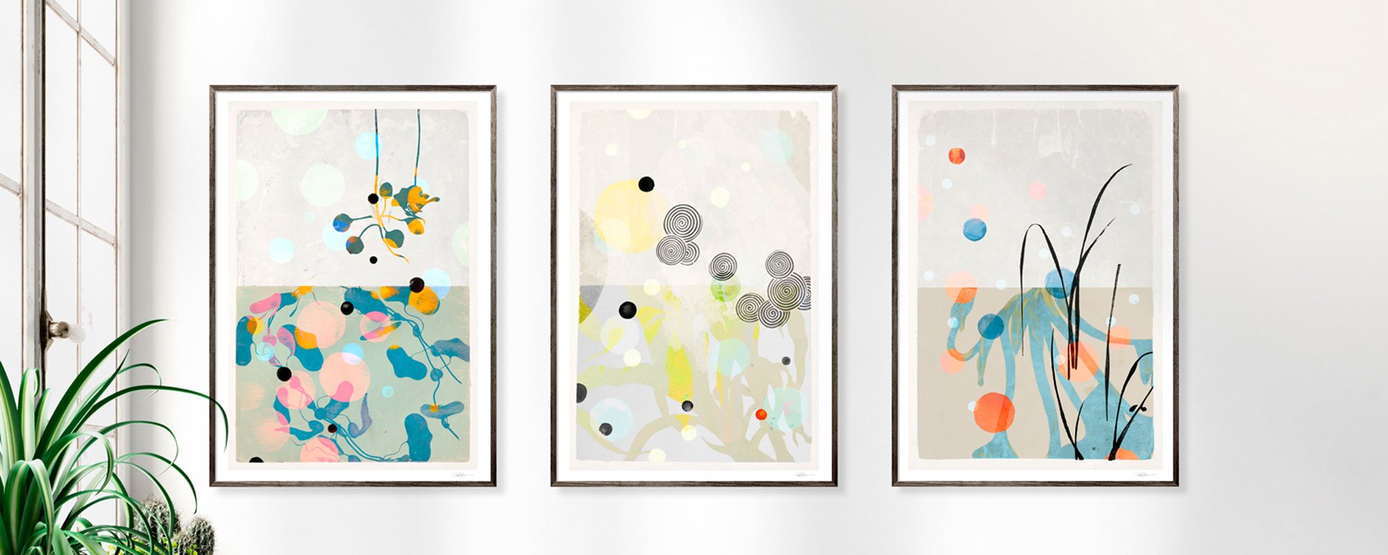
Art for waiting rooms with peace and character
A waiting room is rarely a space one chooses to be in. Precisely for this reason, it deserves more than neutral walls and random decoration. Art for a peaceful waiting room can change the first impression of a clinic, practice, reception, or consultancy firm: from waiting time to a brief, sensory stay with space to breathe.
The right art doesn't necessarily have to be obtrusive. It should create an atmosphere that feels well-thought-out, dignified, and humane. A piece with visual depth can give the eye a place to rest, while a harmonious color scheme makes the room feel less clinical and more caring. It's a quiet but noticeable form of hospitality.
Art for a peaceful waiting room begins with the rhythm of the space
Peace is not the same as an absence of expression. A completely white room can appear clear and resolved, but also cold and impersonal. Conversely, too many contrasts, motifs, or glossy surfaces can create unrest, especially when guests are already tense or unsure of what awaits them.
Therefore, view the waiting room as an entire composition. How does the daylight fall? How long do guests typically stay? Is there a reception, a low sofa, glass partitions, or a long corridor leading to the room? The role of art depends on these conditions. In a physiotherapy clinic, where people might stay briefly, a single, clear piece can create a precise visual anchor. In a doctor's office or psychologist's practice, where waiting times can feel longer, a smaller series of works can create a slower, more immersive rhythm.
A calm expression often arises from the balance between recognition and openness. Abstract compositions, reinterpreted archival motifs, organic forms, and subtle landscape references give the viewer something to return to without locking into one specific narrative. They keep the space open.
Choose colors that work with the nervous system
Colors affect the pace of a room. This doesn't mean a waiting room should be beige or colorless. It means the colors should have an inherent discipline. Dusty blues, deep green tones, warm gray, sand, ochre, and muted rose can add warmth without demanding attention in the same way as sharp primary colors or harsh black-and-white contrasts.
A piece with darker tones can work beautifully in a bright, minimalist room, as it adds weight and focus. In a smaller room with limited daylight, a lighter composition with soft nuances might be more appropriate. Here, it's not just the motif, but also the lightness of the work, that determines whether the room feels spacious.
However, one should not make peace a rule of subduedness. A simple accent in copper, golden ochre, or gold leaf can add the vitality that makes a room feel alive. When used with precision, it doesn't become a distraction but a point of warmth. Hand-finished details in 24-karat gold leaf possess exactly this quality: they subtly catch the light and change throughout the day without dominating the whole.
Motifs that accommodate the individual
In waiting areas, it's wise to be cautious with motifs that might be perceived as too definitive or emotionally closed. Highly dramatic portraits, explicit narratives, or images of high intensity can be powerful in a private collection, but they don't necessarily suit a room that needs to embrace many different people.
Poetic collages, nature fragments, architectural details, and abstract surfaces, on the other hand, can allow for individual interpretation. They can appear calm from a distance and more complex when viewed up close. This is a valuable quality in a waiting room, where the eye often seeks something to fixate on without being overwhelmed.
Materials that make art feel present
A print is not merely an image on paper. The paper's weight, surface, and color reproduction are part of the work's atmosphere. Giclée prints on exclusive art paper have a depth and matte finish that reduces glare and allows nuances to appear with greater tranquility. This is especially relevant in rooms with windows, spotlights, or changing light conditions.
Canvas can be the right choice when the wall needs more texture. Its subtle structure gives the work a physical presence that can soften austere interiors with glass, steel, or smooth, painted surfaces. In a larger waiting area, a canvas format can also unify the space without requiring multiple pictures on the same wall.
The frame deserves the same attention as the artwork. A slender frame in oak, dark-stained wood, or black aluminum can support various expressions but should never compete with the art. In healthcare and advisory environments, simple framing is often the most convincing solution. It signals quality and order without becoming decorative at the expense of the artwork.
Format and placement create the quiet effect
Many choose art based on whether they like the motif on a screen. But in a waiting room, scale is crucial. A work that is too small above a large sofa looks lost, while a very large work in a narrow passage can feel overwhelming. Art needs space around it to act as a breathing room rather than a visual barrier.
Above seating, one larger work or a carefully coordinated duo often works better than a dense gallery wall. It gives the room direction and reduces visual clutter. On a long wall, three works in the same series can create a calm repetition, especially if colors and formats are cohesive, but each work still has its own expression.