How to choose art for the bedroom
The bedroom is the most private room in the home. It's where the day winds down, and where your gaze should be able to rest without becoming irrelevant. When you consider how to choose art for the bedroom, it's less about filling an empty wall and more about finding a piece that refines the room's atmosphere. Art should evoke something in you, but it doesn't have to shout to be remembered.
A well-chosen print, a signed limited edition, or an original artwork can give the room the depth that textiles and furniture alone rarely create. It sets a tone between the intimate and the architectural, between personal history and visual tranquility.
Start with the mood you want to wake up to
Before choosing a motif, you should feel how the room should feel. A bedroom can be cool and graphic, warm and embracing, or poetic and light. The artwork doesn't necessarily have to match the color of the bedspread. Often, the result is more refined when the art adds a nuance, a texture, or a contrast that the room lacks.
Don't just ask: Does it fit the wall? Also ask: What does it do to the pace of the room? Erotic, intense, or very dramatic motifs can be exactly right in a room with few visual impressions. In an already detailed bedroom, a quieter composition can, on the other hand, create the necessary counterweight.
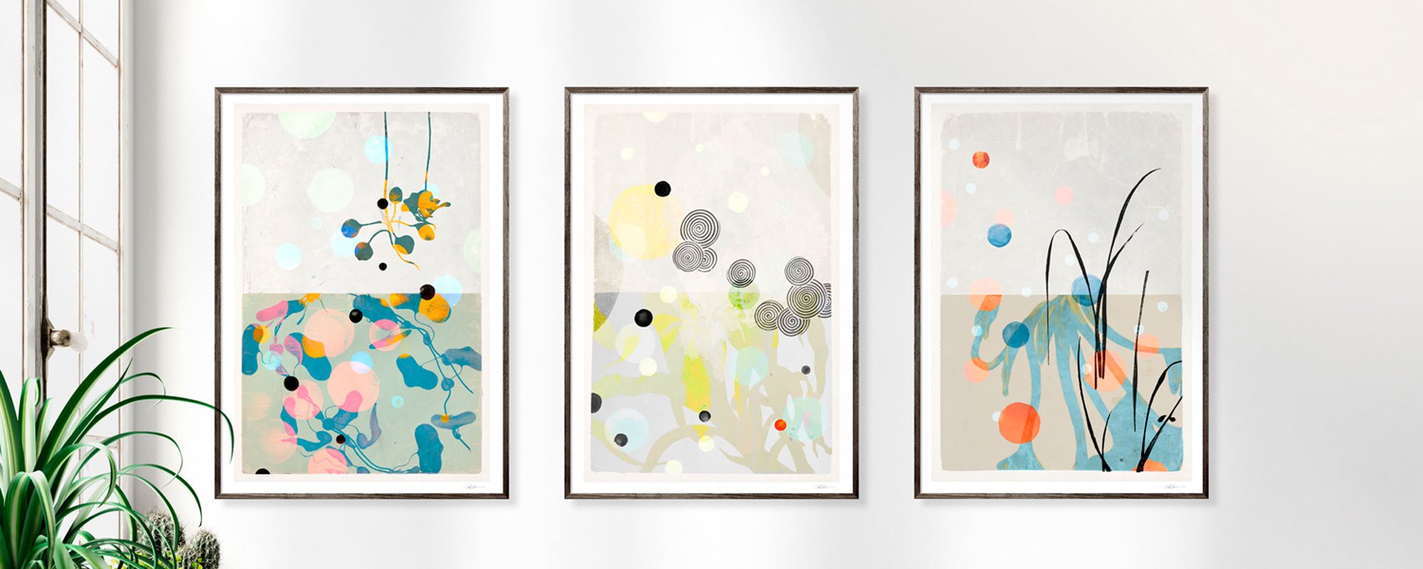
Abstract works, reworked archival motifs, and organic forms often have a special quality in the bedroom. They allow for interpretation and don't feel exhausted after a few weeks. A work should have layers that only reveal themselves in the morning light or in the subdued evening lighting.
Choose colors with both daylight and darkness in mind
Colors are perceived differently throughout the day. The dusty green that appears cool in direct morning sun can become deep and almost velvety under a bedside lamp. Therefore, art for the bedroom should be evaluated in relation to both the room's light direction and the lighting you actually use after dark.
Soft earth tones, gray-blue shades, chalky pink tones, and warm neutrals are natural choices if the goal is a sensual sanctuary. But tranquility is not the same as paleness. A work with dark ultramarine, burnt sienna, or a dense black surface can give the bedroom weight and concentration, especially when the surroundings are light.
If you prefer a more vibrant expression, let one color from the artwork subtly recur in the room. This could be in a pillow, a vase, or a book spine on the nightstand. Don't match everything. The most complete decor always has a bit of tension between the related and the unexpected.
Metallic details require space around them
A hand-finished work with for example, gold leaf reacts strongly to light. In daylight, the surface can appear sharp and clear, while in the evening it acquires a more subdued glow. It's an elegant detail above a bed or on a wall that greets you from the doorway, but it works best when the rest of the room doesn't compete with too many glossy materials.
Give such works breathing room. Matte wall paint, wood, textile, and ceramics create a calm setting where the handcrafted finish is allowed to stand out without being ostentatious.
The format determines whether the art feels present
Many people choose art that is too small. A small frame above a wide bed easily makes the wall seem unfinished, no matter how strong the motif. The format of the art must be in proportion to both the furniture beneath it and the distance from which you view it.
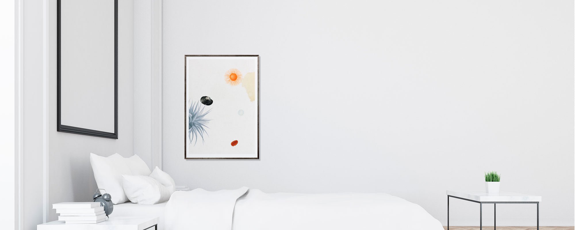
Above a queen- or king-size bed, one larger work often works better than several small ones. As a rule of thumb, the artwork should occupy about half to two-thirds of the bed's width. This provides a clear visual anchor without making the wall feel heavy. If you have high ceilings, a vertical format can add elegance and draw the eye upwards. In a lower or more compact room, a horizontal work can create width and balance.
A gallery wall is not out of the question in the bedroom, but it requires editing. Choose works with a common color palette, related frames, or the same degree of visual stillness. A dense salon hanging with many stories can be beautiful in a living room or hallway, while the bedroom often benefits from fewer, more conscious choices.
Hang with calmness around the artwork
When art is placed above the bed, there should be a clear distance to the headboard. Approximately 6 to 10 inches usually creates a natural relationship between furniture and artwork, but proportions matter more than the exact measurement. Don't automatically hang at a standard height if the bed is low or the ceiling is particularly high.
An artwork on the wall opposite the bed has a different function. It becomes the first thing you see in the morning and the last thing the room shows you in the evening. Here, the motif can be more personal, more tactile, or more enigmatic.
The material is part of the experience
The motif is only one part of the art's effect. The weight of the paper, the depth of the print, the texture of the canvas, and the finish of the frame all influence how the artwork lives in the room. In a bedroom, where the senses are close to textiles, wood, and skin, the material quality is particularly noticeable.
A Giclée art print on exclusive paper often has a precision in colors and details that makes it suitable for complex collages, fine lines, and photographic layers. On canvas, the same type of composition acquires a more painterly, tactile character. There is no single correct choice. Paper behind glass can feel sharp and graphic, while canvas often adds softness and spatiality.
The frame should support the artwork, not explain it. A dark wooden frame can add depth to light motifs. A narrow, light frame can preserve the lightness of a poetic composition. Black is not always the safe choice, and oak is not always the warm one. Look at the undertones in both the artwork and the room before you decide.
Let the work be personal without becoming private in the predictable way
Art in the bedroom doesn't have to depict something you already love. A picture of a place you've visited can be meaningful, but an abstract work can sometimes hit more precisely because it doesn't tell you what to feel.
Rather choose a work that you keep returning to, than one that simply fits perfectly into a photo. The slow attraction is often a better sign than the immediate wow. Art that has durability can accommodate your changing habits, seasons, and moods.
This is also where the logic of editions gains value. A numbered and signed work creates a different intimacy than mass-produced wall decor. It reminds you that the image was created with intention, material awareness, and an artist's hand. At StoltzeStudio, the interplay between curated compositions, exclusive prints, and hand-finished details is precisely intended as part of this experience.
Give yourself time before the final choice
If in doubt, live with the motif for a moment before hanging it. Look at it on a screen next to the room's colors, or place a printed sample against the wall. This doesn't replace the encounter with the finished work, but it quickly reveals whether the color temperature and scale are in dialogue with the room.
The best art for the bedroom rarely feels like a quick decision. It feels like something that already had a place in the room, and that slowly makes the silence around it more personal.