Art posters for the living room with lasting appeal
A living room doesn't need more things. It needs the right eye-catchers. When searching for art posters for the living room, it's rarely just about filling an empty wall. It's about creating a space with weight, rhythm, and a personal visual language – a place where the eye can find peace but never completely stand still.
A well-chosen art poster can unify a sofa, add character to a quiet corner, or create a necessary contrast to an otherwise stark interior. The difference lies not only in the motif but in the curation: the format, the paper's surface, the depth of the colors, and the work's ability to continue to unfold over time.
Art Posters for the Living Room Are More Than Decoration
Mass-produced wall decor is often designed to fit in anywhere. Art has a different ambition. It should be allowed to ask a question, shift the mood of a room, or add a tension that cannot be explained at a glance.
In the living room, where everyday life unfolds, the artwork plays a special role. It's the backdrop for conversations, slow mornings, and late evenings. Therefore, it's worth choosing an art poster that not only matches the cushions or rug but also the atmosphere you wish to live in.
Abstract compositions can create tranquility through form, surface, and repetition. Erotic or figurative motifs can add presence and humanity. Collages, archival images, and graphic transformations often bring a more intellectual energy into the room. No direction is automatically correct – it depends on the home's architecture, light, and temperament.
Start with the Wall, Not with the Motif
The most common pitfall is falling in love with a work and then trying to force it into a placement. Instead, start with the wall. Look at its proportions, the distance to the sofa, and the amount of space the artwork will have around it.
A large, bare wall above a low sofa can carry a prominent format that works with the furniture's width. If you choose something too small, the poster easily feels like an afterthought. As a rule of thumb, a single piece or an entire hanging should ideally make up about two-thirds of the sofa's width, but the room must always have the final say.
In a smaller living room, a medium format can be more convincing than an entire gallery wall. One precisely placed work often creates greater visual clarity than many small ones. Conversely, a salon-style hanging can work beautifully in homes with high ceilings, classic details, or a more layered interior. Here, the variation between formats is part of the composition.
The Right Height Creates Calm
Art should not float up near the ceiling. As a starting point, hang the center of the work at eye level, adjusted according to the room's use. Above a sofa, the distance from the furniture to the frame should be tight enough for the hanging to be perceived as a cohesive whole – not as two separate elements.
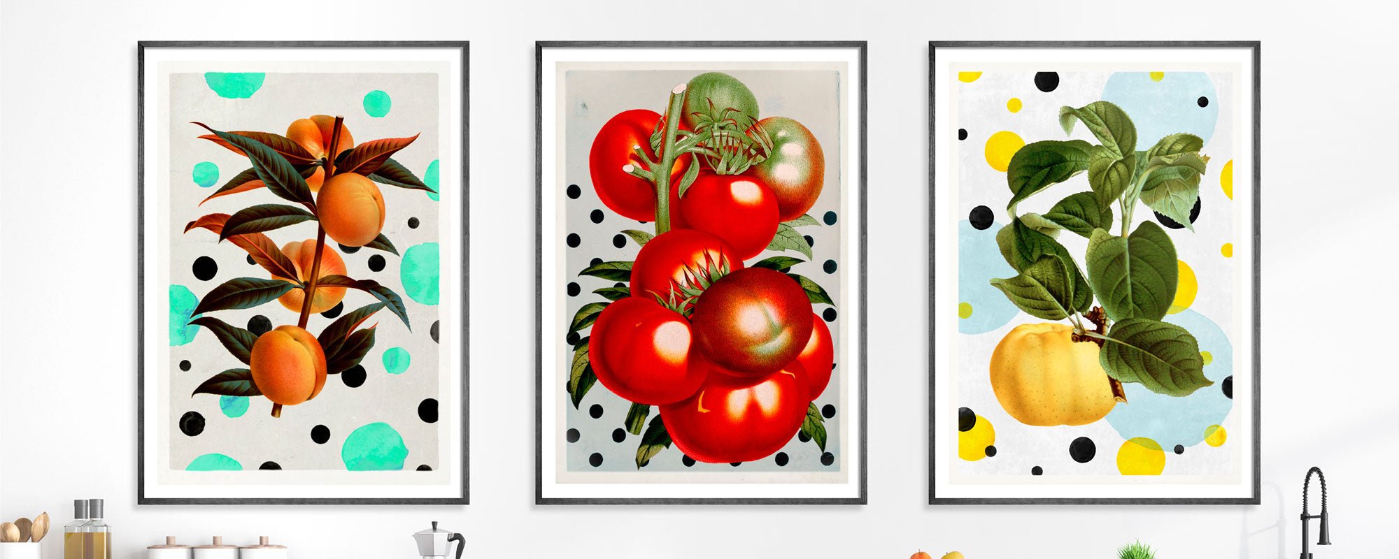
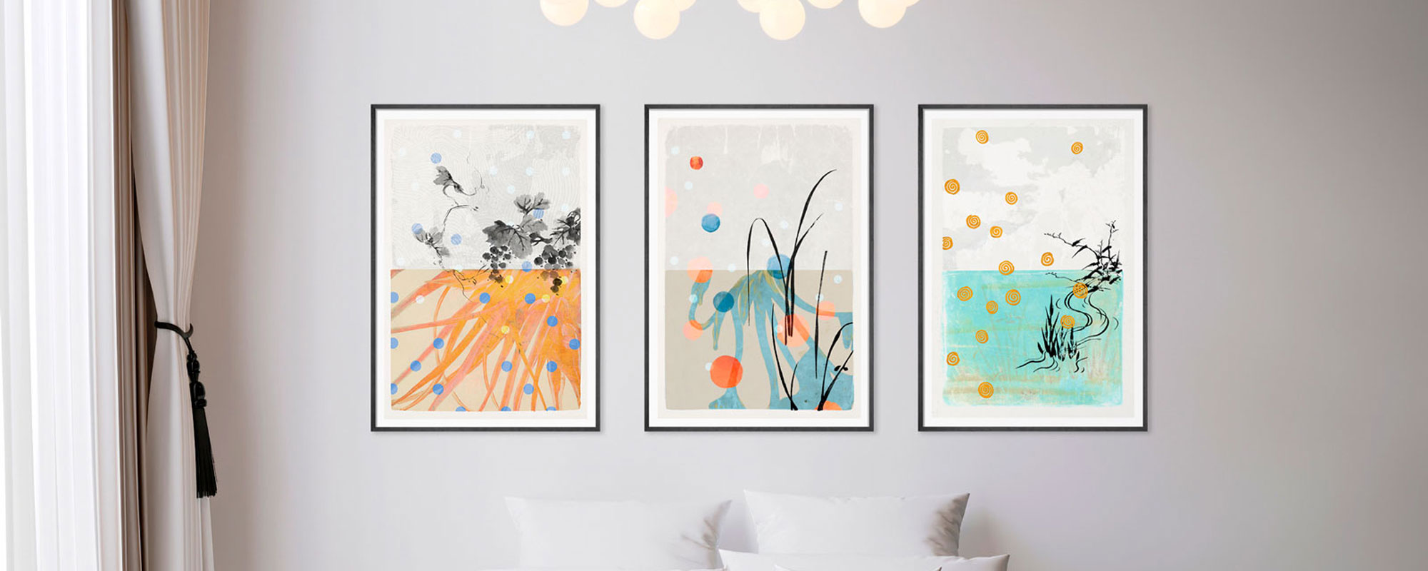
When several art posters are hung together, they should be treated as one work. Maintain a consistent distance between the frames, and let the motifs share a common idea: a related color, a repeated form, a common theme, or a deliberate contrast between the quiet and the expressive.
Colors Must Work with the Light
Color choice isn't just about repeating the nuances of the home's other decor. A work that mirrors everything around it can become invisible. Often, the most refined effect occurs when art either refines an existing color or introduces a new tone with discipline.
In a living room with whitewashed walls, light wood, and natural-colored textiles, deep ultramarine blue, wine red, or black surfaces can give the room a welcome gravitas. In a darker interior, a light motif with off-white, sand-colored, or dusty pink tones can open up the wall and provide reflection to the room.
Also, consider the changing light of the day. A work that is strong in midday sun can take on a completely different, more intimate appearance in lamplight. Pigmented Giclée prints on art paper have a fine ability to retain nuances and details, so the motif doesn't flatten out when the light changes. This is a quality you notice over years – not just in the product image.
Paper, Canvas, and Finish Change the Experience
An art poster is not merely an image. The material is an active part of the artwork. A print on matte, tactile fine art paper gives depth to photographic motifs, drawings, and collages. The surface dampens reflections and allows colors to appear with an almost velvety intensity.
Canvas has a different physicality. It adds relief, texture, and a painterly closeness, especially in larger formats. This choice is well-suited for rooms that can accommodate a more physical presence on the wall. However, it's not necessarily the best choice for every motif. Sharp graphic details can appear more precise on paper, while organic brushstrokes and layered surfaces often benefit from canvas.
Nor should the frame be treated as a practical afterthought. A narrow oak or walnut frame can add warmth to a graphic work, while black wood or aluminum sharpens the expression. A light frame can create lightness but can also lose definition on a white wall. A passepartout adds space and museum-like calm, especially around smaller works, but an edge-to-edge print can be more direct and modern.
When Detail Must Be Visible
Limited editions, signatures, and hand-finished elements add another kind of value. A touch of 24-karat gold leaf catches the light differently from morning to evening, making each copy subtly unique. Numbering and signature place the work within a conscious edition logic: It is created in a limited run, with respect for both the motif and the collector.
This detail is not chosen solely to signal exclusivity. It gives the work a clearer connection to the studio, the process, and the hand behind it. For many, precisely this connection is crucial when art is to live close by.
Create a Hanging with Personal Tension
The most compelling living room is rarely decorated according to a single style rule. It features compositions that feel personal: a poetic collage next to a simple lamp, a brightly colored print against a patinated wall, or a stark graphic motif above a soft, deep sofa.
If the home already contains many materials and colors, a single concentrated artwork can create balance. If, on the other hand, the decor is monochrome and restrained, art can be the place where the room gets its pulse. This doesn't necessarily require grand contrasts. A shift in texture, a precise color, or a motif with unexpected depth can be enough.
At StoltzeStudio, art posters are created with this slow gaze in mind: works with visual integrity, exclusive materials, and compositions that can stand alone without shouting. They are intended for homes where art is not a final detail but part of how the room feels.
Give the Artwork Time to Settle In
A good choice doesn't have to be immediately comfortable. Some art posters grow stronger when you've lived with them for a while. Move the motif around, lean it against the wall for a few days, and observe it in both daylight and evening light before deciding on the hanging.
The right art poster for the living room is the one that still has something to say after the guests have left, the coffee cup is empty, and the room is once again your own.