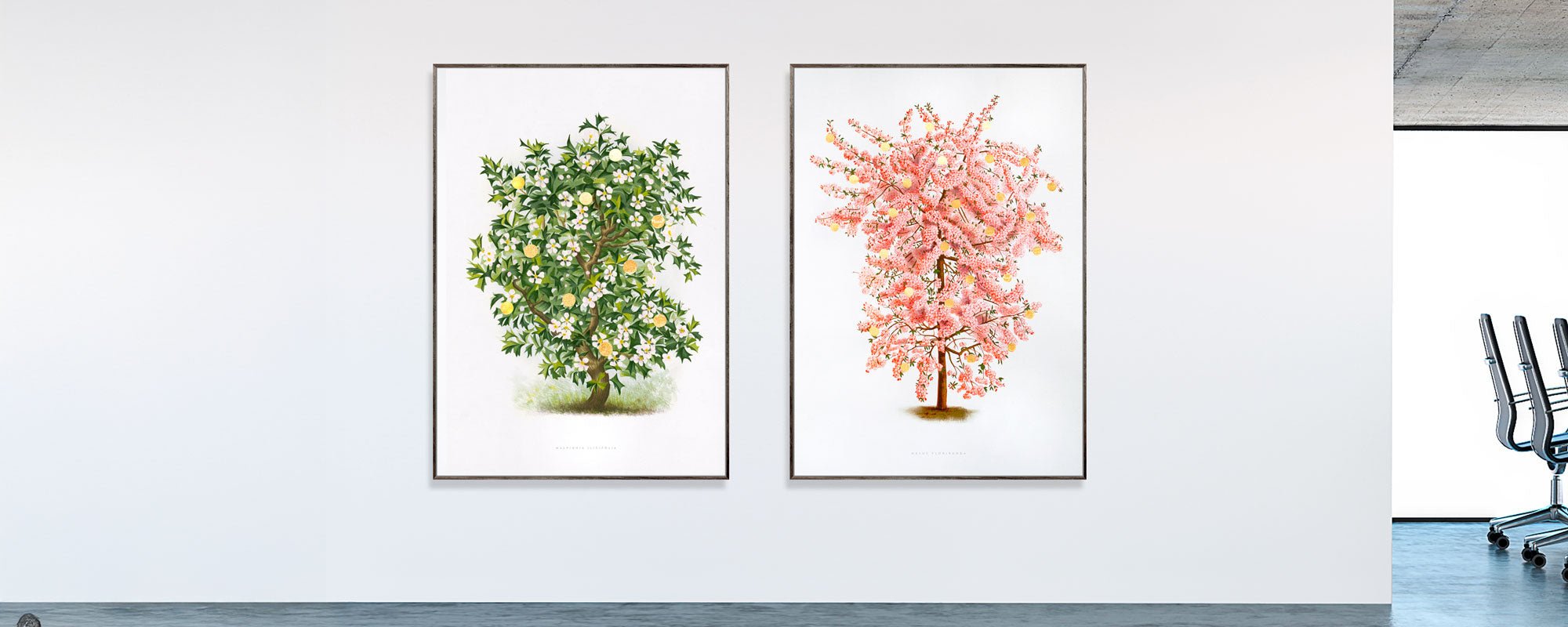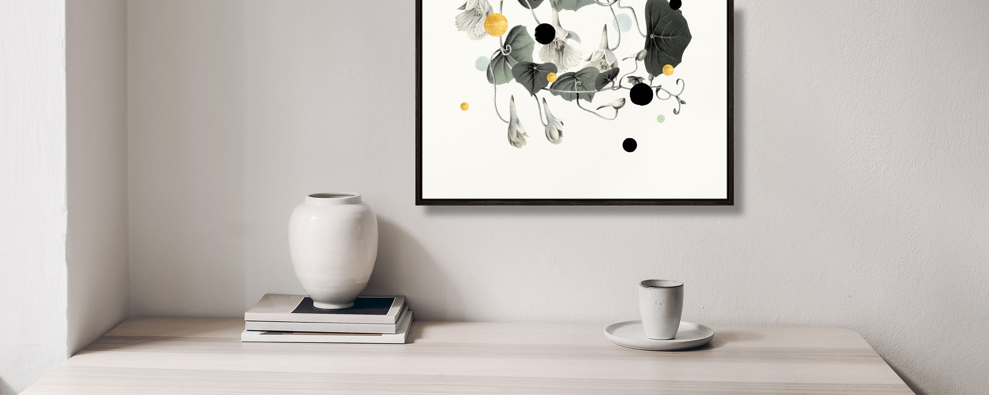
How to match art with your interior
A room can be beautifully furnished and still feel unfinished. Often, it's not the sofa, lamp, or rug that's missing – but the right art. When addressing how to match art with interior design, it's not about making everything pretty in the same way. It's about creating tension, calm, and a sense that the room has a voice.
The most compelling homes are rarely those where everything matches perfectly. Instead, they are curated. Art adds depth, rhythm, and personality, but only when the piece is allowed to interact with the room's materials, proportions, and light. Good art in the wrong format can seem random. A smaller piece with precisely the right tone can change the entire atmosphere.
How to match art with interior design without making the room too neat
The classic mistake is to choose art based on the same color palette as cushions and throws. This can work, but it can also make the expression feel flat. If everything repeats itself, the room loses its tension. Art shouldn't merely confirm the interior. It should be allowed to challenge it slightly.
A warm, tactile room with wood, wool, stone, and muted tones can support a piece with sharp contrast or a poetic collage with more edge. Conversely, a clean, modern room might need a piece with softer movement, organic composition, or handmade details that break the controlled aesthetic. Matching, therefore, isn't just about similarity. It's about balance.
Start by assessing the room. Is the mood quiet and understated, or dramatic and graphic? Are the furnishings light or voluminous? Is the light cool or golden? Art should neither overpower nor disappear. It should settle as a precise layer on top of what already exists.
First, look at the room's architecture
Before you fall in love with a motif, you should look at the wall, ceiling height, and the room's lines. A large, low wall above a sofa rarely calls for a small, vertical piece. A narrow space between two windows requires a different solution than an open dining room with long sightlines.
Architecture doesn't dictate everything, but it sets the framework. In rooms with high ceilings, larger formats or vertical works can emphasize height and create a sense of spaciousness and generosity. In more compact rooms, art often works best when the format is tightly curated, so the wall doesn't become visual noise.
The same applies to rhythm. If your interior already features many elements – open shelves, prominent textiles, visible books, lamps, and objects – one strong piece can bring more calm than an entire gallery wall. Conversely, if the room is very clean and minimalist, a smaller salon hanging can add warmth and humanity.
Format is just as important as the motif
Many choose art based on the motif alone, but the format often determines whether the piece feels right in the room. A wide piece creates a horizon and calm. A tall piece provides direction and elegance. A square format can appear more serene, almost architectural in its weight.
Above a sofa, bed, or sideboard, art should generally have enough volume to relate to the furniture. Pieces that are too small easily get lost, especially in larger rooms. Conversely, an overly dominant piece can visually cramp a room if there isn't enough space around it. Here, proportion is more important than rules.
Colors, tones, and materials
If you want to understand how to match art with interior design at a more refined level, you should focus less on color names and more on tone. A dusty blue is entirely different from a bright blue. A warm white reacts differently than a cool white. The nuances determine whether something feels harmonious or coincidental.
In rooms with whitewashed walls, oak, brushed metal, and natural textiles, art often works beautifully when it shares the same materiality. This could be pieces with matte surfaces, deep pigments, or tactile prints on exclusive paper. In more polished environments with glass, steel, and sharp lines, one can either continue the clean aesthetic or deliberately add handcrafted details to give the room more soul.
Materiality matters more than many think. A giclée art print on heavy art paper has a different presence than a glossy standard print. A canvas with depth and a tactile surface behaves differently in light than a smooth frame behind glass. Hand-finished details, such as gold leaf or visible layers, can add an almost ceremonial focal point to an otherwise calm room.
When art must be the contrast
It's not always the right choice to stay within the same palette. A monochromatic interior might need a piece with earthy tones, dark depth, or a single, unexpected splash of color. A colorful room, conversely, can coalesce around a more subdued piece that brings visual discipline.
Contrast works best when it feels intentional. If the rest of the room is soft and organic, a graphic composition can create precision. If the interior is stark and minimalist, poetic forms or archival motifs can open up the room and make it feel less clinical.
Placement changes the character of the work
The same piece can be experienced entirely differently depending on where it hangs. Above a sofa, it becomes part of the living area. In an entrance hall, it sets the initial tone of the home. In the bedroom, art should often be quieter, more contemplative, because the room calls for a lowered pulse.
Height also matters. Art hung too high loses connection with the interior. Art hung too low can appear cramped. The right placement creates a dialogue between the work, furniture, and sightline. Especially in multi-functional rooms – such as kitchen-diners or open living spaces – art can be used to define zones without building walls.
Leaning a larger piece against the wall on a sideboard or shelf creates a more relaxed, studio-like expression. A precise hanging in a beautiful frame appears more classic and permanent. Neither is more correct. It depends on the room's temperament.
Frames, glass, and finish
The frame is not just a conclusion. It's a transition between art and space. A thin oak frame can elevate a bright, Nordic interior with warmth and lightness. A black frame provides graphic sharpness and works particularly well when the piece has contrast or an architectural composition. More exclusive finish choices can add weight but also require a room that can support them.
Glass significantly changes the experience. Anti-reflective glass provides a calmer viewing of the artwork, especially in rooms with large windows. Without glass, paper and pigment are closer to the viewer, but this places greater demands on placement and care. There isn't one correct answer here – only the choice that suits the character of the work and how you live with it.
Choose art for the mood you want to live in
The most interesting question is rarely what matches the sofa. It's what mood you want to live in every day. Do you want a room that feels meditative, sensory, cultivated, or more energetic? Art is not just decoration. It is emotional architecture.
In the living room, larger pieces with calm compositions can create a sense of generosity and grounding. In the dining room, art can have more presence and conversational power. In the home office, a piece with clear form or visual depth can sharpen concentration. In hospitality environments and professional spaces, art is often the element that elevates the experience from pleasant to memorable.
Therefore, it makes sense to buy fewer pieces but choose better ones. One well-curated piece with material weight and artistic integrity will almost always last longer in both appearance and meaning than several quick fixes. At StoltzeStudio, this idea is central – that art should not merely fill a wall, but anchor a mood.
How to match art with interior design in practice
If you're in the middle of the process, don't start by thinking about trends. Stand in the room and observe the light morning and evening. Feel the materials. Note which colors are already present in textiles, wood types, stone, metals, and shadows. Then choose art that either extends that mood or deliberately shifts it.
Think holistically, but buy with intuition. One without the other rarely turns out well. A room must be able to support the quality of the art, and the art must be able to withstand being lived with. When this succeeds, the result doesn't feel styled. It feels natural.
The best art match is therefore not the most conventional, but the most precise. The one that gives the room character without shouting. The one that adds sensory presence, so the home not only looks complete but also feels like your own.