Current trends in abstract art prints
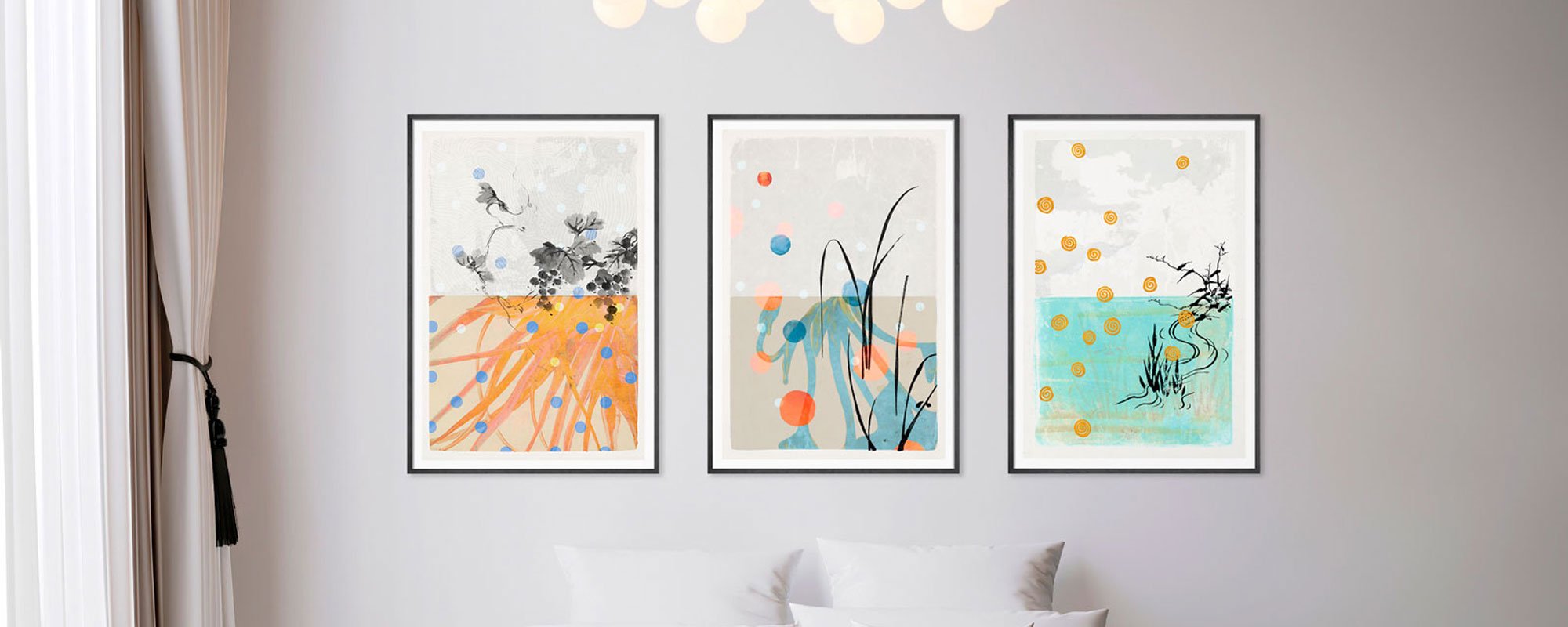
Some trends disappear as quickly as they emerge. Others settle into the space and change the way we live with art. This is especially true for trends in abstract art prints, where the shift is currently moving away from the purely decorative and towards works with greater materiality, more calm, and clearer artistic integrity.
Abstract art has long held a secure place in modern interior design, but its expression has become more discerning. Audiences no longer just choose colors that match the sofa. They choose moods, surfaces, and compositions that can carry a room over time. This also changes which prints feel current and which quickly lose their appeal.
Trends in Abstract Art Prints are Less About Fashion
The most interesting aspect of current trends in abstract art prints is that they are not primarily about following a short-lived aesthetic wave. They are about refinement. About works that create presence without shouting. About compositions that can be experienced again and again because they contain more than a quick visual trick.
For the design-conscious buyer, this means that quality and expression are increasingly inextricably linked. A print feels stronger when the paper has weight, when the pigmentation has depth, and when the surface gives the eye something to linger on. In the premium segment, the art print is therefore not a substitute for original art, but an independent category where production, edition, and finish are crucial.
Earth Tones, Limewashed Hues, and Muted Contrast
The color palette has become more sophisticated. Where clear graphic contrasts and stark black-and-white statements previously dominated many modern homes, we now see a clear movement towards earth tones, limewashed beige hues, dusty terracotta, warm gray, deep olive, and soft mineral colors. This gives abstract prints a more architectural calmness.
This does not mean that color is gone. On the contrary. Color is simply used with greater discipline. A muted blue can gain more weight against off-white than a whole explosive palette. An ochre-colored form can appear far more luxurious when allowed to stand alone in an open composition. It is precisely this restraint that makes many of the strongest works relevant.
In practice, this trend works particularly well in rooms where art needs to coexist with natural materials, textiles, wood, stone, and matte surfaces. Here, the print becomes an extension of the room's sensuality rather than an isolated eye-catcher.
Tactile Surfaces and Visible Materiality
One of the most significant developments is the desire for abstract art prints to feel more physical. Even when the work is a print, many seek an experience of layers, structure, and the presence of the hand. This can be found in reproductions of painterly brushstrokes, collage elements, scraped surfaces, or subtle traces of pigment and texture.
This is closely related to a growing fatigue with sleek, generic wall art. When everything is digitally polished, the tactile becomes almost luxurious in itself. A Giclée print on exclusive paper can precisely deliver the depth that cheaper prints rarely have. And if the work further incorporates handcrafted details, it gains an aura that is closer to the atelier than to the mass market.
However, there is an important caveat here. Materiality must be experienced as integrated into the work, not as decoration. If texture or metallic details are used without artistic necessity, the result can quickly feel contrived. The strongest prints are those where the surface supports the composition's temperament.
Large Formats with Space Around Them
Many of the most sought-after abstract prints are getting larger. Not necessarily because everyone wants monumental walls, but because the large format gives the abstract composition room to breathe. Form, movement, and negative spaces have a different effect when the work is not squeezed into too small a format.
At the same time, there has been a change in the way large art is hung. It doesn't always have to create drama. In many homes, large abstract works are used to add a quiet weight. A single large print above a sofa, in an entrance hall, or in a bedroom can create more calm than a dense salon hanging with many smaller motifs.
This naturally depends on the room. In smaller apartments or more intimate zones, medium formats may be more convincing. But the trend clearly indicates that abstract art is increasingly allowed to be a central element in the interior, not just a supplement.
Organic Forms Replace Hard Geometry
Strict minimalism has not lost its relevance, but it has softened at the edges. Among the clearest trends in abstract art prints, we see a shift from cool geometry to more organic, fluid, and corporeal forms. Curved movements, asymmetrical fields, and compositions with an almost landscape-like rhythm have gained greater traction.
This makes sense in a time when many seek home environments with more warmth and less visual tension. The organic forms are experienced as less confrontational and more sensual. They can still be modern and stringent, but they rarely feel harsh.
For creative professionals and design-conscious homebuyers, this shift is interesting because it opens up more complex spaces. An organic abstract work can easily function in a strict interior. In fact, a more refined balance often arises when the architectural lines of the room meet something freer on the wall.
Limited Editions and Works with a Clear Sense of Origin
The more the market is filled with visual noise, the more value that which seems selected gains. Therefore, the concept of edition is not just a sales model, but part of the trend itself. Collectors and quality-conscious buyers gravitate towards abstract prints where the edition, signature, and production are well thought out.
It's not just about exclusivity. It's about trust. When a work has a clear artistic sender, a defined edition, and uncompromising production, it is experienced as something one can live with in a different way. There is a difference between buying a picture and choosing a work.
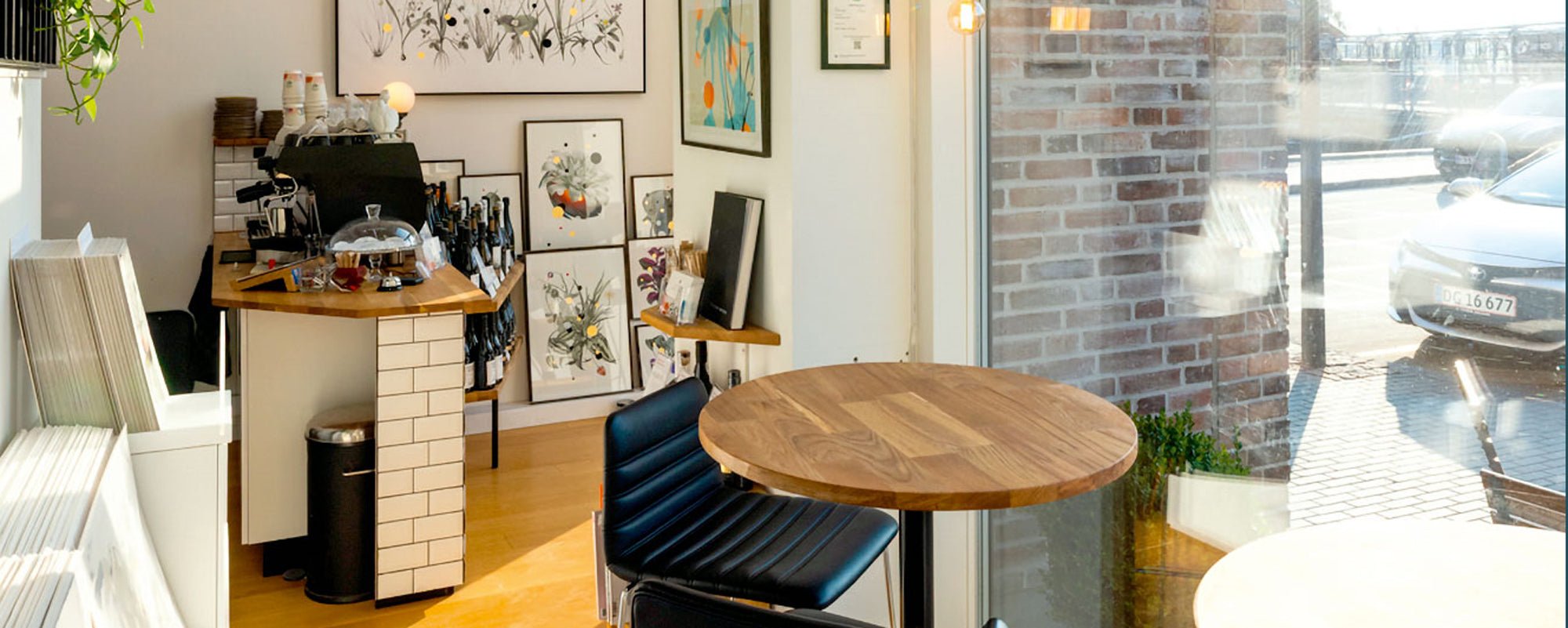
Here, curation becomes crucial. A strong print universe is not created by volume, but by precision. At an atelier-based brand like StoltzeStudio, it is precisely the meeting of craftsmanship, material awareness, and personal curation that makes the difference noticeable.
Abstract Art as Calm, Not Just a Statement
Perhaps one of the most significant movements is the quiet one. Abstract art prints are increasingly chosen for their ability to create mental space. Not emptiness, but visual calm. This is especially true in homes, hospitality environments, and workspaces, where art should not only be beautiful but also regulate the mood.
This means that works with balanced surfaces, slow transitions, and poetic compositions stand strong. Not because they are neutral, but because they are precise. They give the eye a place to rest without becoming anonymous.
This is also where many wrong choices arise. Some believe that calm automatically means beige and harmless. But a truly calm work still has tension. It has rhythm, depth, and an internal energy that holds the gaze. Otherwise, it merely becomes background.
How to choose a print that will still hold its value in five years?
If one looks at current trends in abstract art prints with a more long-term perspective, one criterion becomes more important than all others: The work must have enough character to survive the trend. This applies to color, format, and finish.
A good place to start is to look at what you physically respond to. Is it the matte surface, the open composition, the earthy tones, or a particular kind of movement? When the choice starts there, the art purchase becomes more personal and less governed by fleeting trends.
Next, one should consider the context. A large, textured work can be ideal in a room with few elements and a lot of space. A more complex collage-based print can add depth to a more subdued interior. And if you want a work with collector's value, edition, signature, and material quality naturally add more weight.
The best abstract print is rarely the loudest at the moment. It is the one that continues to unfold itself. The one that maintains its appeal as the light changes throughout the day, and as the rest of the room changes around it.
Therefore, perhaps the most interesting trend is this: We no longer choose abstract art to fill an empty wall. We choose it to give the room a pulse that feels more human, more sensual, and more enduring.